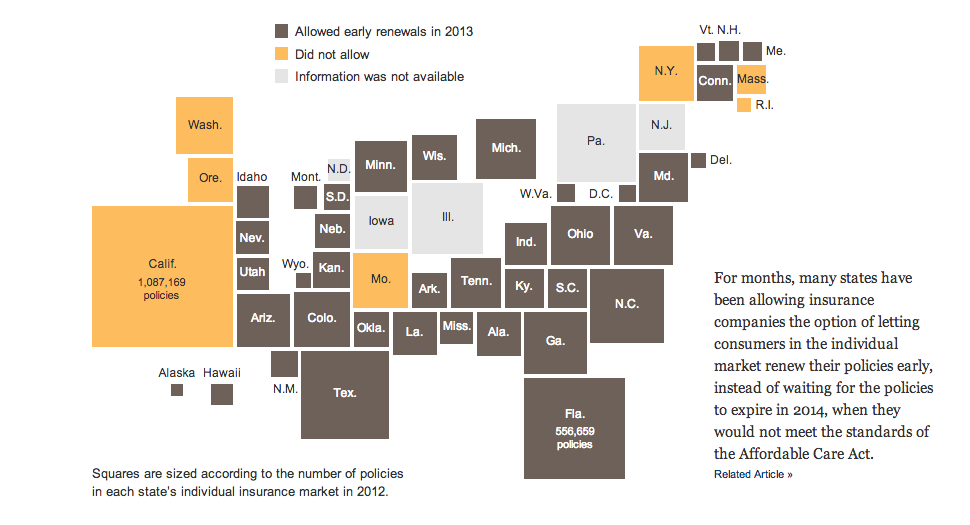
Let’s start this week off with cartograms. Sometimes I like the idea, sometimes not so much. Here is a case where I really do not care for the New York Times’ visualisation of the data. Probably because the two cartograms, a before and after of health policy renewals, do not really allow for a great side-by-side comparison. I imagine there is probably a way of condensing all of that information into a single chart or graphic component.
Credit for the piece goes to Keith Collins, Josh Katz, Katie Thomas, Archie Tse, and Karen Yourish.
Leave a Reply
You must be logged in to post a comment.