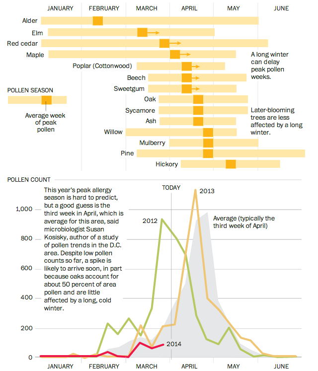
Good news and bad news, folks. The good news is that this chart does not apply to people living in Chicago, Philadelphia, or elsewhere. Unless—here’s the bad news—you live in Washington, D.C. In that case, well, prepare to die. You know, if you have allergies. The Washington Post has a nice graphic that outlines the arrival and peak seasons for different pollen allergens.
Credit for the piece goes to Bonnie Berkowitz and Patterson Clark.
Leave a Reply
You must be logged in to post a comment.