Today’s piece really is not a flashy one. I mean you can see that from the bar chart below. But, FiveThirtyEight put together a piece around it explaining just how that one chart is incredibly useful.
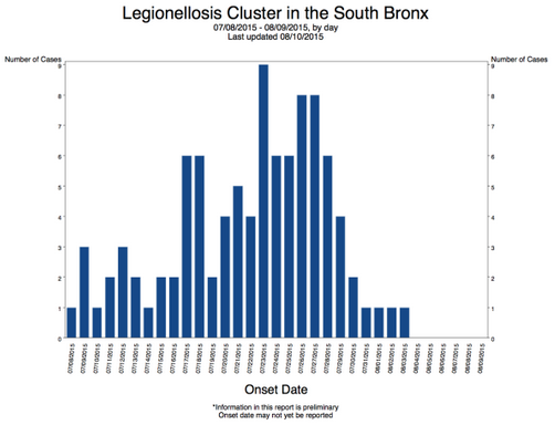
Credit for the graphic goes to the New York City Department of Health. For the analysis piece, that goes to FiveThirtyEight.
Leave a Reply
You must be logged in to post a comment.