Yesterday I opined about how simple tables can convey meaningful information without the aid of unnecessary chart elements. And while we will get back to that post, I did want to take a moment to share an older piece from the New York Times I recalled and that has been updated since Orlando.
The piece uses a table to compare the gun homicide rates for various countries and compares it to other causes of death. Being killed by a gun in the Netherlands is as likely as dying by accidental gas poisoning in the United States. It puts the absurdly high gun homicide rates in the United States in a new light.
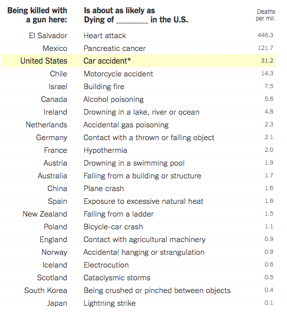
Credit for the piece goes to Kevin Quealy and Margot Sanger-Katz.
Leave a Reply
You must be logged in to post a comment.