I’ve worked on a few scatter plots of late and so this piece from the Economist grabbed my attention. It examines the correlation between unemployment rates and inflation rates. Broadly speaking, the theory has been that low unemployment rates lead to high inflation rates. But the United States has had low unemployment rates now for a few years, but inflation is around that ideal 2% realm. This theory is called the Phillips Curve.
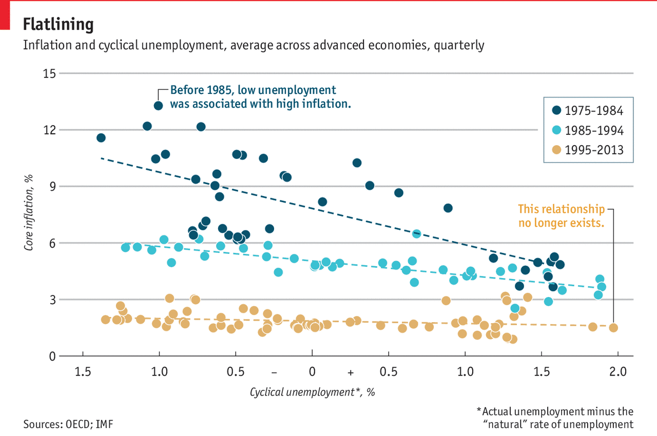
The graphic does a nice job of showing three data series all in one plot. Normally, I would argue for splitting the chart into three smaller plots, a la the small multiples. But here, the data aligns just well enough that the overlapping is minimal. And smart colour choices mean that each data range appears clearly separate from the rest. A nice thoughtful addition is the annotations to the time period are set in the same colour as the dots themselves.
My only two quibbles: One, I would probably increase the height of the chart to better show the trend line. I find that for scatter plots, a more squarish profile works better than the long rectangle. Overall, though, a really well done chart. Second, I would consider adding a zero line to the x-axis to show 0% cyclical unemployment. But that might also not be terribly useful, because you can see how the curve should move regardless of that natural line.
Full disclosure: the Economist article cites a paper from the Philadelphia Fed Research Department, which employs me.
Credit for the piece goes to the Economist Data Team.
Leave a Reply
You must be logged in to post a comment.