Tag: scatter plot
-
Big Beautiful Ballroom
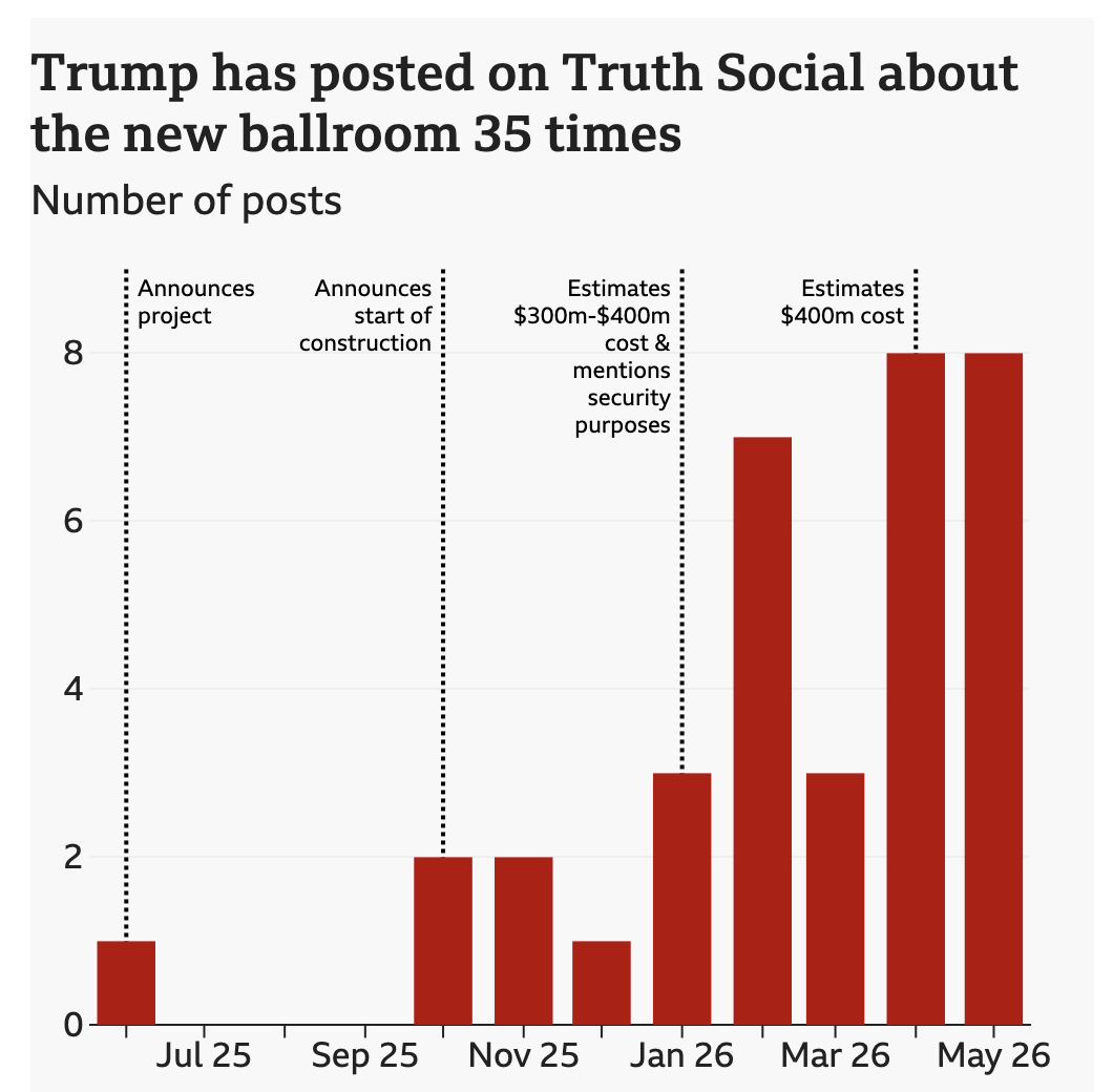
Last week the BBC published a look at the new White House ballroom promised by President Trump. The ballroom required demolishing the existing East Room. Instead of focusing on the legality of the move, I want to focus on the ever increasing cost of the project. The article does include a great before/after photograph of…
-
AC to Philly Expressway?
And I am not talking about Atlantic City. No, on Saturday, the Red Sox fired their manager Alex Cora and his entire staff. Or, rather, the staff loyal to him. I wrote about that on Monday. Little did we know that Saturday night, Alex Cora and the chief of baseball operations for the Philadelphia Phillies,…
-
Revenge of the Nerds
This past weekend I thought I would be writing about something else, and perhaps I still will later this week, but for now we turn to the Boston Red Sox firing Alex Cora, their manager; Jason Varitek, beloved Sox icon and in the dugout as game planning and run prevention coach; Ramon Vazquez, bench coach;…
-
Climate Conscientious and Cheaper Cars
Sometimes in the course of my work I stumble across graphics and work that I previously missed. In this case I was seeking a post about one of my favourite infographics, but it turned out I’ve never posted about it and so I will have to rectify that someday. However in my searching, I came…
-
Serfs Up, Bro
Now get him into the fields. Well that was a week. But at least we made it to Friday and for my American readers and myself this weekend and its bank holiday on Monday, Memorial Day, mark the unofficial beginning of summer. So thanks to Indexed, it’s time to head down to the beach and…
-
I Call Them Life Tiles
Happy Friday, everyone. Here in the United States’ Northeast Corridor we’re looking forward to a potentially powerful nor’easter that could be the first real snowstorm to hit Philadelphia all winter. (Dumb La Niña.) But I’ve also recently started working in a new sketchbook. (It happens often.) But that’s why I thought this graphic from Indexed…
-
Covid Vaccination and Political Polarisation
I will try to get to my weekly Covid-19 post tomorrow, but today I want to take a brief look at a graphic from the New York Times that sat above the fold outside my door yesterday morning. And those who have been following the blog know that I love print graphics above the fold.…
-
Get Your Shots
I’ve heard a lot about vaccine hesitancy and resistance lately and I mentioned this on Monday. Subsequently, I thought I would try to make a graphic to try and help people understand where some of these excuses fit on the spectrum of rational to irrational—with claims of people being magnetised off the chart in the…