Today is my Friday, everyone, as I am going away on holiday for a little bit. (You can expect me back mid-next week.) So, enjoy this design tip from xkcd on my favourite form of data visualisation: the pie chart.
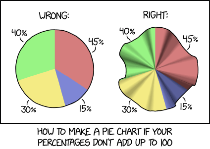
Pie charts are always 100% the wrong choice
Credit for the piece goes to Randall Munroe.
Author: Brendan Barry
I am a graphic designer who focuses on information design. Most recently I worked for the Economic Research Department of the Federal Reserve Bank of Philadelphia and prior to that I was Head of Design at Euromonitor International with my design team split between Chicago and London.
View all posts by Brendan Barry