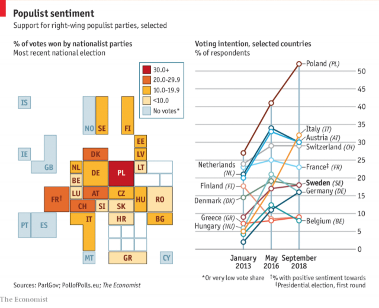
Yesterday we looked at the rise of the far-right in Sweden based on their electoral gains in this past weekend’s election. Today, the Economist has a piece detailing their strength throughout Europe and they claim that this type of nationalist party may have peaked.

The graphic fascinates me because it appears to be a twist on the box or tile map, which is often used to eliminate or reduce the discrepancies in geographic size so that countries, states, or whatevers, can be examined more easily and more equitably.
I am guessing that the ultimate sizes, which appear to be one to four units, are determined by population size. The biggest hitters of Germany, the UK, France, and Spain are all four squares or boxes whereas the smaller states like Malta are just one. (But again, hey, we can all see Malta this time.)
I think this kind of abstraction will grow on me over time. It is a clever solution to the age-old problem of how do we show important data in both Germany and Malta on a map when Malta is so geographically small it probably renders as only a few pixels.
On the other hand, I am not loving the line chart to the right. I understand what it is doing and why. And even conceptually it works well to show the peaks of the parties. However, there are just a few too many lines and we get into the spaghettification of the chart. I might have labelled a far fewer number and let most sit at some neutral grey. Or, space permitting, a series of small multiples could have been used.
Credit for the piece goes to the Economist Data Team.
Leave a Reply
You must be logged in to post a comment.