After a few weeks away for some much needed R&R, I returned to Philadelphia and began catching up on the news I missed over the last few weeks. (I generally try to make a point and stay away from news, social media, e-mail, &c.) One story I see still active is the US threatening Venezuela.
The BBC reported statements this past weekend from Venezuelan leader Nicolás Maduro, who claimed the US of “fabricating a new war”. This followed news the Pentagon ordered the aircraft carrier USS Gerald Ford to deploy to the Caribbean. The American carrier hosts 90 aircraft, including a number capable of striking ground targets within Venezuela if ordered.
In their article detailing Maduro’s comments the BBC included the following graphic detailing US Navy ship deployments to the Caribbean.
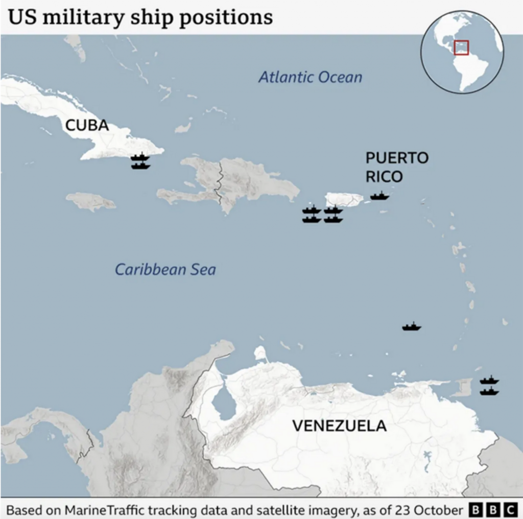
As far as graphics go, we are talking a simple locator map here. Just a little generic icon locating US warships. But I feel it misses some critical context. To start, the map highlights the country of Venezuela and Puerto Rico. Puerto Rico is, of course, part of the United States—despite what some who object to the announced Super Bowl Halftime Show performer think. But then why is Cuba highlighted? Do the US and Cuba not frequently find themselves on opposite sides of most issues?
Well, the map likely included Cuba to somehow acknowledge Guantanamo Bay. Since the turn of the 20th century the US has leased a naval base at the entrance to Guantanamo Bay from Cuba under a deal of indefinite length, which can only be ended by mutual agreement. Clearly post-revolution, Cuba has opposed the US agreement, but the US remains committed to the facility and so the base remains. Since the turn of the 21st century, however, the naval base earned notoriety and infamy for its hosting of the detention facility for high-value detainees in the US War on Terror. Although about a decade before that you may have heard of Guantanamo as the scene of a murder around which the plot of the film A Few Good Men revolved.
Regardless, the point is Guantanamo Bay houses US Navy facilities for the region, but I would have only covered the small area of the bay in Cuba and left the remainder grey. You will note that the designer did not even opt for a label for Guantanamo Bay. But to see two ships placed at a naval base is not at all surprising.
As for Puerto Rico, to my knowledge, the US Navy no longer maintains any active naval bases in Puerto Rico as Roosevelt Roads on the east coast was closed early in the 21st century. (Roosevelt Roads effectively guarded the Vieques Testing Range, which was the US Navy tested munitions, the protests of which were also big news at the turn of the 21st century.) (There have been rumours the administration is looking to reopen Roosevelt Roads.)
However, as the island is—strangely this feels as I cannot emphasise it sufficiently these days—an integral part of the United States, it is not surprising at all to see ships in and around the island just as you could see naval vessels up and down the east and west coasts of the continental United States. Arguably, warships are more valuable there than the mainland because trade with Puerto Rico is even more dependent on sea-based commerce.
An additional context missing from the graphic is just what each little ship icon means. We have reports of the deployment of the USS Newport News, which is a Los Angeles class attack submarine. Whilst nuclear-powered, it does not carry nuclear missiles and primarily attacks submarines and surface ships, though its Tomahawk cruise missiles can also strike land-based targets. But clearly not every icon represents an attack submarine. We also have reports of nearly half a dozen Arleigh Burke-class destroyers, powerful warships equipped with lots of missiles and helicopters, a Ticonderoga-class cruiser, with even more missiles but primarily tasked with air defence for a region, and the USS Iwo Jima, which is basically a light carrier and far smaller than the Gerald Ford and hosts helicopters and a few aircraft. The Iwo Jima is the focal point of amphibious group capable of inserting forces ashore. Definitely something the US would want nearby if the US intended to invade or utilise “land options” in Venezuela. As the centre of an amphibious group, a number of other naval vessels defend and support the Iwo Jima. (Similarly, when the Gerald Ford reaches the Caribbean, she will be defended by a number of ships and usually a submarine or two.)
Importantly, the news of US ships deployed to the Caribbean include logistical ships carrying cargo, fuel, munitions, &c. that are, by themselves not at all a threat to anyone.
Which icons represent which, if any of the aforementioned vessels?
Should this map alarm readers that the US has deployed warships to the Caribbean? I think on its own, no. The graphic does not really add much to the story here from my perspective. We have two (presumably) warships at a naval base and four more south of Puerto Rico, perhaps docking for shore leave—who knows?
Most threateningly for Venezuela, we have three icons near the coast, one more or less directly and two others east of Trinidad and Tobago. But is the icon the aircraft carrier with enough firepower to level a small city? Or is it the USS Minneapolis–St. Paul, a small patrol ship whose designers intended for it to interdict drug vessels and participate in littoral or coastal operations? An aircraft carrier is very different from a coastal patrol ship.
Perhaps if the designer added labels to identify each vessel or if different icons represented different types—not even specific classes—of ship the graphic could add some valuable context to US naval deployments in the Caribbean.
Usually I laud simple graphics for telling things clearly, simply, and plainly. But this graphic is a bit too oversimplified for my liking.
Credit for the piece goes to the BBC graphics department.