Another July day, another heatwave in Philadelphia. But this time we have the added bonus of Canadian wildfire smoke—apparently we call them wildfires and not forest fires now? Just last summer the US administration pointed the finger at Canada for not doing more to prevent and contain these wildfires, but I would humbly suggest that perhaps our efforts to reopen shuttered coal plants and increase our carbon and greenhouse gasses into the atmosphere is, perhaps, possibly partially the problem. Just a thought. An idea.
Regardless of who is to blame, the skies in Philadelphia this morning are a post-apocalyptic orange—apropos on many fronts—and the air hangs heavy with an acrid taste in it. Have I mentioned I am not a nature and campfire person? As my title suggests, I prefer my smokey tastes as flavours in my peated Scotch or lapsang souchong tea.
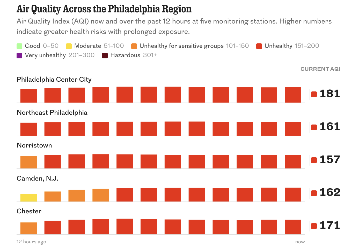
(Un?)Luckily the Philadelphia Inquirer published an article that includes live(ish) data on the air quality in and around the Philadelphia region. This screenshot is from this morning.
In general, I like it and I think it works fairly well. But from the standpoint of data visualisation I would make a few changes here.
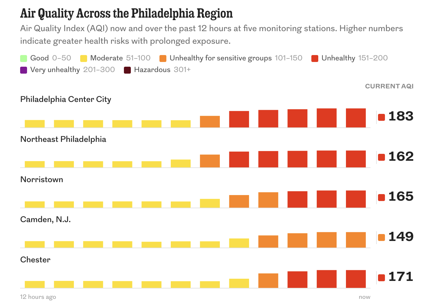
To start, it is unclear whether the rectangles reflect the actual value, e.g. 183 for my near neighbourhood—I live in Greater Centre City—or is simply just an all-values-within-the-range-are-one-height size. I suspect the former rather than the latter because it appears the heights vary ever so slightly. To combat the issue, I would suggest the rows become shorter overall so more cities/neighbourhoods can be placed horizontally. That would allow for greater height in each city’s data display and thus make the differences more readily apparent and, potentially, more cross-comparable.
If you handled the data visualisation in that fashion, the colour-coding of each bar based on its bin might not be necessary. Potentially a line or dot chart could show values rising (and then hopefully falling) through the different thresholds.
Interactively, the different bars do not on mouseover—and presumably tap if you experience this on mobile—reveal the precise value. That could be related to my aforementioned point about the data is rendered, but if it is not, that might a way to alleviate the issue if keeping the cities/neighbourhooods in rows is a design constraint.
I think a mouseover could also reveal the timestamp of the data, because the application does not include any time reference, which makes the “12 hours ago” a bit less useful as a reference.
This could be the beginnings of a particularly useful tool the Inquirer could maintain more permanently. After all, it is not as if wildfires are expected to become infrequent in a warming climate.
Credit for the piece goes to Stephen Stirling.
Bonus: Before posting, I checked the latest and here we go. They now include a time reference, which makes me think my screenshot from this morning was actually a holdover from last night, because in two hours it should not have changed this much.