Tag: Philadelphia Inquirer
-
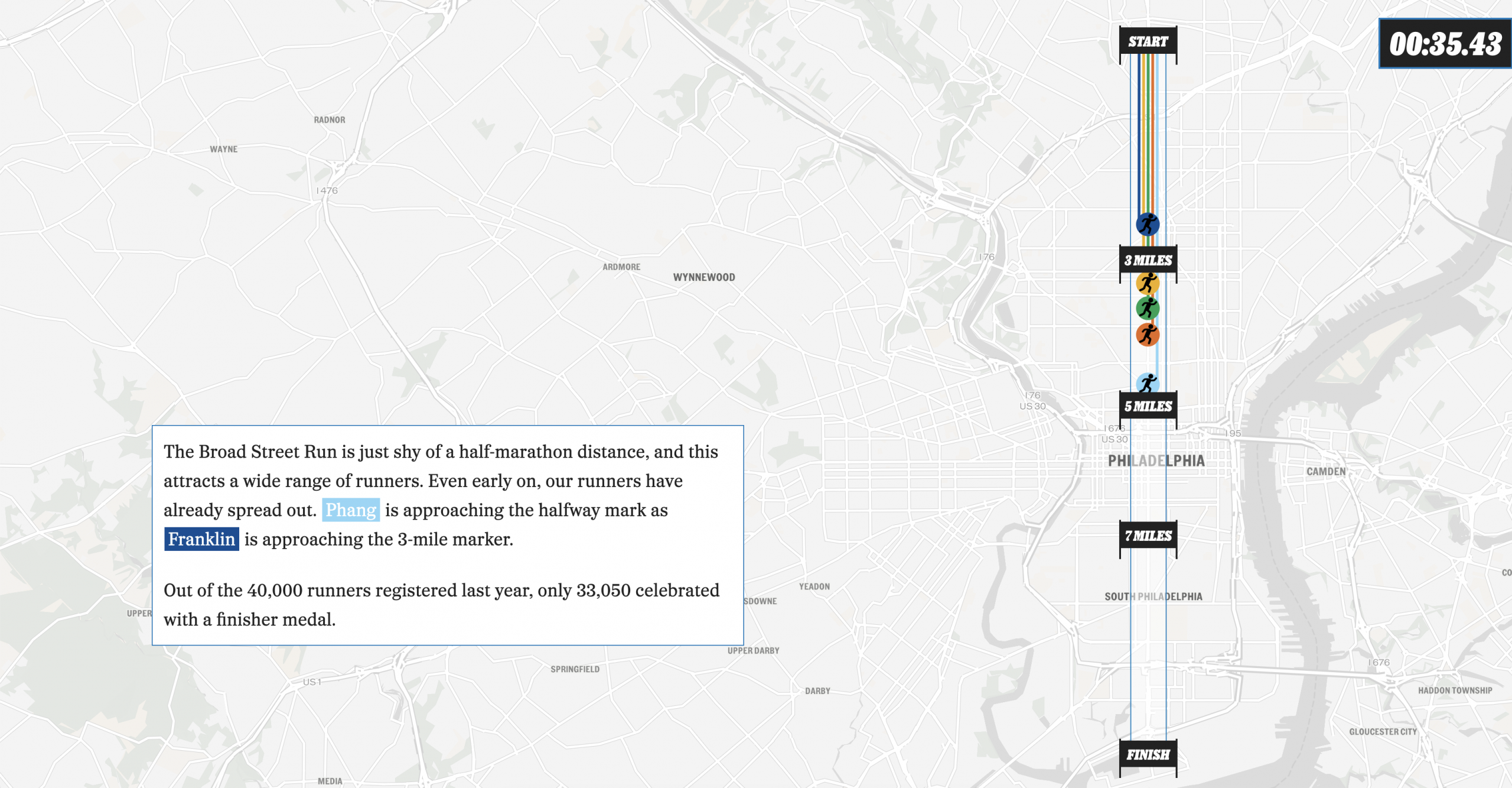
The Broad Street Run
This past weekend, Philadelphia hosted the Broad Street Run, a 10-mile run from the “top” of the city’s Broad Street in the north to the end at the bottom in the Navy Yard, a length of—you guessed it—10 miles. And congratulations to my sister for not just running it for the first time, but completing…
-
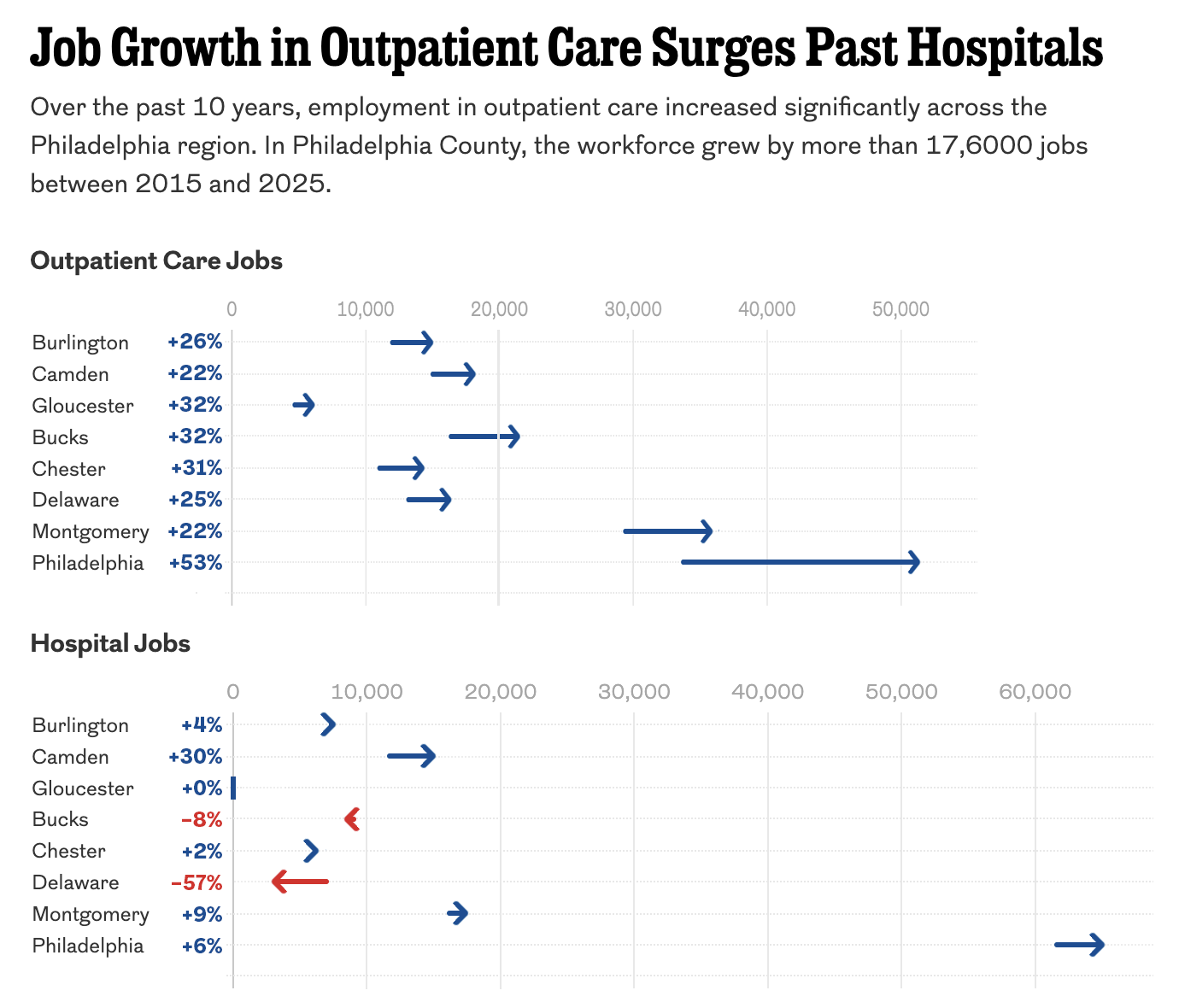
The Arrow Is Pointing Sideways
I was reading an article in my local rag, the Philadelphia Inquirer, when I came upon an article about the healthcare industry’s outsized role in the region’s job growth. The article led off with a staff illustration of medical-looking types on a graphic swirl background—nothing inherently wrong with that. The Inquirer would know best what…
-
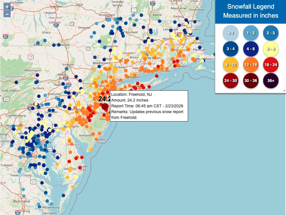
Winter Is Still Here
Ah, a blizzard. Even if the worst of the storm that recently impacted Philadelphia struck mostly at night, it still left a picturesque mess for the morning. I, however, was struck by some of the maps of the snowfall totals and I figured that would be worth sharing today. What got me started on this…
-
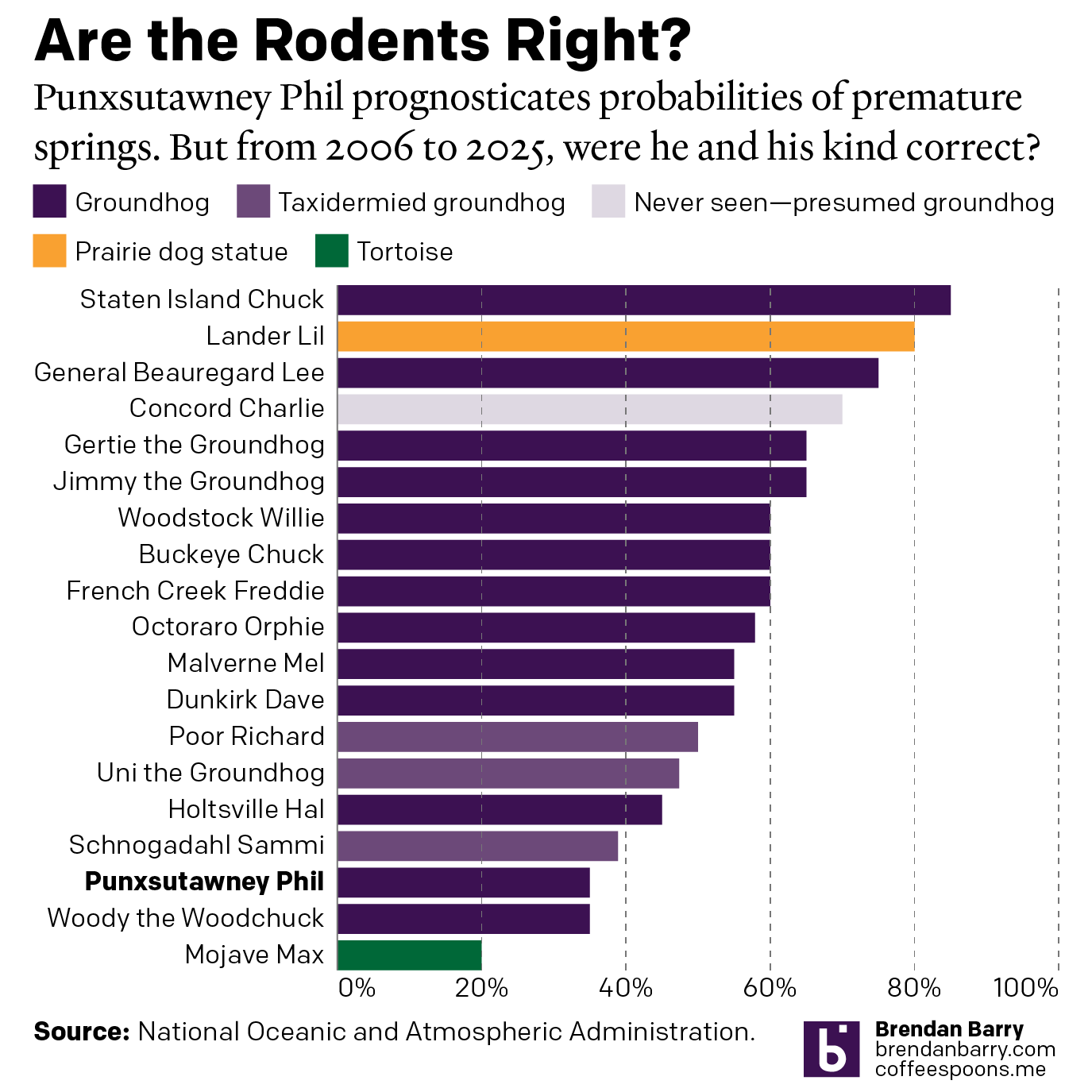
Do We Do This Every Year?
Every year on Groundhog’s Day I feel as if more and more critters crawl up from the Earth to offer their portents of prolonged winter. And every year we look backwards with the fullness of meteorological observations to evaluate the accuracy of these armchair—armburrow?—forecasters. This year, the Philadelphia Inquirer’s required article on the matter included…
-
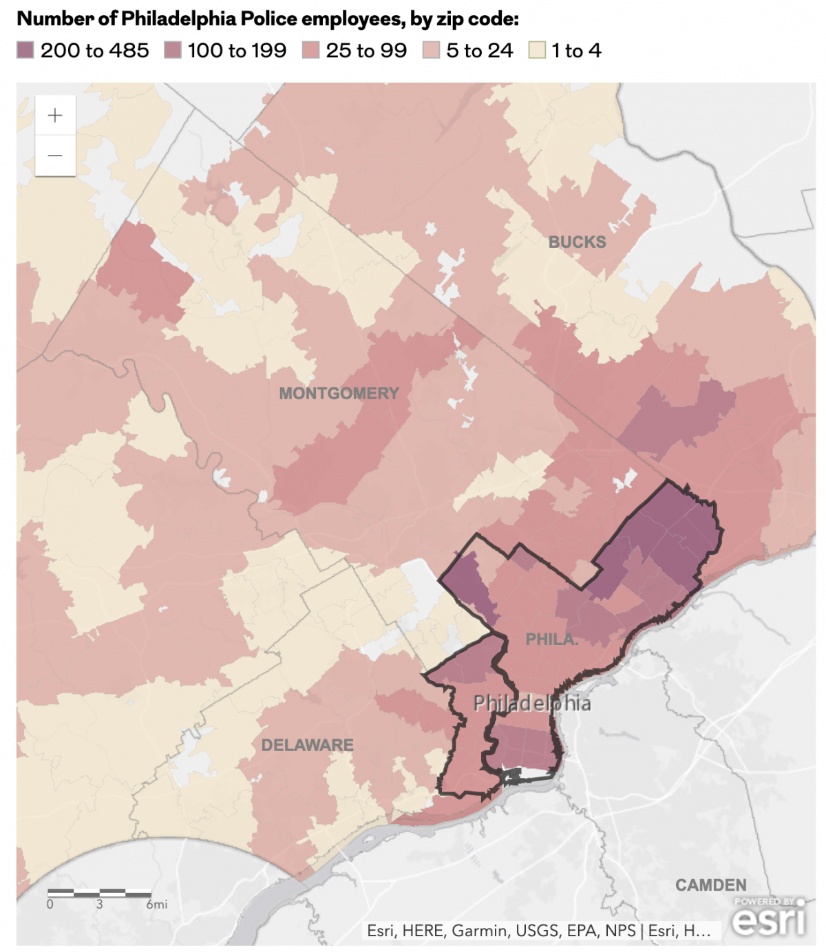
The Philadelphia Beat is Pretty Big
Early last week I read an article in the Philadelphia Inquirer about where the city’s police officers live, an important issue given the city’s loose requirement they reside within the city limits. Whilst most do, especially in the far Northeast, the Northwest, and South Philadelphia, a significant number live outside the city. (The city of…
-
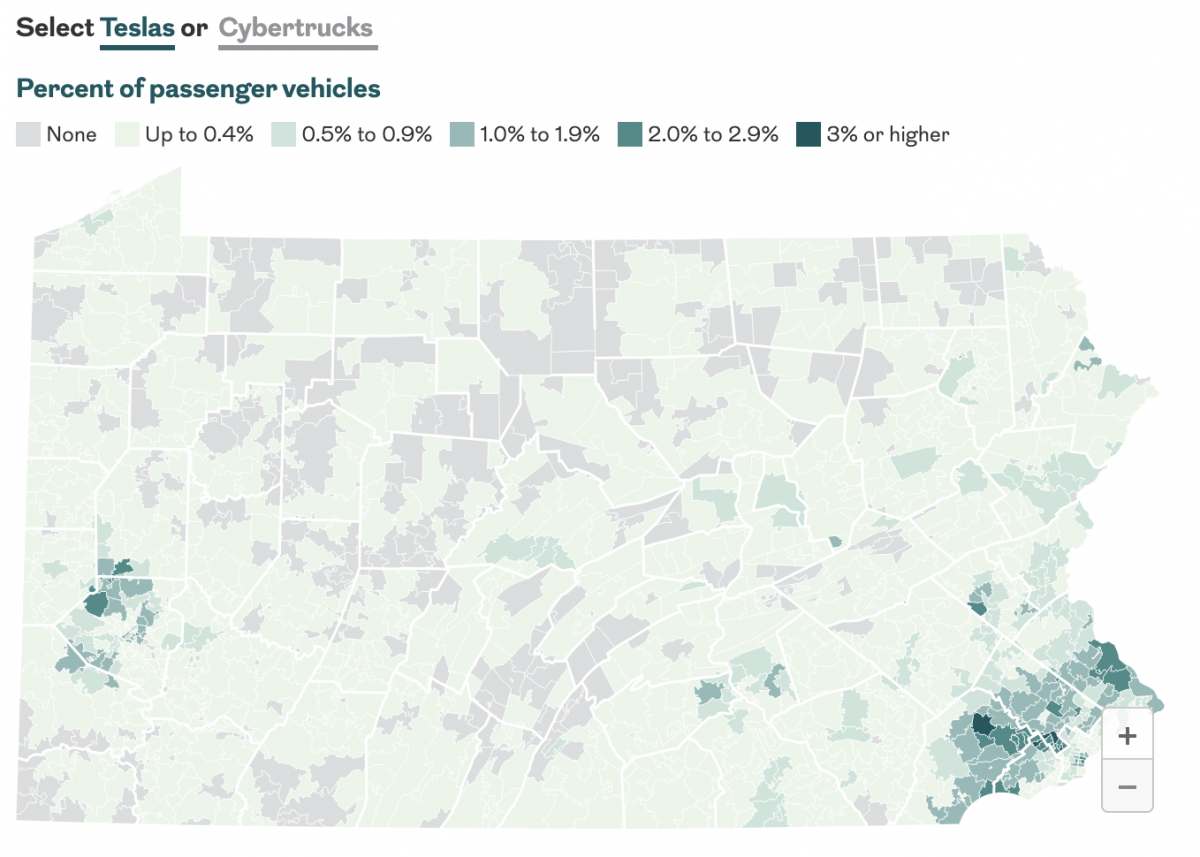
Baby You Can Drive My Car
Last month the Philadelphia Inquirer published an article examining the geographic distribution of Teslas and Cybertrucks and whether or not your car is liberal or conservative. The interactive graphics focused more on a sortable table, which allowed you to find your vehicle type. The sortable list offers users option by brand and body type—not model.…
-
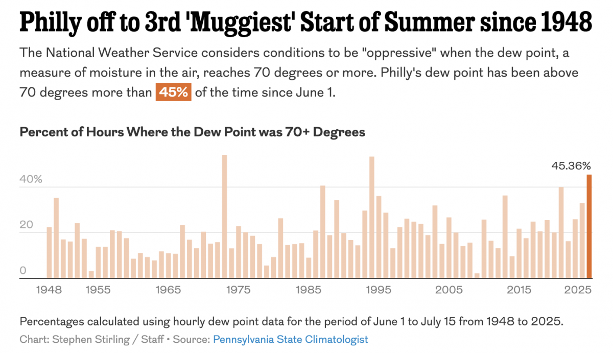
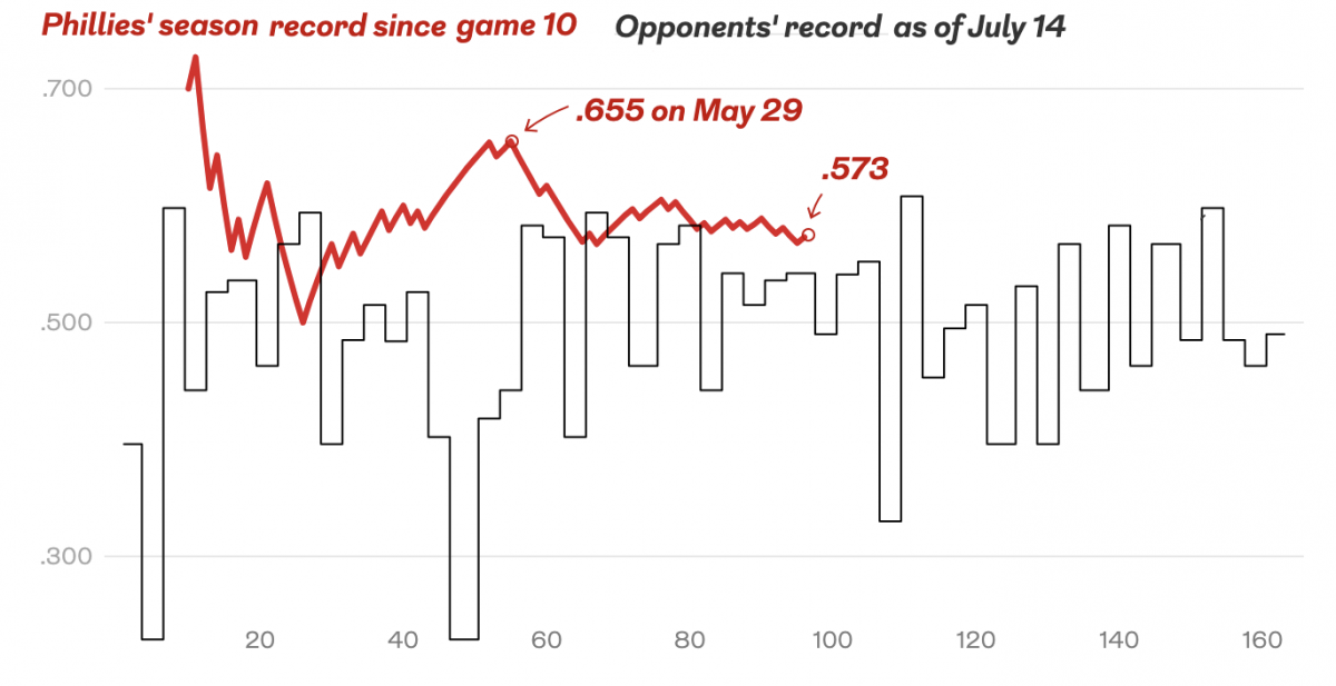
Just a Little Axis if You Please
In my last post, I commented upon a graphic from the Philadelphia Inquirer where a min/max axis line would have been helpful. This post is a quick follow-up of sorts, because a week ago I flagged something similar for me to perhaps mention on Coffee Spoons. So here I shall mention away. We have another…
-
Bring on the Beantown Boys
For my longtime readers, you know that despite living in both Chicago and now Philadelphia, I am and have been since way back in 1999, a Boston Red Sox fan. And this week, the Carmine Hose make their biennial visit down I-95 to South Philadelphia. And I will be there in person to watch. This…
-
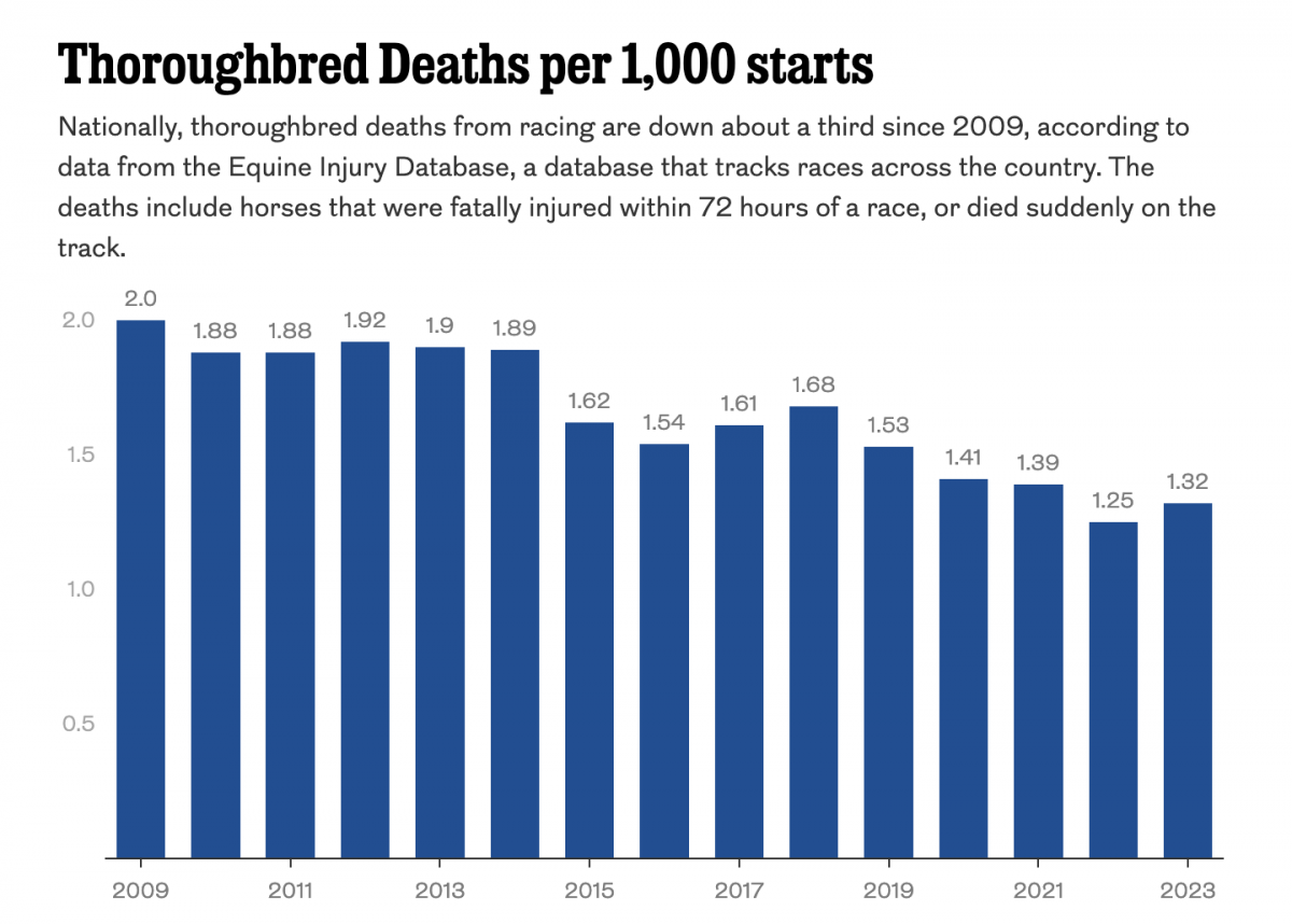
Racing to the Final Finish Line
Thoroughbred racing is big business. And Philadelphia’s Parx Casino owns a racing track that, in a recent article in the Philadelphia Inquirer, has seen a number of horse deaths. The article includes a single graphic worth noting, a bar chart showing the thoroughbred death rate. The graphic contrasts rising deaths at Parx with a national…
-
Cavalcante Captured
Well, I’ve had to update this since I first wrote, but had not yet published, this article. Because this morning police captured Danelo Cavalcante, the murderer on the lam after escaping from Chester County Prison, with details to follow later today. This story fascinates me because it understandably made headlines in Philadelphia, from which the…