
I frequently criticise labelling the data values on bar charts, a style seemingly everywhere on the internets. Labels provide precise values, but if you need to see the precise value in a graphic, you don’t really need the graphic—you need a table.
Enter this interactive graphic in an article from the BBC exploring hotel bookings ahead of this summer’s World Cup. The issue? Each labelled bar already has a mouseover hover state that provides the precise value—the ideal design solution for situations like these.
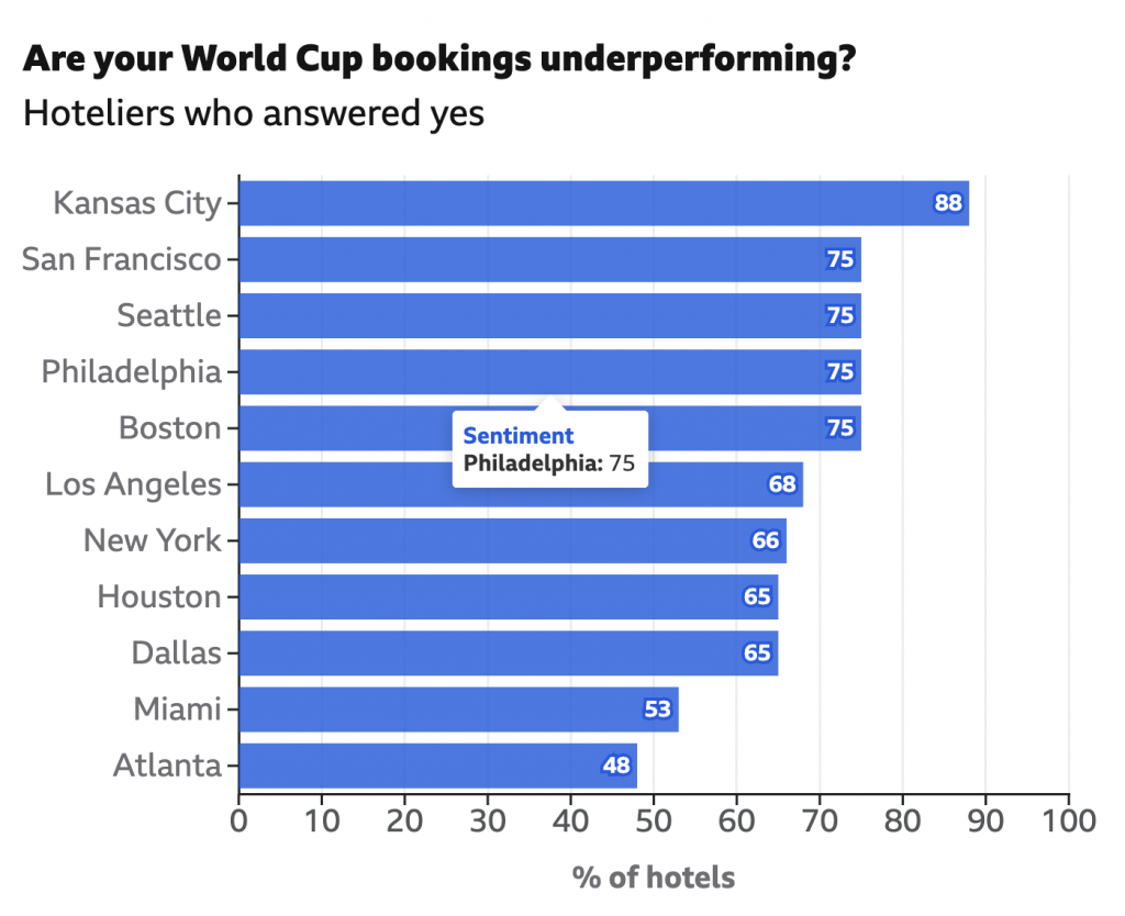
Otherwise, I enjoy this graphic. It includes labelling on the axis—most of the charts I see fail to include that basic requirement anymore. I might tweak the mouseover and use a different word in place of “sentiment”. Maybe “Responded Yes” or something similar?
Credit for the piece goes to the BBC graphics department.