
Apologies for the lack of posting over the last month, but it was a very busy month. And so here I am back to share something I have been working on the last several weeks, an interactive application exploring inflation in America. Spoiler: it’s too damn high.
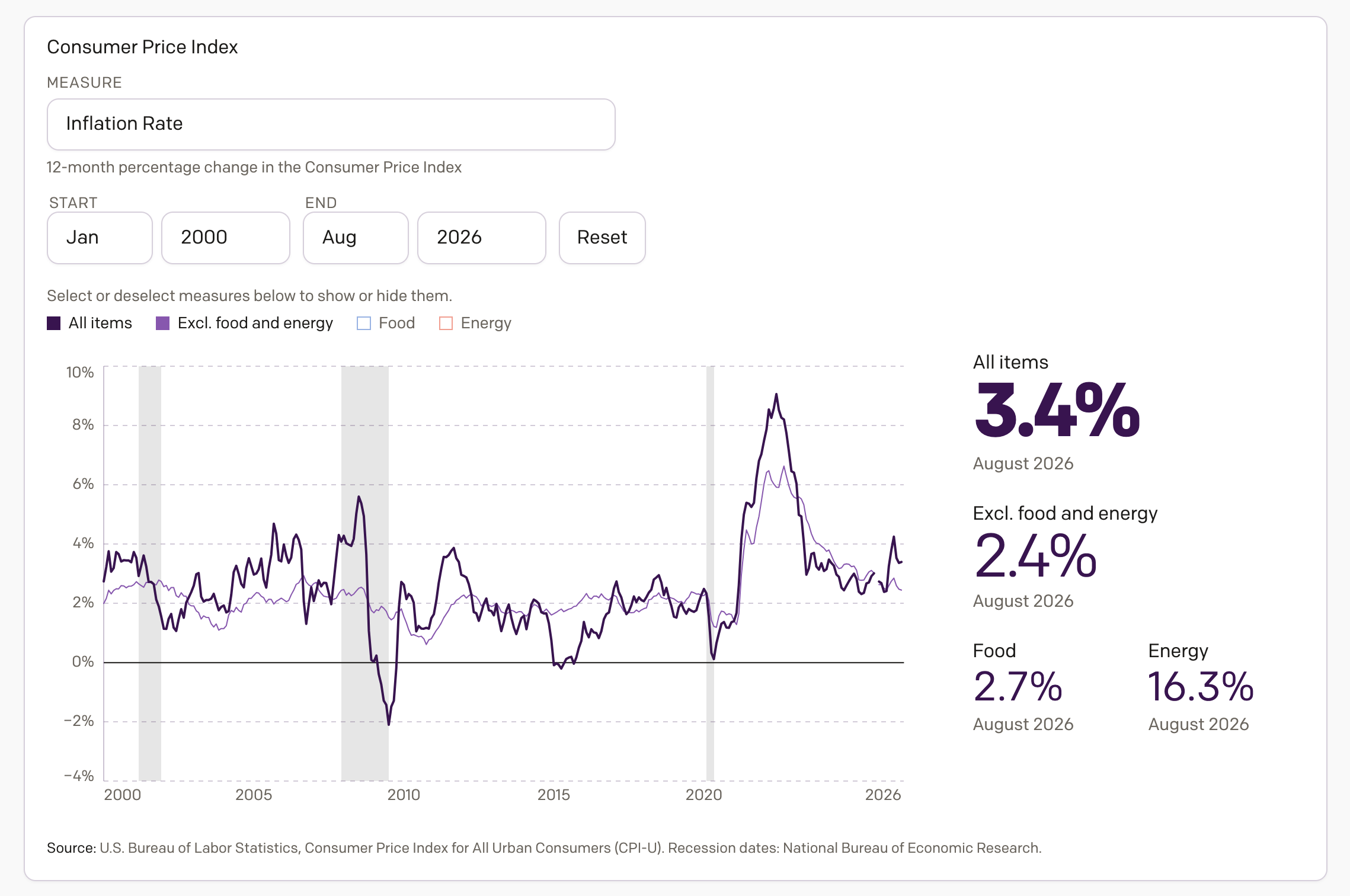
The screenshot above links to the piece now live on my portfolio, which defaults to the year over year inflation rate, i.e. what you hear about when the media says the inflation rate is at such and such percent. Importantly, I opted to show four metrics—maybe I will expand it later—the inflation rate, the inflation rate excluding food and energy, food inflation, and energy inflation.
Food and energy are key components to our consumer expenditures. You cannot live if you do not eat. And good luck doing anything without heat or electricity. But, they are also highly volatile. Just think about how much your fuel prices have changed over the last several months. Things like socks, toothpaste, and books are—often, not so much these days—less volatile and can provide a better look at overall inflation trends, and so people often analyse inflation excluding food and energy.
Finally, I decided to include both food and energy. The latter was obvious given the severe disruptions to global supply chains since February. And once I included energy, I figured I should include food as well. (The disruption to food markets in the wake of Russia’s invasion of Ukraine, one of the world’s largest grain exporters, has been significant in the last several years.)
You can also switch from the yearly trend to looking at the monthly change. This is where the volatility and swings from month to month really appear as the spiky lines. Nevertheless, it provides valuable insight into more recent changes. One need only look at energy price changes over the last several months to see why.
The data is all sourced from the Bureau of Labor Statistics.
Credit for the piece is mine.