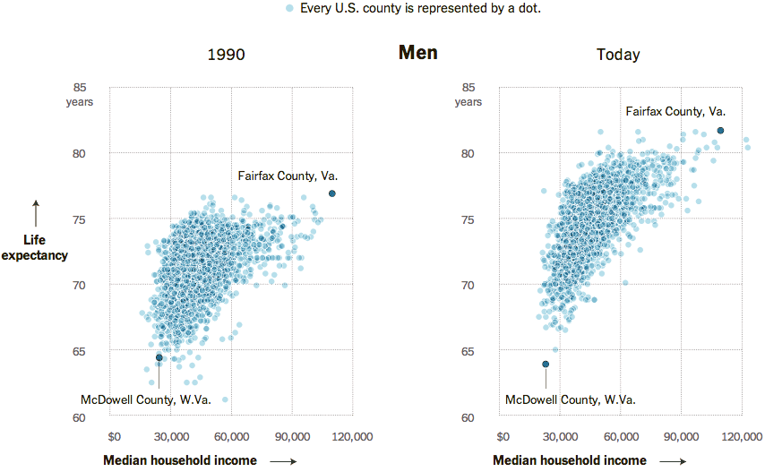
Today’s post comes via the New York Times. It’s a simple concept, but shown clearly in this collection of scatter plots. Growth in income for many counties has meant a growth in life expectancy. Unfortunately, not all counties are prospering and so the gap between rich and poor, and therefore the long-lived and shorter-lived, has grown.

Perhaps the only criticism I have about this piece is that for the highlighting of Fairfax County, Virginia and McDowell Country, West Virginia, an additional component could have summarised the growing gap between the two. For example, a bar chart along the axes of each could measure the growth in income disparity and the growth in life expectancy disparity.
Credit for the piece goes to Alicia Parlapiano.
Leave a Reply
You must be logged in to post a comment.