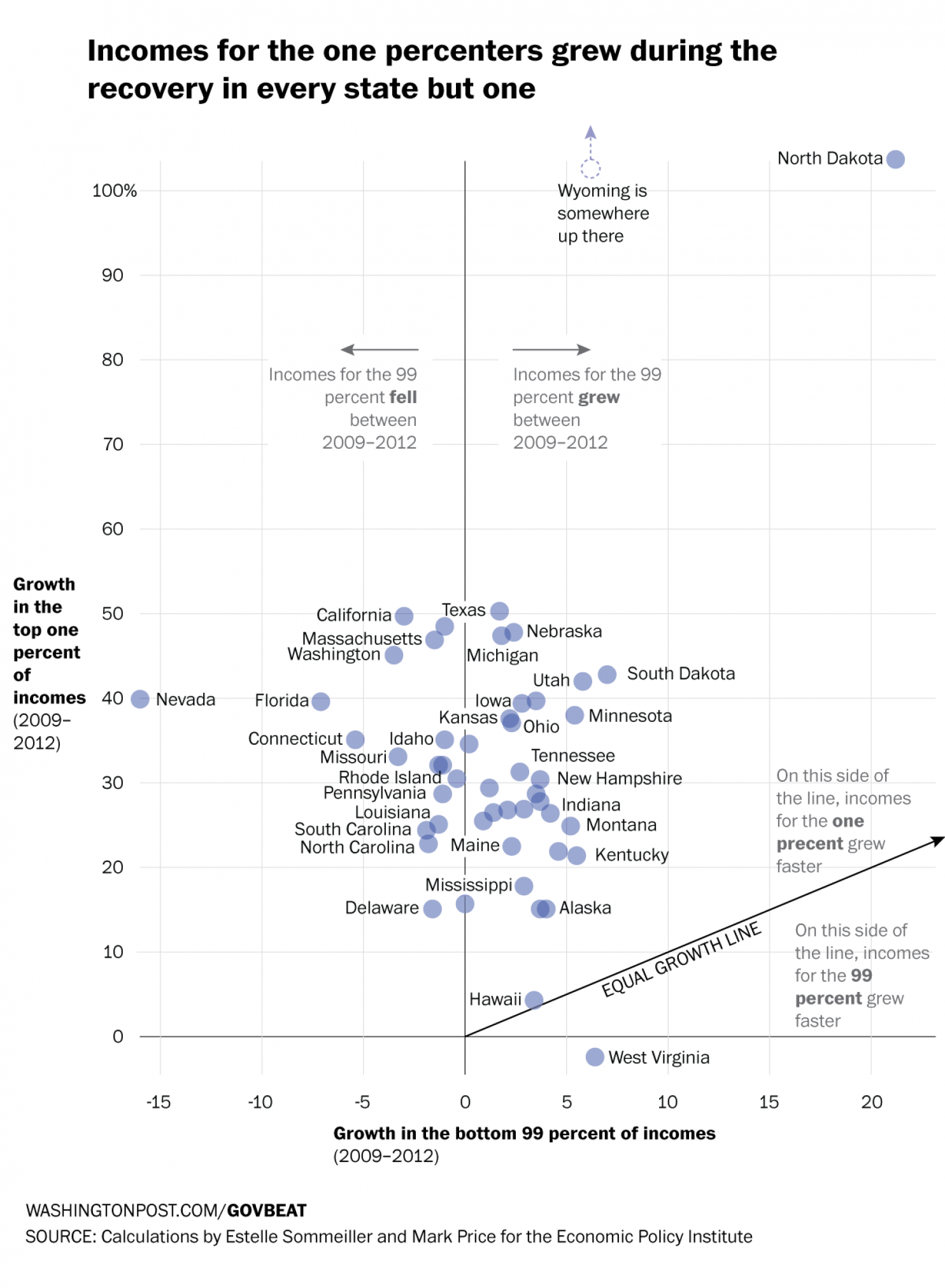
The Recession was not great for the 99%. It was, however, good for the 1%. How good? Well as data put together by the Economic Policy Institute indicates—and as reported by the Washington Post—it was very good. In only 1 of 49 states did the 99% fare better than the 1%. One state’s data was unavailable. This scatter plot compares the growth over the period of the two income groups. And as the reader can see, the growth was generally speaking not even close to being equal.

Credit for the piece goes to Niraj Chokshi and Jeff Guo.
Leave a Reply
You must be logged in to post a comment.