Choropleths are not always a good idea. For example, look at election maps. Highly populated but geographically small cities appear as mere drops of ink on paper or pixels on a screen. Meanwhile, vast deserts appear gigantic empires. Nothing new there. But even within cities, these issues exist. London is one such city and one design studio has been working on a means of changing that. London Squared Map converts the boroughs of London into almost all squares of equal area. Each is placed in the appropriate space to represent geographic location. But to convey actual geography and familiarise the audience, not all squares are equal. Instead, just like the city itself, the squares are divided by a simplified shape of the Thames.
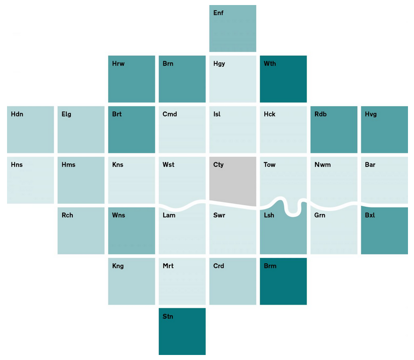
Credit for the piece goes to After the Flood.
Leave a Reply
You must be logged in to post a comment.