Another week, another batch of news and posturing from North Korea. So I was delighted to see last week a post from Politico exploring the history of the North Korean missile programme with data visualisation.
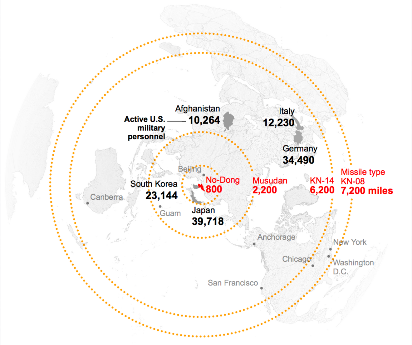
This kind of maps are my favourite for these types of stories. So often people get locked into this idea of a Mercator or Robinson projection and lines moving right/left or east/west on a map. Instead the world is a globe and the missiles or airplanes or birds or whatever will fly in circles over the poles if it’s easier.
Credit for the piece goes to the Politico graphics department.
Leave a Reply
You must be logged in to post a comment.