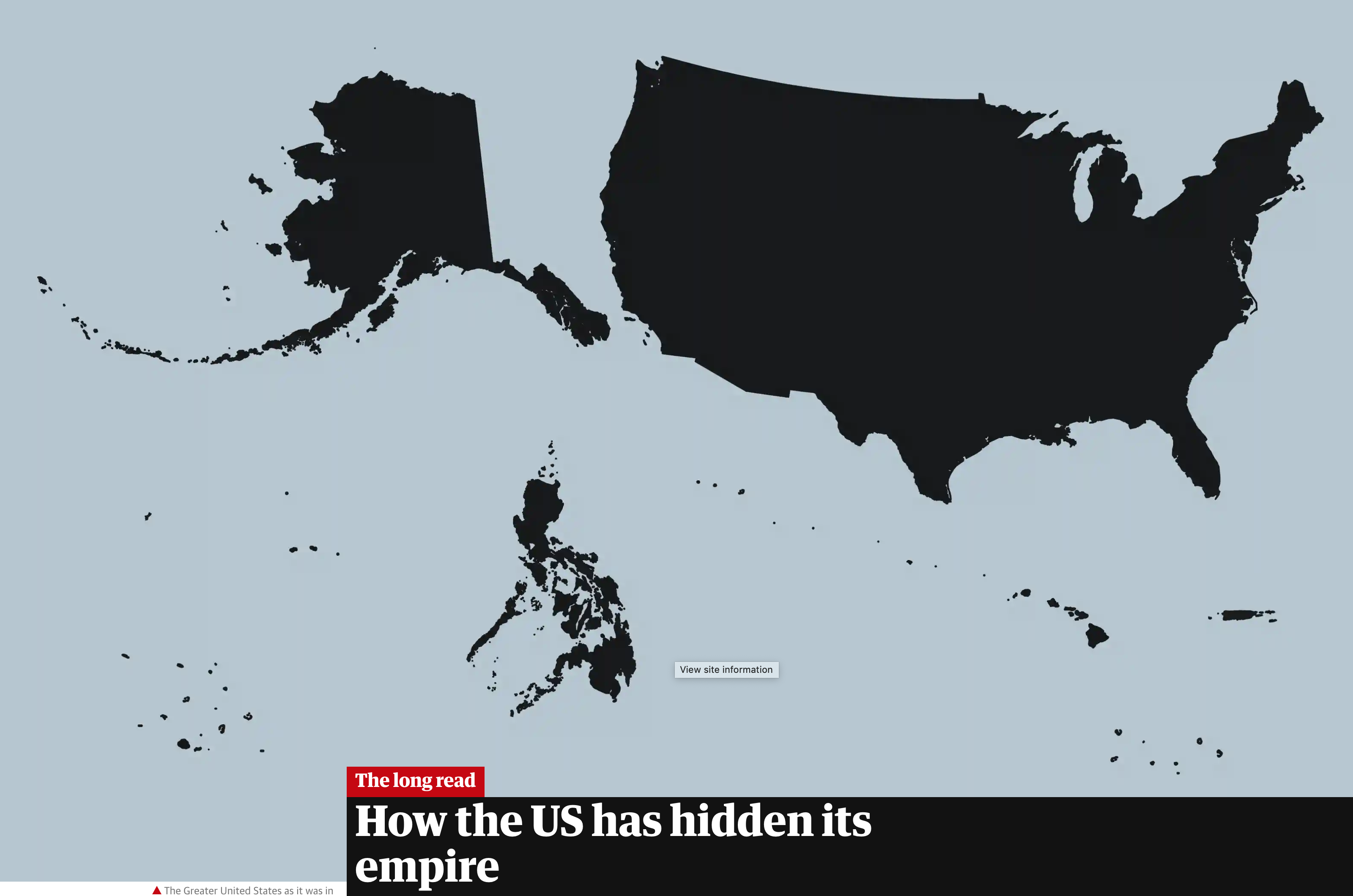
Yesterday I wrote about the failure in a Politico piece to include Alaska and Hawaii in a graphic depicting the “entire” United States. After I had posted it, I recalled an article I read in the Guardian that looked at the shape of the United States, using the term “logo map”. It compared what many would consider the logo map to the actual map of the United States.

I warn you, it is a long read. But it was worth it to try and reframe the idea of what does the United States look like?
Credit for the piece goes to the Guardian graphics department.
Leave a Reply
You must be logged in to post a comment.