The Entire United States Pt 2

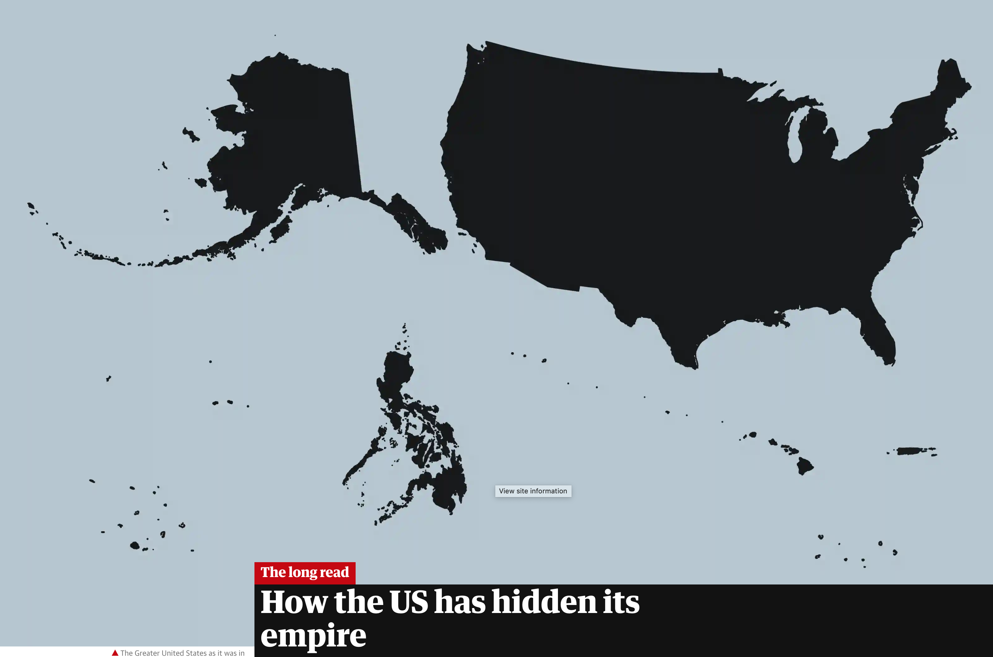
Yesterday I wrote about the failure in a Politico piece to include Alaska and Hawaii in a graphic depicting the “entire” United States. After I had posted it, I recalled an article I read in the Guardian that looked at the shape of the United States, using the term “logo map”. It compared what many would consider the logo map to the actual map of the United States.

Still no New Zealand…

I warn you, it is a long read. But it was worth it to try and reframe the idea of what does the United States look like?

Credit for the piece goes to the Guardian graphics department.

Author: Brendan Barry

I am a graphic designer who focuses on information design. My day job? Well, they asked me not to say. But to be clear, this blog is my something I do on my own time and does not represent the views of…my employers. I think what I can say is that given my interest in information design—be it in the shape of clear charts, maps, diagrams, or wayfinding systems—I am fortunate that my day job focuses on data visualisation. Outside of work, I try to stay busy with personal design work. Away from the world of design, I have become an amateur genealogist and family historian. You will sometimes see that area of work bleed into my posts.

Leave a Reply