Last month Politico published an article called the Democrats’ Dilemma. It looked at what will likely be the crux of their debate for their 2020 candidates. Go moderate or hard left? The super simple version of the argument is that do you win by persuading independents and moderate Republicans to vote Democratic? Or do you win by ginning up the fervour of your liberal base and drive out the vote?
The article contrasts those approaches by looking at two neighbouring congressional districts. The first was won by Ilhan Omar, a Somali-American woman who has been at the centre of several causes célèbres in recent months. The second was won by a moderate, wealthy white man who has not really attracted any attention whatsoever.
But I don’t want to talk about the merits of either representative nor the fascinating split the article discusses. Instead, I want to look at a little piece of the graphics used in the article. It uses some simple stacked bar charts to compare and contrast the demographics of the representatives’ districts. Notably, they are different. But it goes on to compare and contrast them to the overall United States.
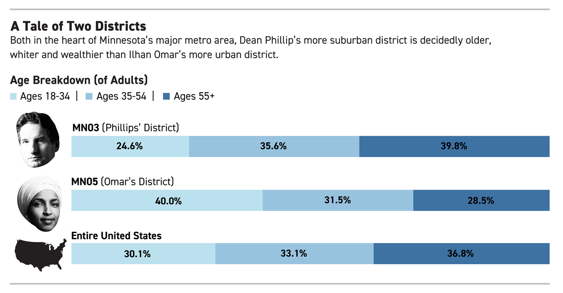
The first thing, I probably would have angled Mr. Phillips’ head so his head is straight, but that is a minor detail. The other thing I immediately noticed is a big pet peeve of mine. For the “Entire United States”, we have a map of the United States. Or do we?
What is missing? The entire states of Alaska and Hawaii, that’s what. I can understand not including Puerto Rico or other insular territories like the U.S. Virgin Islands because they are either not states or so small they would not appear visible at such a scale. However, Alaska and Hawaii are both integral parts of the United States. They are not marginal, like former Attorney General Jeff Sessions’ infamous quip about Hawaii being “some island in the Pacific”.
Perhaps at the above scale, Hawaii would be too small to appear—though I doubt it. But what about Alaska? It is the largest state. And Texas isn’t even a close second. So why is Alaska not included? Unfortunately—though fortunately for Politico, whose work I generally like—this is not a problem specific to Politico.
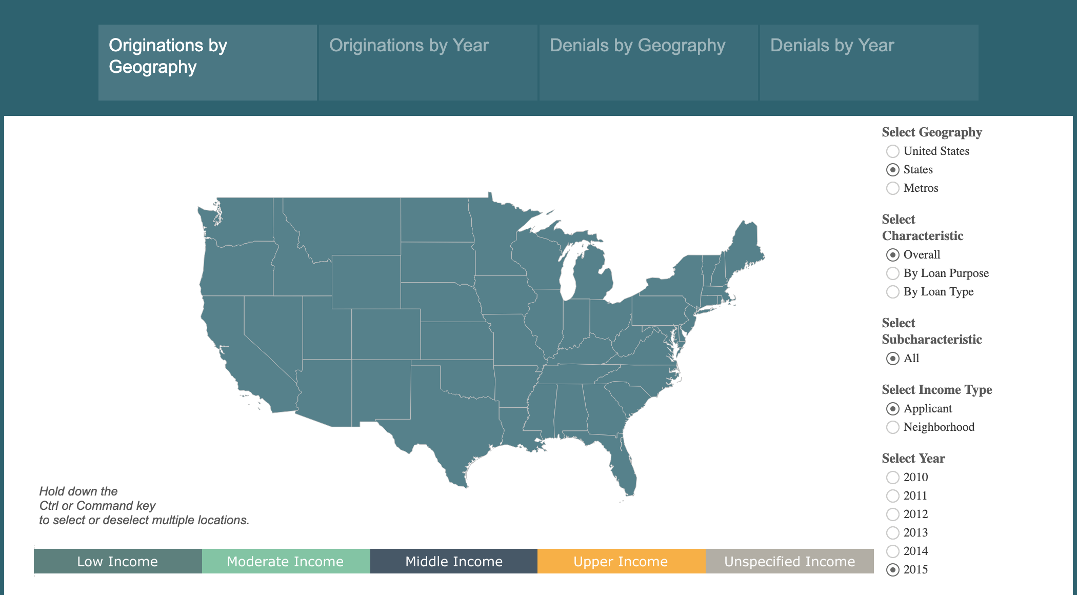
Even my own employer, the Federal Reserve Bank of Philadelphia, gets it wrong. One of their interactive data visualisation pieces, which for the record my team had nothing to do with, also completely omits Alaska and Hawaii in their map of the United States. And it’s a far larger map with ample space.
Including Alaska and Hawaii should not be afterthoughts. They are not second-class states. They are full constituent parts of the union. And if it is not easy to include them because they are not contiguous nor sharing the same continent, that should not obviate designers from including them in the United States.
Credit for the piece goes to the Politico’s design department and the Philadelphia Fed’s design department.
Leave a Reply
You must be logged in to post a comment.