Category: Datagraphic
-
Dots Beat Bars
Today is just a quick little follow-up to my post from Monday. There I talked about how a Boston Globe piece using three-dimensional columns to show snowfall amounts in last weekend’s blizzard failed to clearly communicate the data. Then I showed a map from the National Weather Service (NWS) that showed the snowfall ranges over…
-
How Accurate Is Punxsutawney Phil?
For those unfamiliar with Groundhog Day—the event, not the film, because as it happens your author has never seen the film—since 1887 in the town of Punxsutawney, Pennsylvania (60 miles east-northeast of Pittsburgh) a groundhog named Phil has risen from his slumber, climbed out of his burrow, and went to see if he could see…
-
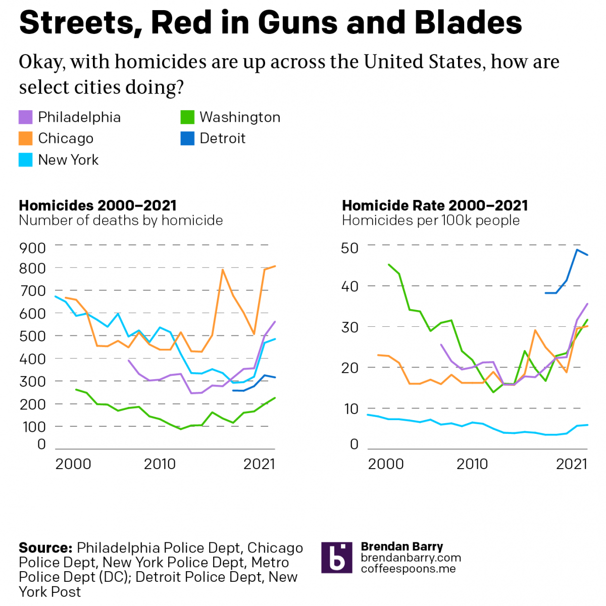
America’s Crime Problem
During the pandemic, media reports of the rise of crime have inundated American households. Violent crimes, we are told, are at record highs. One wonders if society is on the verge of collapse. But last night a few friends asked me to take a look at the data during the pandemic (2020–2021) and see what…
-
Obfuscating Bars
On Friday, I mentioned in brief that the East Coast was preparing for a storm. One of the cities the storm impacted was Boston and naturally the Boston Globe covered the story. One aspect the paper covered? The snowfall amounts. They did so like this: This graphic fails to communicate the breadth and literal depth…
-
I Call Them Life Tiles
Happy Friday, everyone. Here in the United States’ Northeast Corridor we’re looking forward to a potentially powerful nor’easter that could be the first real snowstorm to hit Philadelphia all winter. (Dumb La Niña.) But I’ve also recently started working in a new sketchbook. (It happens often.) But that’s why I thought this graphic from Indexed…
-
How the Globe’s Writers Voted
Yesterday we looked at a piece by the Boston Globe that mapped out all of David Ortiz’s home runs. We did that because he has just been voted into baseball’s Hall of Fame. But to be voted in means there must be votes and a few weeks after the deadline, the Globe posted an article…
-
558 Dingers
Yesterday baseball writers elected David Ortiz of the Boston Red Sox, better known as Big Papi, to the Baseball Hall of Fame. I was trying to work on a thing for yesterday, but ran out of time. While I will attempt to return to that later, for now I want to share a simple interactive…
-
Finding Home with a Homemade Map
We’re going to start this week out with some good news and for that we turn to China. 30 years ago, child traffickers kidnapped four-year old Li Jingwei from his family and sold him to another family over 1,000 miles away. A BBC article from earlier this month covered Li Jingwei’s reunion with his family.…
-
Tea. Earl Grey. Hot.
Any science fiction fan—and likely many who are not—can identify the character who utters those words in that order: Jean-Luc Picard, Star Trek’s captain of the USS Enterprise, NCC-1701-D. Ask your Amazon Alexa for it. Or your Google Home. Thanks to the work of xkcd, we now know that Jean-Luc—may I call him Jean-Luc?—had a…
-
Even Older Family Trees
Yesterday we looked at a graphic about an old family tree, revealed by ancient DNA. But at the end of the day it is a family tree of descent for a human male. But mankind itself fits within a kind of family tree, the circle family tree of life. The tree of life continues to…