Unfortunately, I don’t subscribe to Business Insider, but I saw this graphic on the Twitter and felt the need to share it. Primarily because baseball will almost certainly stop at midnight when the owners of the teams will impose a lockout (as opposed to players going on strike). And with that baseball will be on hold until the two parties resolve their current labour issues.
And at present that seems like it could take quite some time.
So on the eve of the lockout Bradford William Davis tweeted a link to an article he wrote, alas no subscription as aforementioned, but he did share one of the graphics therein.
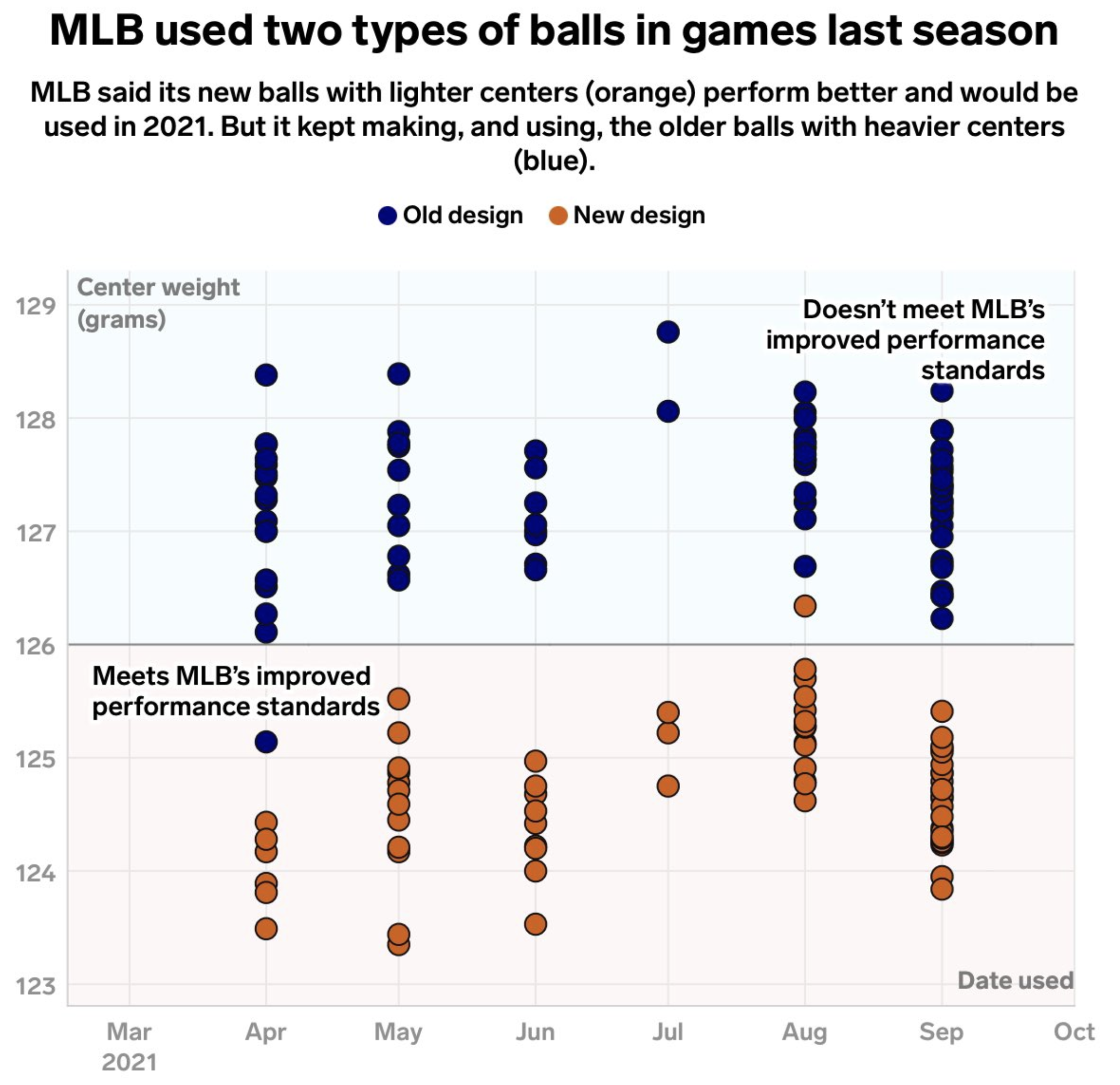
We have a basic dot plot charting the weight of the centre of baseballs, sorted by the month of game from which they were pulled.
The designer made a few interesting choices here. First, typographically, we have a few decisions around the type. I would have loved to have seen a bit of editing or design to eliminate the widow at the end of the graphic’s subtitle, that bit that just says “(blue)”. Do the descriptors in parentheses even need to be there when the designer included a legend immediately below? I find that one word incredibly distracting.
On the other hand, the designer chose to use a thin white outline around the text on the plot. Normally I’d really like this choice, because it can reduce some of the issues around legibility when lines intersect text, especially when they are the same colour. Here, however, the backgrounds are not white. I would have tried, for the top, using that light blue instead of white as the stroke for the outside of the letters. And on the bottom I would have tried the light pink. That would probably achieve the presumed desired effect of reducing the visual interference unintentionally created by the white. I also would have moved the top label up so it didn’t sit overlay the top dot.
As far as the dot plot itself goes, that works fine. I wonder if some transparency in the dots would have emphasised how many dots sit atop each other. Or maybe they could have clustered, but when overlapping moved horizontally off the vertical axis.
Overall this was a really nice graphic with which to end this half of the baseball off season. Hopefully the lockout doesn’t last too long.
Credit for the piece goes to Taylor Tyson.
Leave a Reply
You must be logged in to post a comment.