Winter is coming? Winter is here. At least meteorologically speaking, because winter in that definition lasts from December through February. But winters in Philadelphia can be a bit scattershot in terms of their weather. Yesterday the temperature hit 19ºC before a cold front passed through and knocked the overnight low down to 2ºC. A warm autumn or spring day to just above freezing in the span of a few hours.
But when we look more broadly, we can see that winters range just that much as well. And look the Philadelphia Inquirer did. Their article this morning looked at historical temperatures and snowfall and whilst I won’t share all the graphics, it used a number of dot plots to highlight the temperature ranges both in winter and yearly.
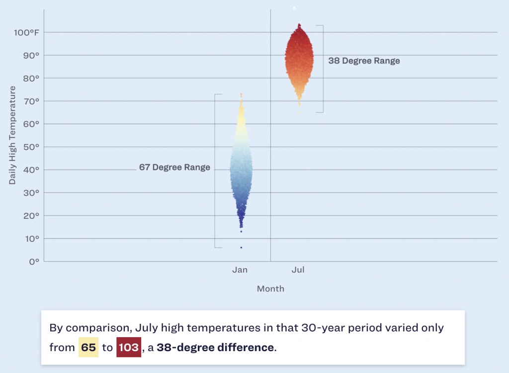
The screenshot above focuses attention on the range in January and July and you can see how the range between the minimum and maximum is greater in the winter than in the summer. Philadelphia may have days with summer temperatures in the winter, but we don’t have winter temperatures in summer. And I say that’s unfair. But c’est la vie.
Design wise there are a couple of things going on here that we should mention. The most obvious is the blue background. I don’t love it. Presently the blue dots that represent colder temperatures begin to recede into and blend into the background, especially around that 50ºF mark. If the background were white or even a light grey, we would be able to clearly see the full range of the temperatures without the optical illusion of a separation that occurs in those January temperature observations.
Less visible here is the snowfall. If you look just above the red dots representing the range of July temperatures, you can see a little white dot near the top of the screenshot. The article has a snowfall effect with little white dots “falling” down the page. I understand how the snowfall fits with the story about winter in Philadelphia. Whilst the snowfall is light enough to not be too distracting, I personally feel it’s a bit too cute for a piece that is data-driven.
The snowfall is also an odd choice because, as the article points out, Philadelphia winters do feature snowfall, but that on days when precipitation falls, snow accounts for less than 1/3 of those days with rain and wintry mixes accounting for the vast majority.
Overall, I really like the piece as it dives into the meteorological data and tries to accurately paint a portrait of winters in Philadelphia.
And of course the article points out that the trend is pointing to even warmer winters due to climate change.
Credit for the piece goes to Aseem Shukla and Sam Morris.
Leave a Reply
You must be logged in to post a comment.