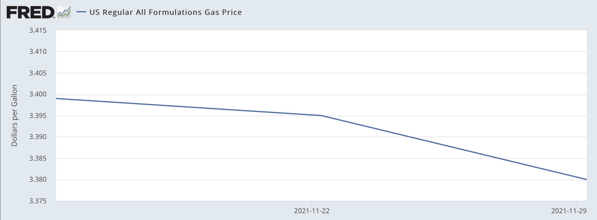
Saw this graphic on the Twitter the other day from the Democratic Congressional Campaign Committee (DCCC), or the D Triple C or D Trip C. The context was that earlier in the day Matt Yglesias posted a clearly tongue-in-cheek chart about how after signing the infrastructure bill, President Biden had single-handedly fixed inflation and gas prices were heading down.
Of course, anyone with a brain knows this isn’t true. The President of the United States cannot control the price of petrol. Because, you know, market economy. The underlying problem of high demand and low supply was, of course, not solved by the infrastructure bill. But lots of people complain on the telly or the internets about Biden not doing more about inflation, but, you know, not really within the wheelhouse.
Anyway, this chart in particular does not bother me. Because Yglesias knows—and most of his audience knows—it is not meant to be taken seriously. It is really just a joke.
But emphasis most of his audience.
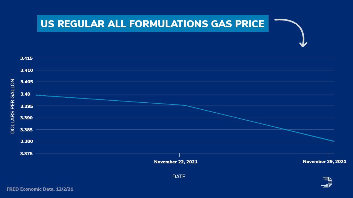
Because the DCCC later posted this graphic with the accompanying text “Thanks, Joe Biden”.
Oh boy.
Clearly they didn’t get the memo about the original being a joke.
The entire scale of the chart is 4¢. I cannot even recall the last time I had to use the glyph ¢ we’re talking so small a scale. The change in the the three week period amounts to a decline of 2¢.
And now you get the joke of the post. Ask me my 2¢ about the chart…
Now look closely at that y-axis. You’ll also note that we are carrying it all the way out to the third decimal point. Now, it’s true that some petrol stations will have a wee little nine trailing just after the two digits to the right of the decimal. Sometimes you might see a 9/10. As was explained to me in school that’s because people will buy something if it looks even a fraction of a cent cheaper. Thing 99¢—getting the use out of this glyph today—versus $1. Makes all the difference. So back when petrol was cheap (inflation stories come round and round), 0.899 looked better than 0.90. But now that it’s routinely well over a few dollars, that 9/10 is a laughable percentage of the total price.
So, yes, we do present petrol prices to three decimals in the environmental design space. But think to yourself, when have you ever aloud repeated a price to the third decimal point? You probably haven’t. And so this chart probably shouldn’t be using that granular a level of specificity.
The other underlying problem, jokes aside, is that the chart spends all that horizontal space looking at three data points. Three. If the data were showing the daily price, not the weekly average, we’d have 21 days worth of data, and that—scale notwithstanding—would be worthy of charting. My basic rule is that if it’s five or six data points, you can use a table unless there is a contextual or design reason for doing so. Say, for example, you’re doing a series of small multiples for a time series of objects in a category. For all but a few categories you have dozens of data points, but just a few have really spotty observations. In those cases, plot the three or four numbers. But in this case, just don’t.
Instead this kind of graphic is best presented as a factette, a big old number, preferably in a narrow or condensed width. Because a 2¢ decline over a three-week period is also not terribly newsworthy. (Unless your story is how prices haven’t changed much over the last three weeks.)
This also points to how the original chart misses the context of time. Granted, a lot can happen in three weeks, but a 2¢ shift is not massive. Give those three weeks their proper place in time, however, and you can see just how little movement that truly is. Cue my own quickly whipped up charts.
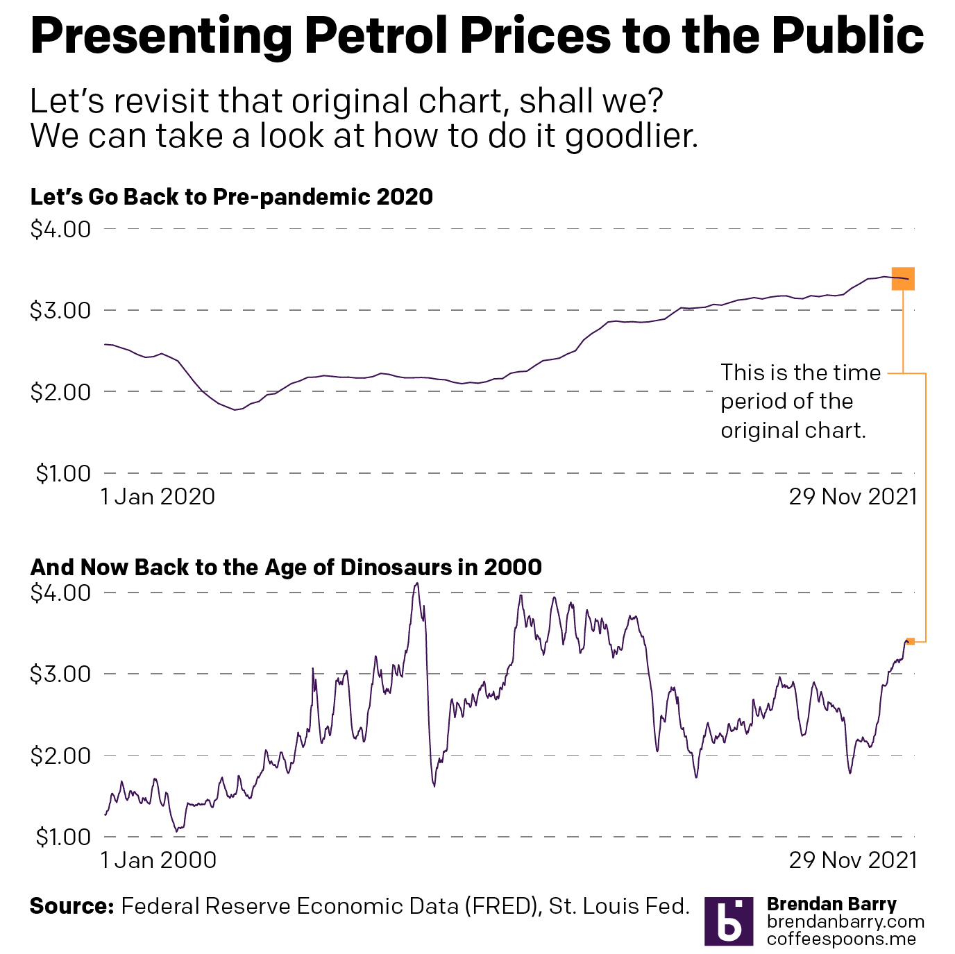
In the first chart you can begin to see how the change, during the course of the last nearly two years, is not significant. And in the second you can see that things really are not that bad compared to where they were back during the lead up to the Great Recession and then in the recovery that followed. (Aww, look at back in the early oughts when prices averaged just over a $1/gallon. I can still remember filling up my minivan for prices like 99¢.)
If the designer wants to make a point that perhaps we’re reaching the peak prices during this time period, sure. Because a two-week decline in prices could well be the beginning of that. But, to show that you also need to show the context of the time before that.
But once again, the President of the United States cannot much affect the price of petrol short of releasing the strategic reserve, which as its name implies, is meant for strategic purposes in case of national emergency. And high consumer prices are not a strategic national emergency on the scale of, say, a crippling storm impacting the refineries in the Gulf or an earthquake destroying pipelines in Alaska or an invasion or stifling blockade of overseas imports.
At the end of the day, this was just a terrible, terrible chart. And I think it speaks to a degree of chart illiteracy that I see creeping up in society at large. Not that it wasn’t there in the past—get off my lawn, kids—but seems more ever present these days. I don’t know if that’s because of the amplification effect of things like the Twitter or just a decline in education and critical thinking. But those are topics for another day.
This chart fails on so many levels. The concept is bad, i.e. neither Biden nor Trump nor their predecessors nor their successors—unless we adopt a planned economy, am I right, comrades?—can directly affect petrol prices. Prices are governed by larger market forces that boil down to supply and demand.
But also, the sheer design is bad. Don’t use a chart of three data points. Don’t stretch out the x-axis. Don’t use decimal points to a point where they’re unrecognisable.
In the meantime, charts like this? Don’t do them, kids.
Credit for the first original goes to FRED, whose chart Matt Yglesias used.
Credit for the second goes to the DCCC graphics department.
Oh, and because I used Federal Reserve data for the charts, and because I work there, I should add the views and opinions are my own and don’t represent those of my employer.
Leave a Reply
You must be logged in to post a comment.