We’re back after a nice holiday break. And one of the most fascinating things to happen was the successful—and seemingly easy, more on that in a bit—launch of the James Webb space telescope. The James Webb was developed by NASA with contributions from both the European Space Agency (ESA) and the Canadian Space Agency (CSA). Whilst it did launch behind schedule and at a price tag of $10 billion, the James Webb is the most sophisticated and complex space telescope mankind has yet launched into space. It will look backwards into time to some of the earliest stars and galaxies in the universe. It will also look at the thousands of exoplanets we have discovered in the last three decades. The instruments aboard James Webb will be able to help us identify if any of these planets have water and other ingredients necessary for life as we know it. This could be one of the most monumental space missions yet.
But James Webb’s launch was far from guaranteed. As this great article from the BBC explains, the construction, assembly, launch, and deployment were all incredibly complicated. James Webb is expected to operate for ten years before its fuel, needed to keep the telescope cold, runs out. However, the seemingly easy launch and deployment means that it used less fuel than expected. Some early reports suggest that the telescope may have some additional time left in it now before the fuel runs dry.
I encourage you to read the article, because it explains the advantages of the telescope, how it works, and its deployment with several illustrations. There are five in particular, though I’ll share only two screenshots.
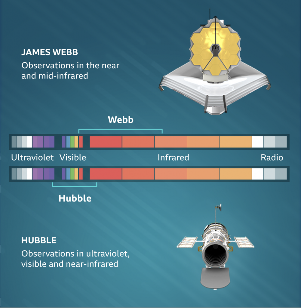
The most important is this, the key distinction between Hubble and James Webb. It shows how the two space telescopes will be operating in different parts of the electromagnetic spectrum.

The graphic fakes the colours, because by definition we can only see the visible portions of the spectrum. Wavelengths get either too short or too long on either side of the visible spectrum—which differs for different species. I would actually really enjoy seeing how these two spectra stack up against other space observatories like Chandra (x-ray) and Spitzer (infrared).
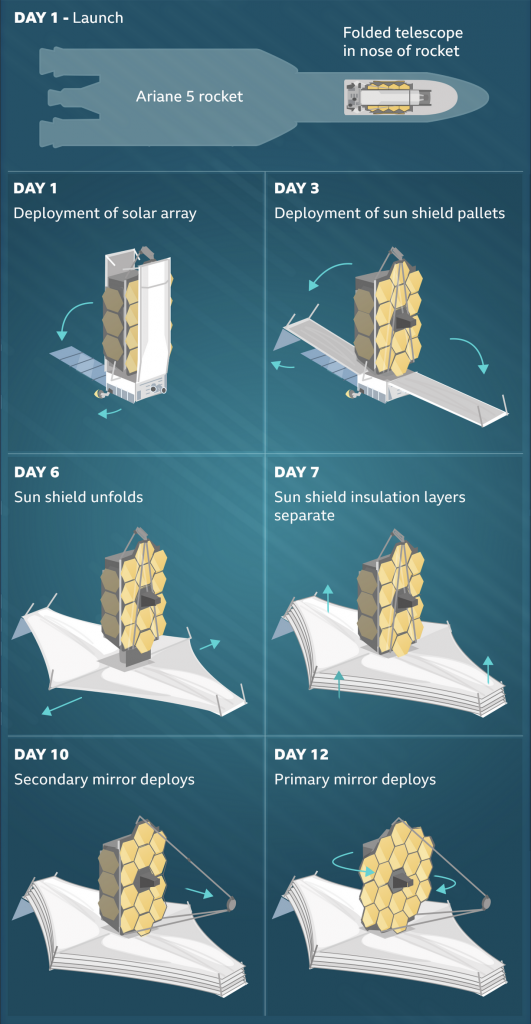
Next we have the deployment, which finished just last week. The graphic summarises how complicated this process was—and how fraught with risk. But in the end it went off without any major hitch.

This uses a nice series of small multiples of illustrations. These simplified drawings show how the tightly packed telescope unfolds and then begins deploying its vital heat shield then its mirror.
The last thing to check out in the article is a slider showing the “before” and “after”. You have seen them before for things like flood or hurricane damages. Here, however, you can compare a photo in Hubble’s visible light to an existing infrared version of the same photo.
Of course, just because the telescope finished deploying its mirror last week doesn’t mean we get photos this week. The Baltimore-based team running the observatory will spend the next few months tuning everything up. But the goal is hopefully to have the first images from James Webb sometime in June.
And then we have the next ten years to hopefully start collecting data.
Credit for the piece goes to the BBC graphics team.
Leave a Reply
You must be logged in to post a comment.