Tag: interactive design
-
Go Fly a Kite
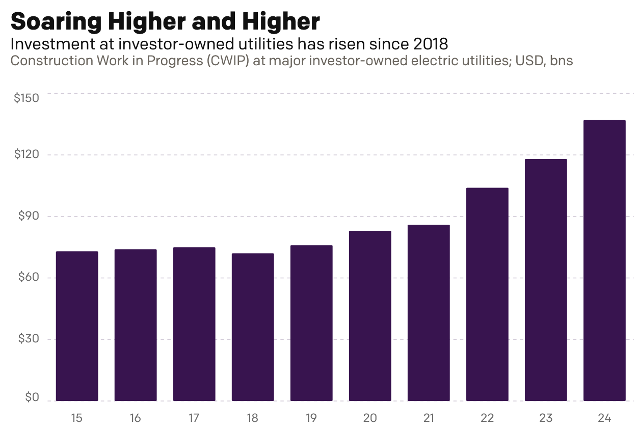
This past weekend I read an article over on Reuters about the cost of electricity for Americans, especially as it pertains to unfinished electrical generation projects. To be fair, I did not read it thinking I would be getting an opportunity to talk about something here on Coffeespoons. Rather, I just received a letter from…
-
AC to Philly Expressway?
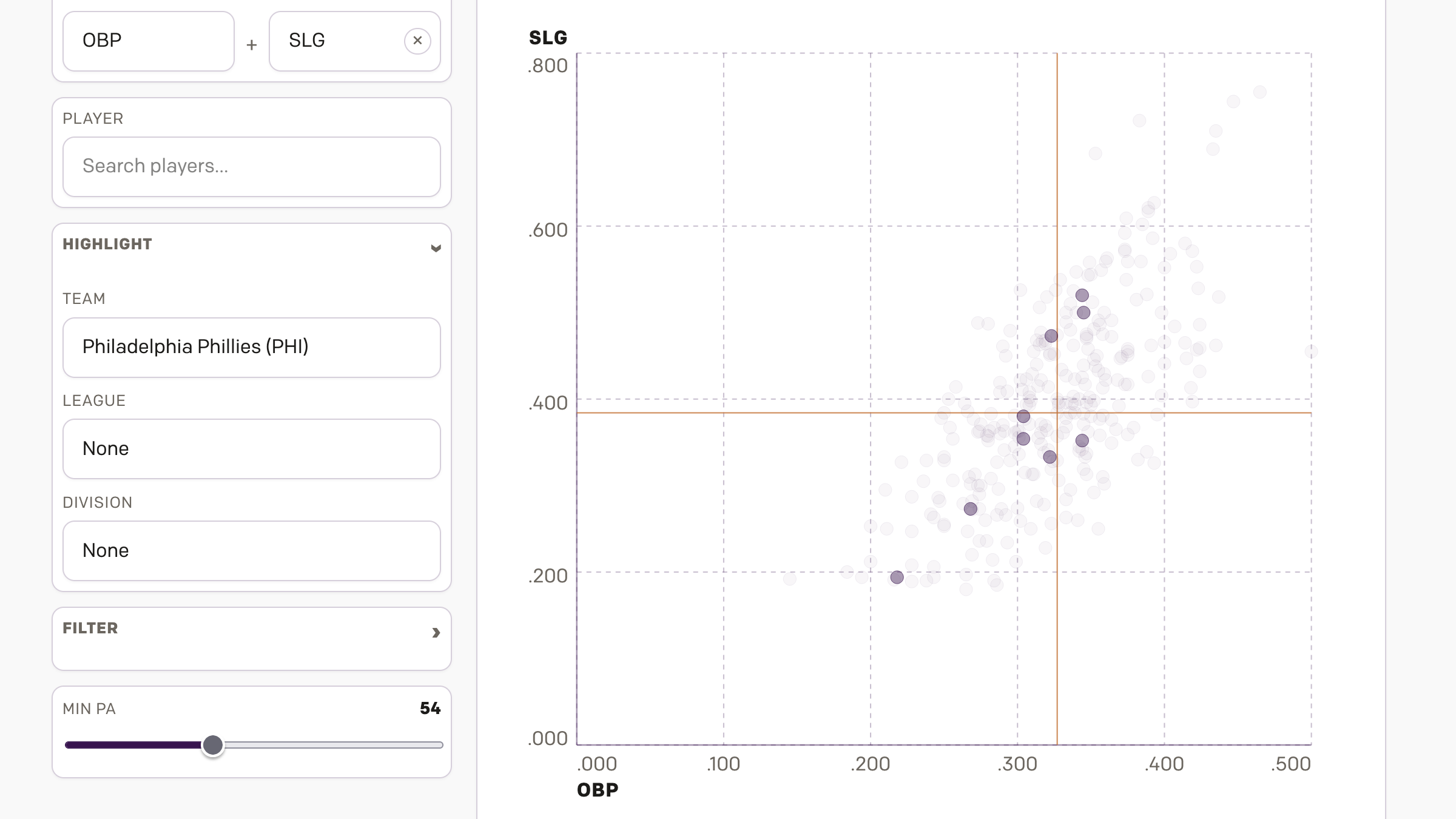
And I am not talking about Atlantic City. No, on Saturday, the Red Sox fired their manager Alex Cora and his entire staff. Or, rather, the staff loyal to him. I wrote about that on Monday. Little did we know that Saturday night, Alex Cora and the chief of baseball operations for the Philadelphia Phillies,…
-
Born in the U.S.A.
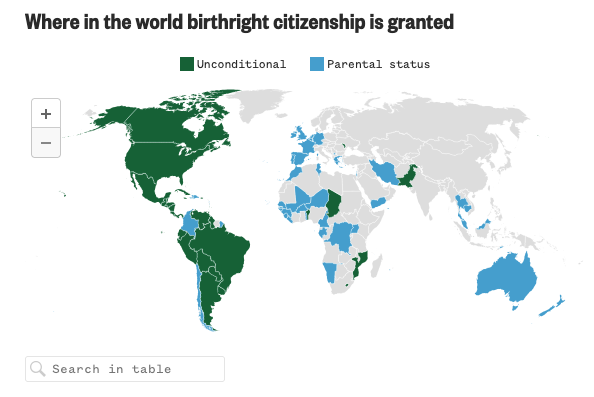
Last Wednesday, when I was more focused on the Artemis II launch, the Supreme Court held oral arguments about the administration’s attempt to end birthright citizenship and overturn the 14th Amendment to the United States’ constitution. Kind of a big deal. NBC News ran a live blog covering the arguments and included an interactive map…
-
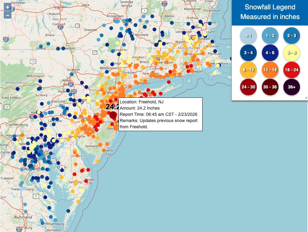
Winter Is Still Here
Ah, a blizzard. Even if the worst of the storm that recently impacted Philadelphia struck mostly at night, it still left a picturesque mess for the morning. I, however, was struck by some of the maps of the snowfall totals and I figured that would be worth sharing today. What got me started on this…
-
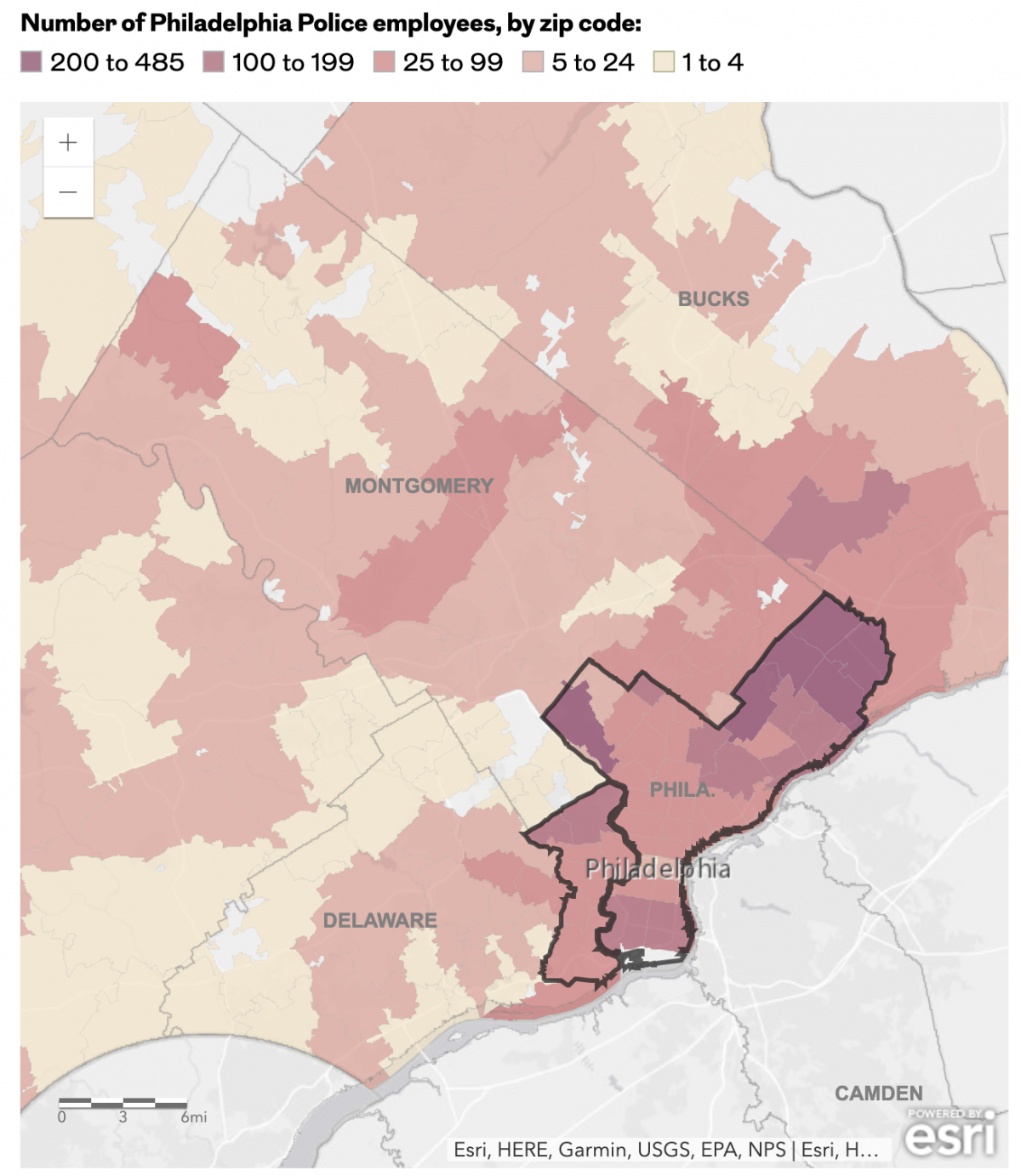
The Philadelphia Beat is Pretty Big
Early last week I read an article in the Philadelphia Inquirer about where the city’s police officers live, an important issue given the city’s loose requirement they reside within the city limits. Whilst most do, especially in the far Northeast, the Northwest, and South Philadelphia, a significant number live outside the city. (The city of…
-
Pour One Out—For Your Liver
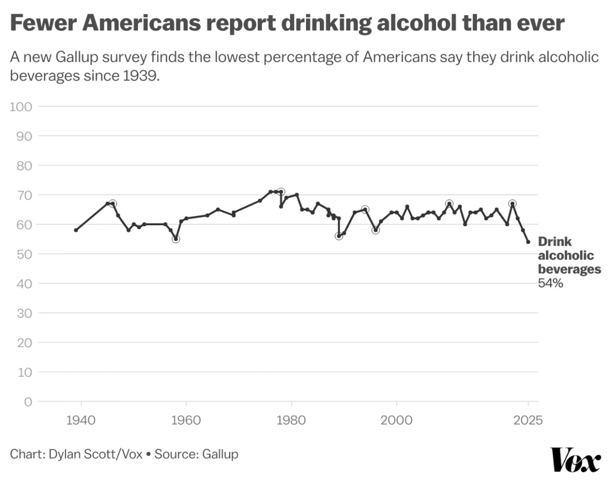
Last month Vox published an article about the trend in America wherein people are drinking less alcohol. They cited a Gallup poll conducted since 1939 and which reported only 54% of Americans reported partaking in America’s national tipple—except for that brief dalliance with Prohibition—making this the least-drinking society since, well, at least 1939. Vox charted…
-
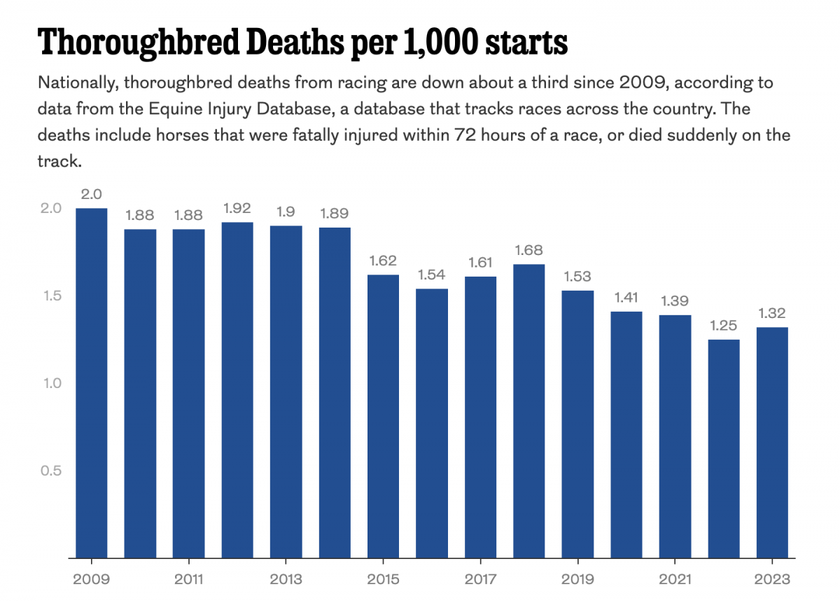
Racing to the Final Finish Line
Thoroughbred racing is big business. And Philadelphia’s Parx Casino owns a racing track that, in a recent article in the Philadelphia Inquirer, has seen a number of horse deaths. The article includes a single graphic worth noting, a bar chart showing the thoroughbred death rate. The graphic contrasts rising deaths at Parx with a national…
-
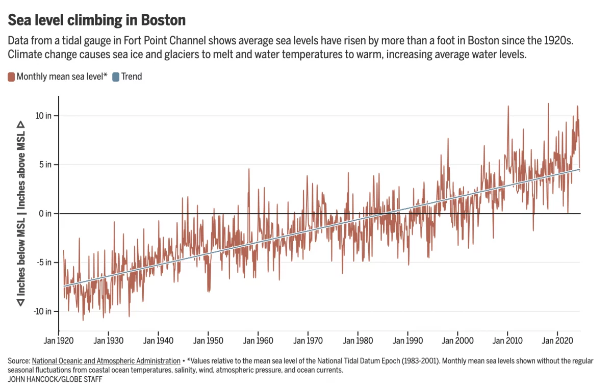
Fear the Floodwaters
This past weekend saw some flooding along the East Coast due to the Moon pulling on Earth’s water. In Boston that meant downtown flooding, including Long Wharf. The Boston Globe’s article about the flooding dwelt with more impact, causes, and long-term forecasts—none of which really warranted data visualisation or information graphics. Nonetheless, the article included…
-
Just Keep Grinding it Out
There are certain journalism outlets that I read that consistently do a good job with information design or at least are known for it. Now I try to keep my media diet fairly large and ideologically broad, but in that there are also still some outlets that feature quality design than others. The New York…
-
Europe By Rail
Many of us have pent up travel demand. Covid-19 remains with us, lingering in the background, but it’s largely from our front-of-mind. For those of my readers in Europe, or just curious how superior European rail infrastructure is over American, this piece from Benjamin Td provides some useful information. It uses isochrones to map out…