On Friday, I mentioned in brief that the East Coast was preparing for a storm. One of the cities the storm impacted was Boston and naturally the Boston Globe covered the story. One aspect the paper covered? The snowfall amounts. They did so like this:

This graphic fails to communicate the breadth and literal depth of the snow. We have two big reasons for that and they are both tied to perspective.
First we have a simple one: bars hiding other bars. I live in Greater Centre City, Philadelphia. That means lots of tall buildings. But if I look out my window, the tall buildings nearer me block my view of the buildings behind. That same approach holds true in this graphic. The tall red columns in southeastern Massachusetts block those of eastern and northeastern parts of the state and parts of New Hampshire as well. Even if we can still see the tops of the columns, we cannot see the bases and thus any real meaningful comparison is lost.
Second: distance. Pretty simple here as well, later today go outside. Look at things on your horizon. Note that those things, while perhaps tall such as a tree or a skyscraper, look relatively small compared to those things immediately around you. Same applies here. Bars of the same data, when at opposite ends of the map, will appear sized differently. Below I took the above screenshot and highlighted two observations that differed in only 0.5 inches of snow. But the box I had to draw—a rough proxy for the columns’ actual heights—is 44% larger.
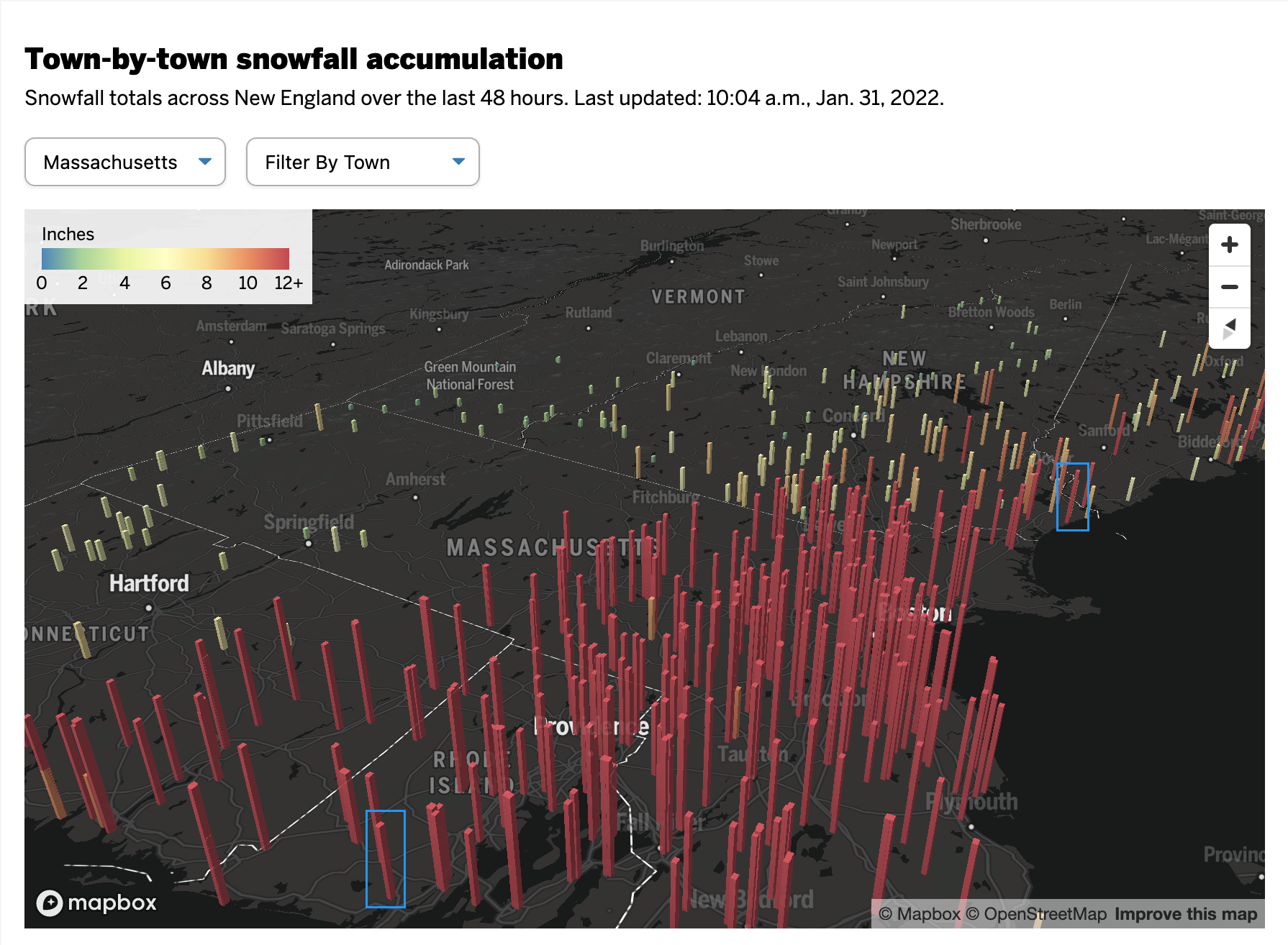
This map probably looks cool to some people with its three-dimensional perspective and bright colours on a dark grey map. But it fails where it matters most: clearly presenting the regional differences in accumulation of snowfall amounts.
Compare the above to this graphic from the Boston office of the National Weather Service (NWS).
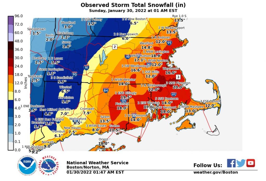
No, it does not have the same cool factor. And some of the labelling design could use a bit of work. But the use of a flat, two-dimensional map allows us to more clearly compare the ranges of snowfall and get a truer sense of the geographic patterns in this weekend’s storm. And in doing so, we can see some of the subtleties, for example the red pockets of greater snowfall amounts amid the wider orange band.
Credit for the Globe piece goes to John Hancock.
Credit for the NWS piece goes to the graphics department of NWS Boston.
Leave a Reply
You must be logged in to post a comment.