
Tag: interactive design
-
Racing to the Final Finish Line
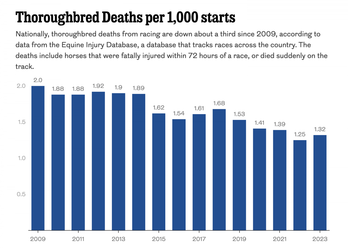
Thoroughbred racing is big business. And Philadelphia’s Parx Casino owns a racing track that, in a recent article in the Philadelphia Inquirer, has seen a number of horse deaths. The article includes a single graphic worth noting, a bar chart showing the thoroughbred death rate. The graphic contrasts rising deaths at Parx with a national…
-
Fear the Floodwaters
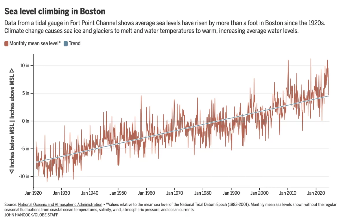
This past weekend saw some flooding along the East Coast due to the Moon pulling on Earth’s water. In Boston that meant downtown flooding, including Long Wharf. The Boston Globe’s article about the flooding dwelt with more impact, causes, and long-term forecasts—none of which really warranted data visualisation or information graphics. Nonetheless, the article included…
-
Just Keep Grinding it Out
There are certain journalism outlets that I read that consistently do a good job with information design or at least are known for it. Now I try to keep my media diet fairly large and ideologically broad, but in that there are also still some outlets that feature quality design than others. The New York…
-
Europe By Rail
Many of us have pent up travel demand. Covid-19 remains with us, lingering in the background, but it’s largely from our front-of-mind. For those of my readers in Europe, or just curious how superior European rail infrastructure is over American, this piece from Benjamin Td provides some useful information. It uses isochrones to map out…
-
There Goes the Shore
The National Oceanic and Atmospheric Administration (NOAA) released its 2022 report, Sea Level Rise Technical Report, that details projected changes to sea level over the next 30 years. Spoiler alert: it’s not good news for the coasts. In essence the sea level rise we’ve seen over the past 100 years, about a foot on average,…
-
Obfuscating Bars
On Friday, I mentioned in brief that the East Coast was preparing for a storm. One of the cities the storm impacted was Boston and naturally the Boston Globe covered the story. One aspect the paper covered? The snowfall amounts. They did so like this: This graphic fails to communicate the breadth and literal depth…
-
How the Globe’s Writers Voted
Yesterday we looked at a piece by the Boston Globe that mapped out all of David Ortiz’s home runs. We did that because he has just been voted into baseball’s Hall of Fame. But to be voted in means there must be votes and a few weeks after the deadline, the Globe posted an article…