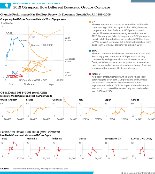
The Olympics are now fully underway and we can begin to see some patterns about who is doing well and who is, well, not. This infographic has a lot more to say about who had been doing well up through 2008. That is important because that was the last year before the fiscal/financial crisis brought about the first global recession since World War II. Stay tuned for the post-Olympic piece where I look at medal performance in 2012 compared to GDP per capita. Some interesting stories appear to be happening.
One can clearly see that GDP per capita is (generally speaking) a good variable for estimating Olympic success. So the countries in this graphic are three major economic regions. The G7, BRIC, and the Future-7. The G7 are the world’s richest/most productive countries. BRIC are supposed to become the next G7. And the Future-7 is a Euromonitor International grouping that looks at a group of countries that are expected to become the next BRIC-like group of countries.

It is probably worth noting that despite this being an infographic for work, where I generally am not allowed to write analysis, the written analysis is mostly mine with some key ideas brought to my attention by co-workers.
Leave a Reply
You must be logged in to post a comment.