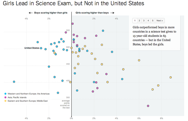
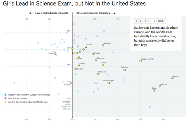
This piece from the New York Times is really well done. With simple colours to differentiate three groups, values are charted on a scatter plot to show the distribution of results for an OECD science test in 65 countries. The results clearly show regional differences in the performance of girls in the sciences depending upon the region.

But to make the story clearer for those who may not take the time to really delve into the data, five simple buttons on the upper right take the user through the story by annotating the different highlighted views shown in each step.

Credit for the piece goes to Hannah Fairfield and Alan McLean.
Leave a Reply
You must be logged in to post a comment.