This article on Yahoo by the AFP has an interesting graphic on the problem facing Australia of illegal arrivals via boat that, in part, probably cost Kevin Rudd and the Labor Party of Australia the recent election.
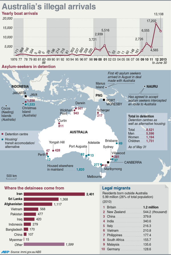
I like the overall graphic, but I feel that the data labels are unnecessary on the line chart and the bar chart. They distract from the overall shape of the data and are anyways hinted at by the axes labels within the charts themselves. Also, I am a bit unclear as to the meaning of the grey bars in the line chart.
Credit for the piece goes to John Saeki.
Leave a Reply
You must be logged in to post a comment.