Last week Twitter went a wee bit crazy when Donald Trump’s son posted an image about how the Republican nominee had gained ground. Except that it turns out the image was from FiveThirtyEight and looked only at a demographic split by gender—it was what the map would look if only men voted. Suffice it to say, yeah, the Twitterverse went a wee bit crazy. Thankfully the BBC put together this really great recap with some of the best of it.
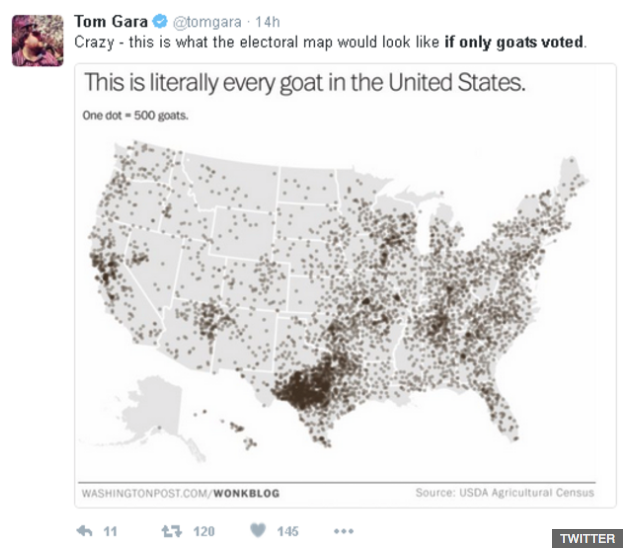
Happy Friday, all.
Credit for the pieces goes to the various original authors and designers.
Author: Brendan Barry
I am a graphic designer who focuses on information design. My day job? Well, they asked me not to say. But to be clear, this blog is my something I do on my own time and does not represent the views of…my employers. I think what I can say is that given my interest in information design—be it in the shape of clear charts, maps, diagrams, or wayfinding systems—I am fortunate that my day job focuses on data visualisation. Outside of work, I try to stay busy with personal design work. Away from the world of design, I have become an amateur genealogist and family historian. You will sometimes see that area of work bleed into my posts.
View all posts by Brendan Barry