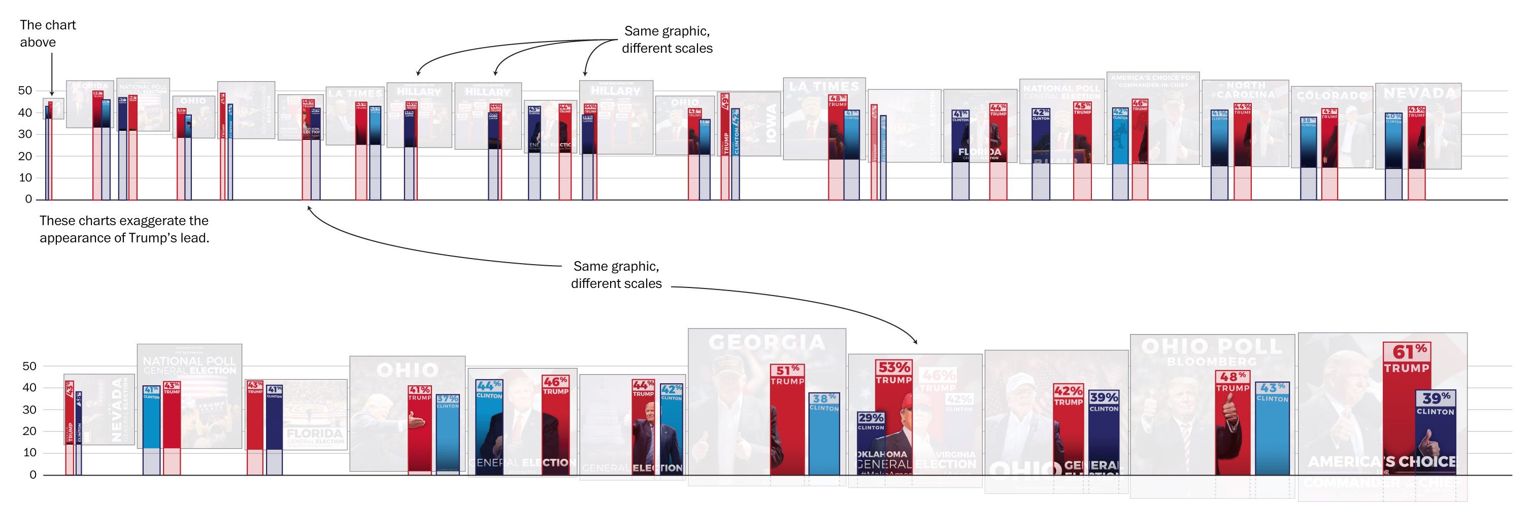
Last week the Washington Post published a fascinating article on the data visualisation work of the Donald Trump media campaign. In my last job I frequently harped on the importance of displaying the baseline and/or setting the baseline to zero. When you fail to do so you distort the data. But maybe that is the point of this, for lack of a better term, political data visualisation.
My favourite author is George Orwell of 1984 and Animal Farm fame. But Orwell also penned numerous essays, one of which has struck me as particularly relevant in this election cycle: Politics and the English Language. In concluding the essay Orwell wrote:
Political language…is designed to make lies sound truthful and murder respectable, and to give an appearance of solidity to pure wind.
And so political data visualisation? Well I believe it exists to serve the same purpose. The article goes into detail about how the designers behind the graphics fudged the numbers. Now did the campaign intend to mislead people with the data visualisation graphics? It is hard to say, because some of their graphics actually diminish leads that Trump has among certain demographics. Could it be the designer behind the graphics simply does not understand what he or she is doing? Perhaps. We clearly cannot know for certain.
Either way, it points to a need for more understanding of the importance and value of data visualisation in the political discourse. And then the natural follow-up of how to best design and create said visualisations to best inform the public.
But I highly recommend going to the Post and reading the entirety of the article.
Credit for the original work goes to the Trump campaign graphics department, the criticism to John Muyskens of the Washington Post.
Leave a Reply
You must be logged in to post a comment.