Now for the actual piece for today.
We have a scatterplot from the Financial Times that looks at wage and economic growth across the OECD, focusing on the exception that is the United Kingdom. And that is not an exception in the good sense.
The UK had the rare privilege of experiencing economic growth—that’s good—while simultaneously wages fell—that’s bad. But I wanted to comment on the chart today.
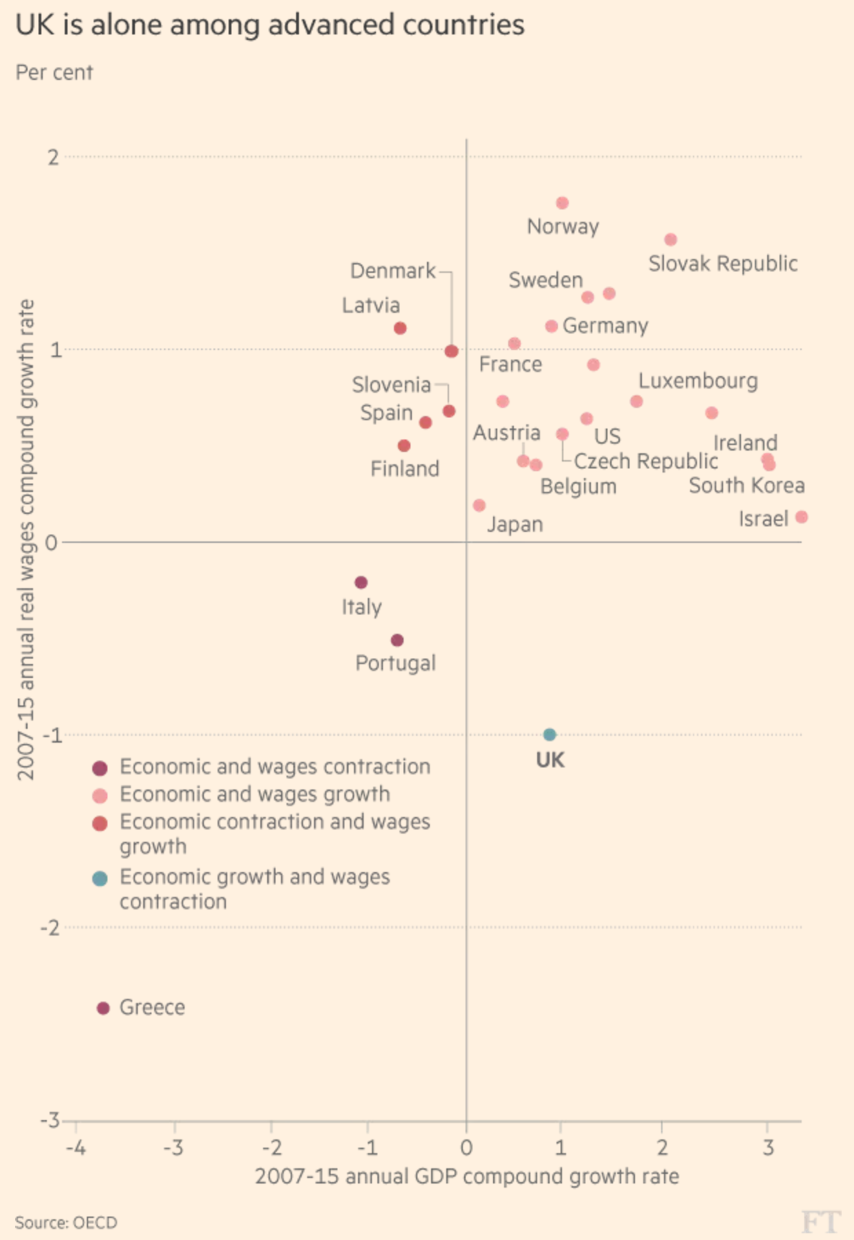
Straight off the bat, the salmon-coloured background does not bother me. That is FT’s brand and best to stick to it and make your graphics work around it. Possibly the colours in the plot could use a bit of a push to increase separation, but that is more a design quibble. Instead, I am not too keen on the colour coding here.
Not that the colours need not be applied, but why to the dots? Note how the dots of a colour fall into one of the quadrants. Instead of having people refer to the legend, incorporate the legend into the chart by moving the labels to the plot background. You could colour code the labelling or even colour the quadrants to make it a bit clearer.
Credit for the piece goes to the Financial Times graphics department.
Leave a Reply
You must be logged in to post a comment.