I Didn’t Predict a Riot

Yesterday I wrote about a BBC graphics locator map that was perhaps not as helpful as possible. Well today I want to talk about another BBC map, though not in as critical a fashion.

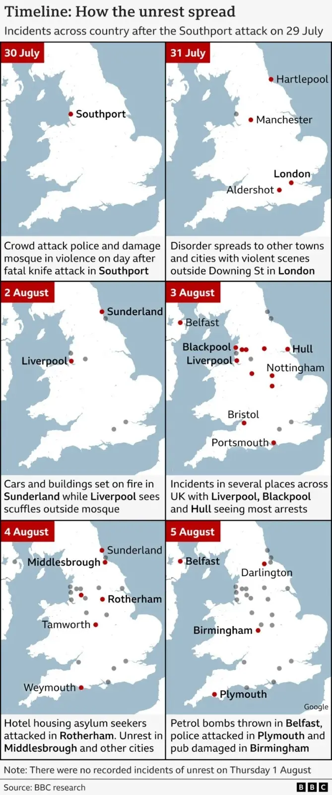
I landed upon this map whilst reading a series of updates about last month’s anti-immigrant riots throughout the United Kingdom—principally England.

The graphic uses small multiples of a cropping of the United Kingdom, excluding most of Northern Ireland and a good bit of Scotland. Red dots highlight where, on a particular date, far-right riots erupted. As the reader moves further into time, the red dots become a dark grey.

In general, I think this graphic works really well. The designer does not label every city and town as it’s not necessary so long as you hit the big and most notable ones. Nonetheless I have two peccadilloes with the graphic.

First, and the minor of the two, is the grey dots could perhaps be toned down a wee bit. Or fade as tints as they recede into the past.

Secondly, the note at the bottom of the graphic indicates “[t]here were no recorded incidents of unrest on Thursday 1 August”. Correspondingly, the graphic lacks a map for 1 August. If I had designed the graphic, I would have included a blank map for that date, because its emptiness could tell part of the story as sometimes nothing is something.

A blank map on Thursday could show that a brief flare up after the incident in Southport had, at best, burned out or, at worst, cooled to a simmer. Something then happened likely Friday night—after a day with only two reported incidents—or Saturday morning, which prompted a weekend of riots and destruction across the United Kingdom.

What could that be? Social media. Surprise, surprise. The BBC had a good article about the potential inflammatory aspect of social media posts on the reignition of the hatred the weekend of 3–4 August. Imagine a blank map for 1 August and a caption that notes a series of posts on, say, 2 or 3 August, followed by the red dots all across northern England.

As I said at the outset, however, I like the piece overall. Just a few small tweaks and the piece really could have hit home on just how bad things were in parts of the United Kingdom at the end of July and early August.

Credit for the piece goes to the BBC graphics department.

The Great British Baking

Recently the United Kingdom baked in a significant heatwave. With climate change being a real thing, an extreme heat event in the summer is not terribly surprising. Also not surprisingly, the BBC posted an article about the impact of climate change.

The article itself was not about the heatwave, but rather the increasing rate of sea level rise in response to climate change. But about halfway down the article the author included this graphic.

It’s getting hotter…

As graphics go, it is not particularly fancy—a dot plot with ten points labelled. But what this piece does well is using a dot plot instead of the more common bar chart. I most typically see two types of charts when plotting “hottest days” or something similar. The first is usually a simple timeline with a dot or tick indicating when the event occurred. Second, I will sometimes see a bar chart with the hottest days presented all as bars, usually not in the proper time sequence, i.e. clustered bar next to bar next to bar.

My issue with the the latter is always where is the designer placing the bottom of the bar? When we look at the best temperature graphics, we usually refer to box plots wherein the bar is aligned to the day and then top of the bar is the daily high and the bottom of the bar the daily low. It does not make sense to plot temperatures starting at, say 0º.

In this particular case, however, the dates would appear to overlap too closely to allow a proper box plot. Though I suspect—and would be curious to see—if the daily minimum temperatures on each of those ten hottest days have also increased in temperature.

As to the timeline option, this does a better job of showing not just the increasing frequency of the hottest days, but also the rising maximum value. In the early 20th century the hottest day was 36.7ºC, and you can see a definite trend towards the hottest days nearing and finally surpassing 40ºC.

I do wonder if a benchmark line could have been added to the chart, e.g. the summertime average daily high or something similar. Or perhaps a line showing each day’s temperature faintly in the background.

Finally, I want to point out the labelling. Here the designers do a nice job of adding a white stroke or outline to the outside of the text labels. This allows the text to sit atop the y-axis lines and not have the lines interfere with the text’s legibility. That’s always a nice feature to see.

Credit for the piece goes to the BBC graphics department.

Biden’s English Ancestry Revisited

Last week I posted about an article in the BBC on the English ancestry of American president Joe Biden. And these types of article are a bit pro forma, famous person has an article about their personal ancestry with a family tree attached. Interestingly, this article did not, just the timeline I mentioned and a graphic as part of an aside on the declining self-identification as English-American.

And that, normally is it. Perhaps the article comes out with a few revisions upon the famous person’s marriage, birth of children, and more rarely death, but that is it. Yesterday, however, the BBC posted a follow-up article about an English family claiming kinship with Joe Biden. This article, however, included a family tree of sorts.

With some interesting spacing here…

This isn’t a family tree in the traditional sense, I would argue it’s the sort of chart genealogists would use to highlight two parties’ relationship to their most recent common ancestor (MCRA). But this chart does something odd, it spaces out the generations inconsistently and so Joe Biden appears at the bottom, aligned with the grandchildren of Paul Harris, the man at the centre of the story.

If you compare the height/length of the lines linking the different generations you can see the lines on Biden’s side of the graphic are very long compared to those on the Harris’ side. This isn’t technically incorrect, but it muddies the water when it comes to understanding the generational differences. So I revisited the design below.

Now with more even spacing…

Here I dropped the photographs because, primarily, I don’t have access to them. But they also eat up valuable real estate and aren’t necessary to communicate the relationships. I kept the same distance between generations, which does a better job showing the relationship between Joe Biden and Paul Harris, who appear to be actual fifth cousins. Joe is clearly at a different level than that of Paul’s grandchildren.

I added some context with labelling the generational relationship. At the top we have William and James Biden, assuming they are brothers, listed as siblings. The next level down are first cousins, then second, &c. Beyond Paul, however, we have two additional generations that are removed from the same relationship level. This is where the confusing “once-removed” or “twice-removed” comes into play. One way to think of it is as the number of steps you need to take from, say, Paul’s grandchildren, to get to a common generational level. In their case two levels, hence the grandchildren are fifth cousins to Joe Biden, twice removed.

These types of charts are great to show narrow relationships. Because, if we assume that up until recently each of the generations depicted above had four or five children, that tree would be unwieldy at best to show the relationship between Paul’s family and Joe Biden. If you ever find yourself working on your family ancestry or history and need to show someone how you are related, this type of chart is a great tool.

Credit for the original goes to the BBC graphics department

Credit for my remake is mine.

Back to the Office, Back to Basics

Two weeks ago I posted about an article from the BBC that used graphics about which I was less than thrilled. Inconsistent use of axis lines, centring the graphic were two of the things that irked me. Two weeks hence, I do want to draw some positive attention to another article in the BBC. This one discusses the, for many of us, impending return to the office. (I’ve also heard the phrase “return to work”, although a coworker of mine pointed out that’s not a great phrase because many of us never stopped working when we decamped for our flats and houses.)

The article discusses why some think the return to a five-day office week will occur within the next few years. There is some sound logic to the idea and for those like your author who are closely following the issue, I recommend the article.

But that’s not why we’re here, instead I wanted to focus on the one data visualisation graphic in the piece. It displays the amount of office space used in the city centres of six different UK cities outside London.

But what about Slough?

Here we have small multiples with the same fixed y-axis display. Axis lines are present and consistent and the baseline is distinct from the other lines. Solid improvement over what we discussed two weeks ago.

My only quibble? The colours here are not necessary. A single colour would work because each city’s graphic exists apart from the rest. The charts also all represent the same type of data, occupied office space. If the chart were doubling or tripling up cities somehow—though I wouldn’t want to see this as a stacked area chart—I would buy the need for colours to differentiate the cities. This, however, represents an opportunity to use a single, BBC-branded colour to define the experience whilst not negatively impacting the communication from the data visualisation standpoint.

Again, though, that’s a minor quibble. Of course, the BBC puts out copious amounts of content daily and I see only a fraction, but it is nice to see an improvement. Furthermore, at the end of the article I also spotted a graphic credit, which I don’t often see—and honestly cannot recall when I last saw period—from the BBC.

I wonder if moving forward the BBC intends to highlight the contributors to articles who are not solely the writers, i.e. the people creating the graphics? Of course, if we did that, we should also probably take a look at the copy editors who also play a role. Especially for an online article as opposed to say a print newspaper or magazine where space is money.

Credit for the piece goes to Daniele Palumbo.

Warmer, Wetter Winters in the UK

I remember hearing and reading stories as a child about the Thames in London freezing over and hosting winter festivals. Of course most of that happened during what we call the Little Ice Age, a period of below average temperatures during the 15th through the early 19th century.

But those days are over.

The UK’s Meteorological Office, or the Met for short, released some analysis of the impacts of climate change to winter temperatures in the United Kingdom. And if, like me, you’re more partial to winter than summer, the news is…not great.

Winter warming

Broadly speaking, winters will become warmer and wetter, i.e. less snowy and more rainy. Meanwhile summers will become hotter and drier. Farewell, frost festivals.

But let’s talk about the graphic. Broadly, it works. We see two maps with a unidirectional stepped gradient of six bins. And most importantly those bins are consistent between the maps, allowing for the user to compare regions for the same temperatures: like for like.

But there are a couple of things I would probably do a bit differently. Let’s start with colour. And for once we’re not dealing with the colour of the BBC weather map. Instead, we have shades of blue for the data, but all sitting atop an even lighter blue that represents the waters around the UK and Ireland. I don’t think that blue is really necessary. A white background would allow for the warmest shade of blue, +4ºC, to be even lighter. That would allow greater contrast throughout the spectrum.

Secondly, note the use of think black lines to delineate the sub-national regions of the UK whilst the border of the Republic of Ireland is done in a light grey. What if that were reversed? If the political border between the UK and Ireland were black and the sub-national region borders were light grey—or white—we would see a greater contrast with less visual disruption. The use of lines lighter in intensity would allow the eye to better focus on the colours of the map.

Then we reach an interesting discussion about how to display the data. If the purpose of the map is to show “coldness”, this map does it just fine. For my American audience unfamiliar with Celsius, 4ºC is about 39ºF, many of you would definitely say that’s cold. (I wouldn’t, because like many of my readers, I spent eight winters in Chicago.)

The article touches upon the loss of snowy winters. And by and large, winters require temperatures below the freezing point, 0ºC. So what if the map used a bidirectional, divergent stepped gradient? Say temperatures above freezing were represented in shades of a different colour like red whilst below freezing remained in blue, what would happen? You could easily see which regions of the UK would have their lowest temperatures fail to fall below freezing.

Or another way of considering looking at the data is through the lens of absolute vs. change. This graphic compares the lowest annual temperature. But what if we instead had only one map? What if it coloured the UK by the change in temperature? Then you could see which regions are being the most (or least) impacted.

If the data were isolated to specific and discrete geographic units, you could take it a step further and then compare temperature change to the baseline temperatures and create a simple scatterplot for the various regions. You could create a plot showing cold areas getting warmer, and those remaining stable.

That said, this is still a really nice piece. Just a couple little tweaks could really improve it.

Credit for the piece goes to the UK Met Office.

Axis Lines in Charts

The British election campaign is wrapping up as it heads towards the general election on Thursday. I haven’t covered it much here, but this piece from the BBC has been at the back of my mind. And not so much for the content, but strictly the design.

In terms of content, the article stems from a question asked in a debate about income levels and where they fall relative to the rest of the population. A man rejected a Labour party proposal for an increase in taxes on those earning more than £80,000 per annum, saying that as someone who earned more than that amount he was “not even in the top 5%, not even the top 50”.

The BBC looked at the data and found that actually the man was certainly within the top 50% and likely in the top 5%, as they earn more than £75,300 per annum. Here in the States, many Americans cannot place their incomes within the actual spreads of income. The income gap here is severe and growing.  But, I want to look at the charts the BBC made to illustrate its points.

The most important is this line chart, which shows the income level and how it fits among the percentages of the population.

Are things lining up? It's tough to say.
Are things lining up? It’s tough to say.

I am often in favour of minimal axis lines and labelling. Too many labels and explicit data points begin to subtract from the visual representation or comparison of the data. If you need to be able to reference a specific data point for a specific point on the curve, you need a table, not a chart.

However, there is utility in having some guideposts as to what income levels fit into what ranges. And so I am left to wonder, why not add some axis lines. Here I took the original graphic file and drew some grey lines.

Better…
Better…

Of course, I prefer the dotted or dashed line approach. The difference in line style provides some additional contrast to the plotted series. And in this case, where the series is a thin but coloured line, the interruptions in the solidity of the axis lines makes it easier to distinguish them from the data.

Better still.
Better still.

But the article also has another chart, a bar chart, that looks at average weekly incomes across different regions of the United Kingdom. (Not surprisingly, London has the highest average.) Like the line chart, this bar chart does not use any axis labels. But what makes this one even more difficult is that the solid black line that we can use in the line charts above to plot out the maximum for 180,000 is not there. Instead we simply have a string of numbers at the bottom for which we need to guess where they fall.

Here we don't even a solid line to take us out to 700.
Here we don’t even a solid line to take us out to 700.

If we assume that the 700 value is at the centre of the text, we can draw some dotted grey lines atop the existing graphic. And now quite clearly we can get a better sense of which regions fall in which ranges of income.

We could have also tried the solid line approach.

But we still have this mess of black digits at the bottom of the graphic. And after 50, the numbers begin to run into each other. It is implied that we are looking at increments of 50, but a little more spacing would have helped. Or, we could simply keep the values at the hundreds and, if necessary, not label the lines at the 50s. Like so.

Much easier to read
Much easier to read

The last bit I would redo in the bar chart is the order of the regions. Unless there is some particular reason for ordering these regions as they are—you could partly argue they are from north to south, but then Scotland would be at the top of the list—they appear an arbitrary lot. I would have sorted them maybe from greatest to least or vice versa. But that bit was outside my ability to do this morning.

So in short, while you don’t want to overcrowd a chart with axis lines and labelling, you still need a few to make it easier for the user to make those visual comparisons.

Credit for the original pieces goes to the BBC graphics department.

From Order to Chaos?

A few weeks ago we said farewell to John Bercow as Speaker of the House (UK). Whilst I covered the election for the new speaker, I missed the opportunity to post this piece from the BBC. It looked at Bercow’s time in office from a data perspective.

The piece did not look at him per se, but that era for the House of Commons. The graphic below was a look at what constituted debates in the chamber using words in speeches as a proxy. Shockingly, Brexit has consumed the House over the last few years.

At least climate change has also ticked upwards?

I love the graphic, as it uses small multiples and fixes the axes for each row and column. It is clean, clear, and concise—just what a graphic should be.

And the rest of the piece makes smart use of graphical forms. Mostly. Smart line charts with background shading, some bar charts, and the only questionable one is where it uses emoji handclaps to represent instances of people clapping the chamber—not traditionally a thing that  happens.

Content wise it also nailed a few important things, chiefly Bercow’s penchant for big words. The piece did not, however, cover his amazing sense of sartorial style vis-a-vis neckties.

Overall a solid piece with which to begin the weekend.

Credit for the piece goes to Ed Lowther & Will Dahlgreen.

Hoyle’s House

John Bercow is no longer the British Speaker of the House. He left office Thursday. Fun fact: it is illegal for an MP to resign. Instead they are appointed to a royal office, in Bercow’s case the Royal Steward of the Manor of Northstead, that precludes them from being an elected MP. Consequently the House of Commons then had to elect a new Speaker.

For my American audience, despite the same title as Nancy Pelosi, John Bercow had a very different function and came to it in a very different fashion. First, the position is politically neutral. Whoever the House elects resigns from his or her party (along with his or her three deputies) and the political parties abide by a gentlemen’s agreement not to contest the seat in general elections. (The Tories were so displeased with Bercow they were actually contemplating running somebody in the now 12 December election to get rid of him.) Consequently, the Speaker (and his or her deputies) do note vote unless there is a tie. (Bercow actually cast the first deciding vote by a speaker since 1980 back in April.)

Because the position is politically neutral, all MPs vote in the election and debate is chaired by the Father of the House, the longest continuously serving MP in the House. Today that was Ken Clarke, one of the 21 MPs Boris Johnson booted from the Tory party for voting down his No Deal Brexit and who is not standing in the upcoming election. The candidates for Speaker must receive the vote of 50% of the House. And so they are eliminated in successive votes until someone reaches 50% of the total votes cast, though not all MPs cast votes, since some have already started campaigning. (Today there were 562, 575, 565, 540 votes per round.)

Notably, today’s vote occurs just days before Parliament dissolves prior to the 12 December election. Bercow, who chose to retire on 31 October, essentially ensured that the next Parliament will have a Speaker not chosen what could well likely be a pro-No Deal Brexit, one of the things which the Tories have against him.

So all that said, who won? Well I made a graphic for that.

A very different accent will occupy the big green chair.

Credit for the piece goes to me.

UK–Narnia Border

Yesterday the United Kingdom was supposed to leave the European Union. Again. Boris would rather be dead in a ditch. But he’s neither dead nor in a ditch. And the UK is still in the EU. So let’s enjoy the moment and reflect on this xkcd piece from the other day. And then enjoy the weekend.

But what about the UK–Shire border? Or UK–Westeros?

Credit for the piece goes to Randall Munroe.

Brexit Deal 2.0

I’ve been trying to work on a Syrian changing alliances graphic, but the Brexit news today scuppered that. Instead, we take a look at Boris’ deal, which differs from May’s in that it chucks out the notion of territorial integrity, creating a border in the Irish Sea where goods will have to be inspected. My old Brexit trilemma graphic shows the new deal’s fundamental choices.

Shifting priorities
Shifting priorities

But how does this exiting the customs union and single market work? Well, the whole of the UK is leaving the customs union, but on the single market, there Northern Ireland remains in, aligned to the EU, whereas the rest of the UK is leaving. Ports will screen for some goods to ensure compliance with UK officials ensuring EU standards.

There are still questions about how this will all shake out

The BBC graphic above is pretty straightforward, showing the new border as a dotted line. But the border is there. There is still quite a bit we don’t know. And most important of those questions is can Boris get his deal through Parliament? Remember, he tossed 20 MPs out of the party. And there are signals that the DUP, a conservative Northern Irish party that provides the crucial backing votes to the Tories to ensure the Tory majority (before, again, Boris kicked out 20 of his own MPs), will vote against the deal because it separates them from the rest of the UK.

Credit for the trilemma is mine.

Credit for the BBC graphic goes to the BBC graphics department.