While today’s post is not an uplifting story, I did find it remarkable in its presentation. Nothing too fancy or revolutionary to be certain, but remarkable nonetheless. What was it? This morning when I picked up the Times there was a chart in black and red, above the fold, below the cover photo.
The story is about the rising number of deaths in the United States attributed to drugs. And, no, the line chart is not groundbreaking—though I do love the way the designers cut into the space to efficiently set copy and annotations. But as an above-the-fold graphic this morning, it did the trick.
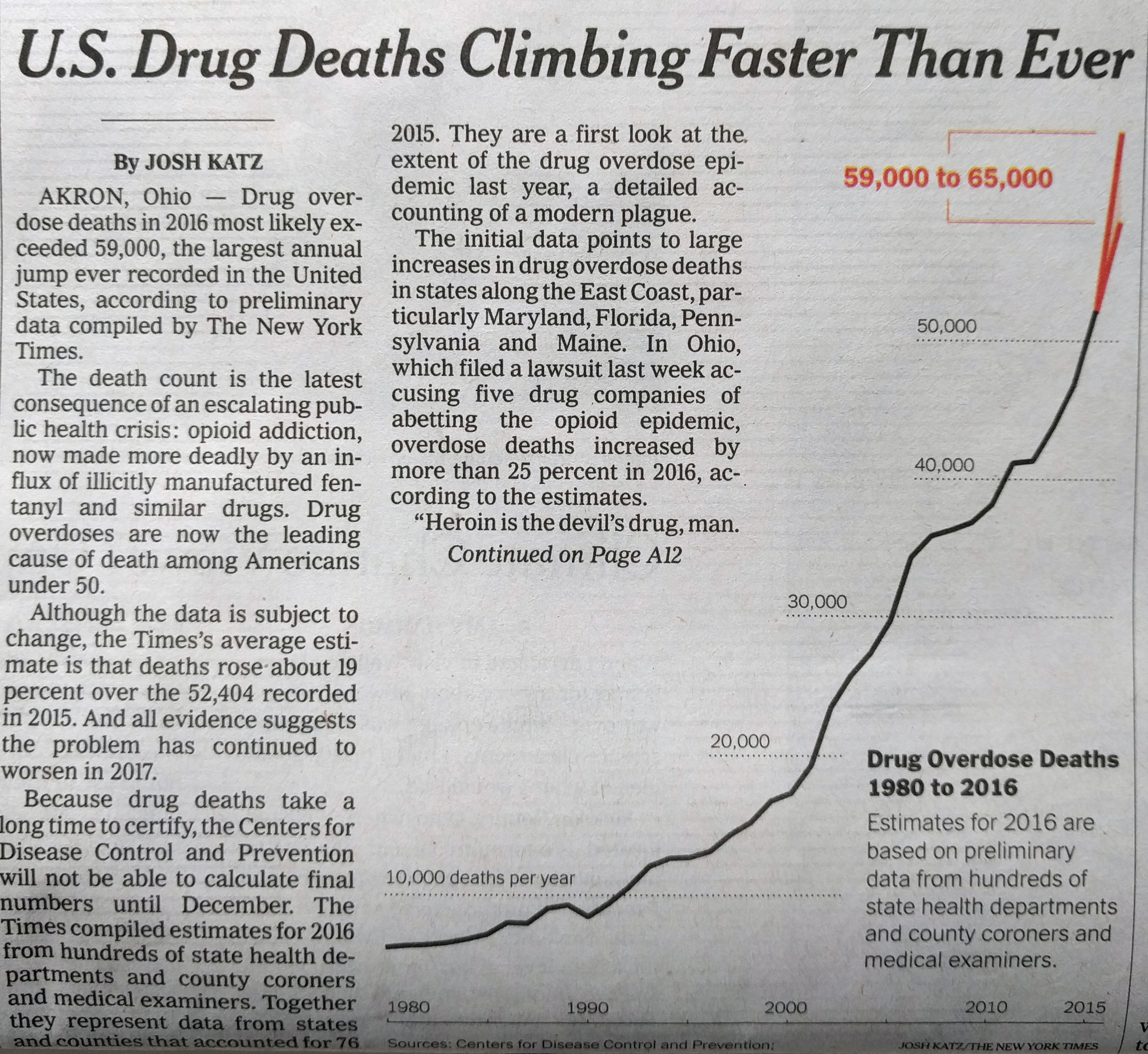
Credit for the piece goes to Josh Katz.
Leave a Reply
You must be logged in to post a comment.