Last week I covered a lot of Red Sox data. And your feedback has been fantastic. I think you can look forward to more visualisation of sportsball data. But since this is not a sports blog, let us dive back into some other topics. Like today’s piece on economic growth.
It comes from the Economist and explores the development history of national economies relative to that of the United States. The point of the chart was to illustrate what the researchers determined was the middle income trap, a space in which countries develop and become semi-rich, but then can never quite escape.
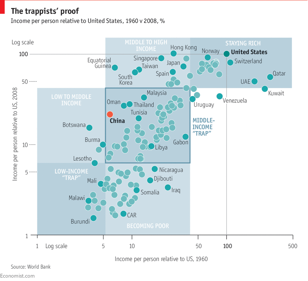
The Economist makes the point that the definition of middle income matters. The range is enormous and one statistic says that it could take 48 years to graduate at a healthy rate of economic growth. I wonder is this bit, however, could also have been charted. The show don’t tell mantra works well here for setting up the problem, but a chart or two showing that exact range could have supplemented the text and perhaps made it more digestible.
Credit for the piece goes to the Economist Data Team.
Leave a Reply
You must be logged in to post a comment.