Yesterday Hurricane Ophelia hit Ireland and the United Kingdom. Yes, the two islands get hit with ferocious storms from time to time, but rarely do they enjoy the hurricanes like we do on the eastern seaboards of Canada, Mexico, and the United States.
Earlier this hurricane season the US had to deal with Harvey, Irma, and Maria. And in early October the Wall Street Journal published a piece that looked at the economic impact of the former two hurricanes as exhibited in economic data.
Overall the piece does a nice job explaining how hurricanes impact different sectors of the economy, well, differently. And wouldn’t you know it that leisure and hospitality is the hardest hit? But then they put together this stacked bar chart showing the impact of the hurricanes on both Florida/Georgia and Texas for Irma and Harvey, respectively.
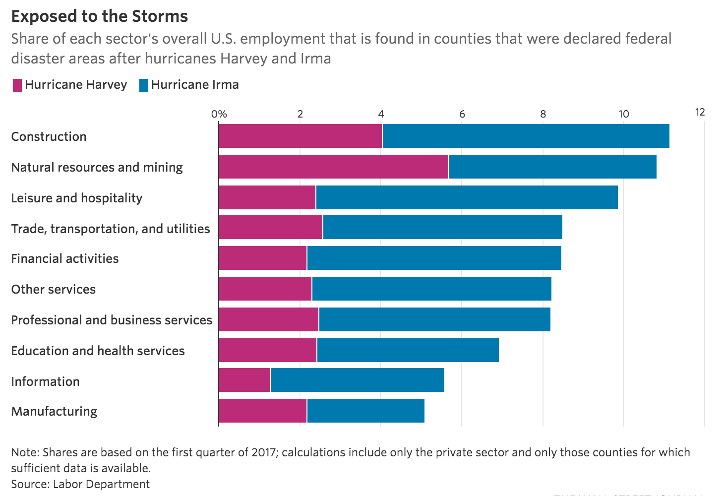
The problem is that the stacked bar chart does not allow us to examine each hurricane as a specific data set. Because the Harvey data set is first, we have the common baseline and can compare the lengths of the magenta-ish bars. But what about the blue sets for Irma? How large is natural resources and mining compared to professional and business services? It is incredibly difficult to tell because neither bar starts at the same point. You must mentally move the bars to the same baseline and then hope your brain can accurately capture the length.
Instead, a split bar chart with each sector having two bars would have been preferable. Or, barring that, two plots under the same title. Then you could even sort the data sets and make it even easier to see which sectors were more important in the impacted areas.
Stacked bar charts work when you are trying to show total magnitude and the breakdowns are incidental to the point. But as soon as the comparison of the breakdowns becomes important, it’s time to make another chart.
Credit for the piece goes to Andrew Van Dam.
Leave a Reply
You must be logged in to post a comment.