The New York Times has posted a nice piece with an animated graphic. No, not that piece, I’ll probably cover that next week. This one looks at demographic changes in the United States, specifically in the population change at county levels. A number you arrive at by subtracting deaths from births and excluding migration.
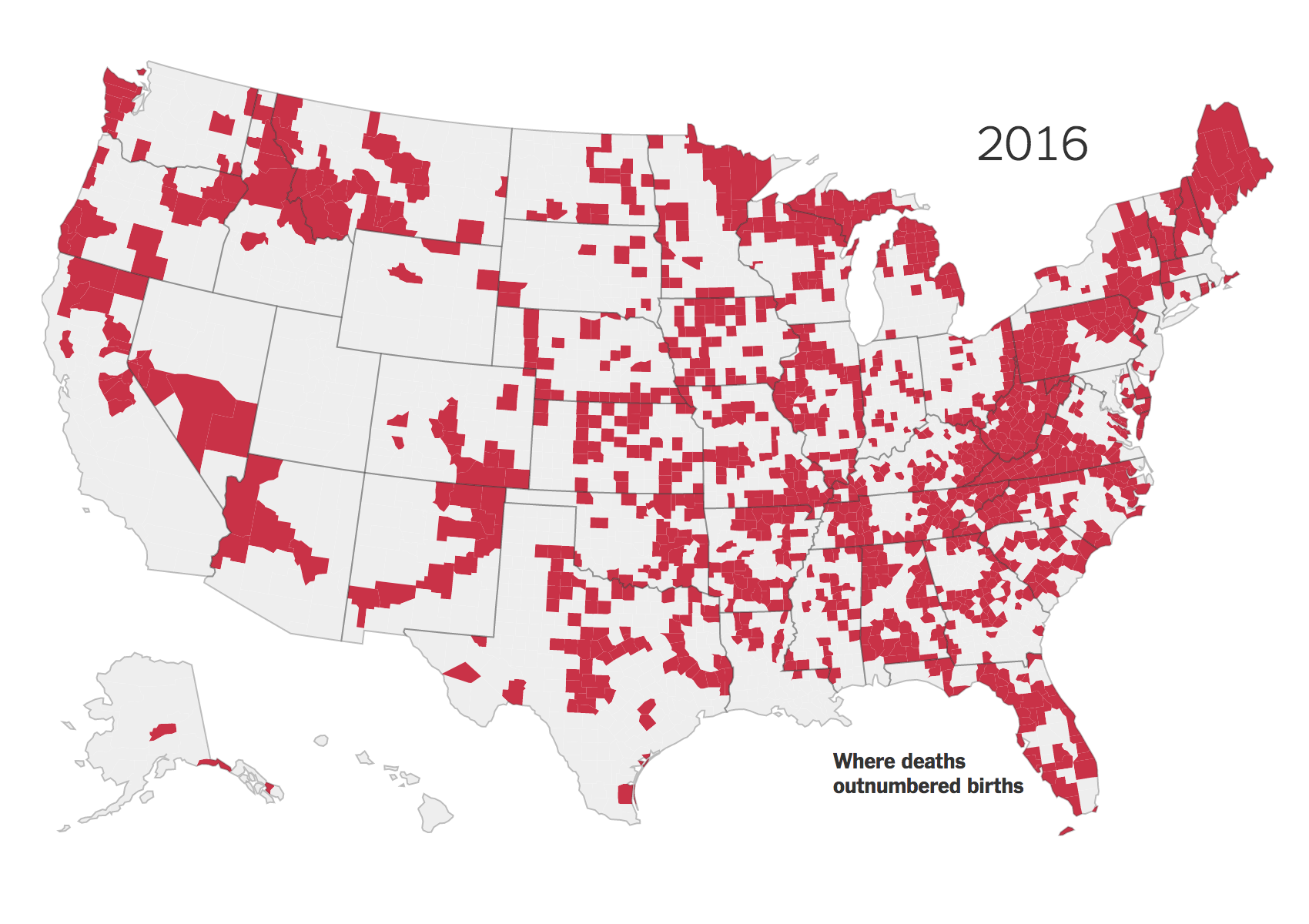
Basically what we are seeing is a whole lot of red outside the major cities, i.e. the outer suburbs. The article does a nice job of explaining the factors going into the declines and is well worth its quick read.
Credit for the piece goes to Robert Gebeloff.
Leave a Reply
You must be logged in to post a comment.