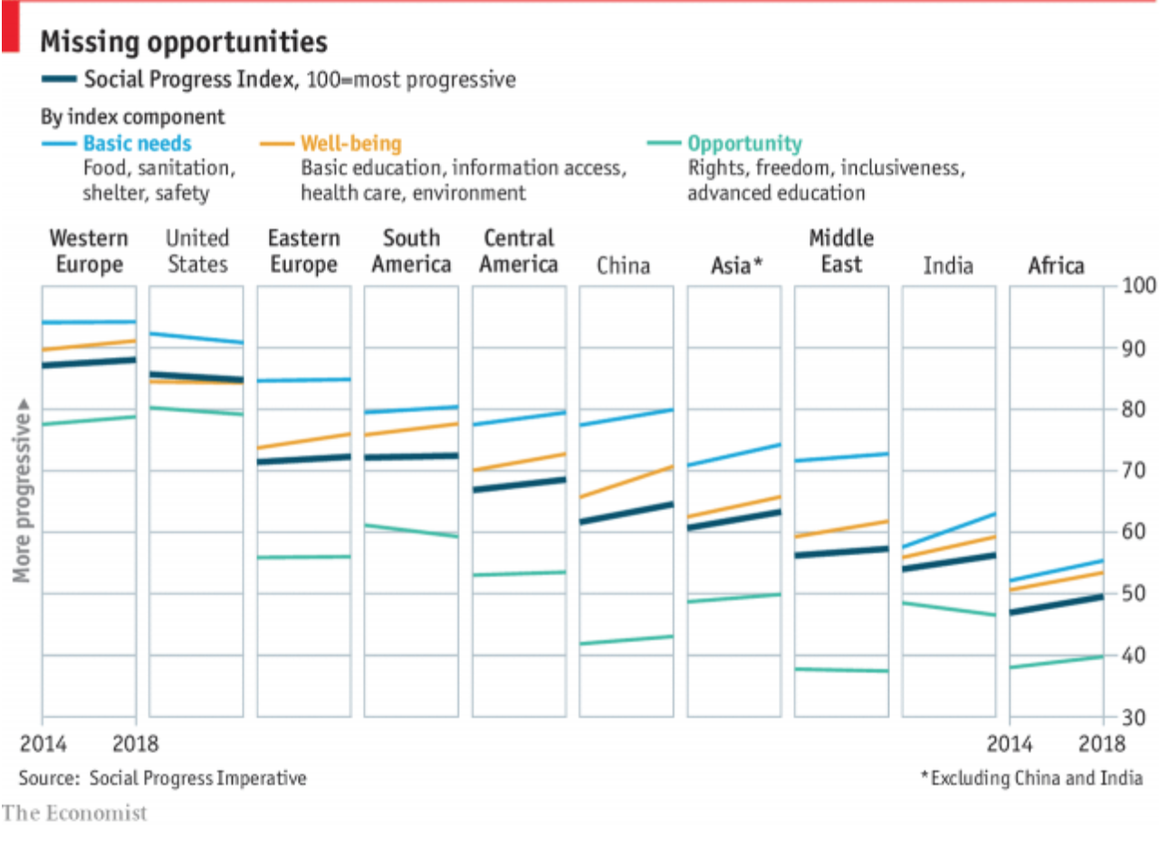
Last Thursday the Economist published an article looking at quality of life across the world. The data came from the Social Progress Imperative and examined quality of life, excluding economic performance. And as the article details, the results were mixed at best.
But, hey, the chart was really nice. We have a small multiple set looking at the overall index across all regions across the world and then the US, China, and India in particular.

I think this chart hits almost all the right notes. My only qualm would be the component indices being placed alongside the overall index. I wonder if breaking the whole thing out by component would work. As it is, it generally works well, I am just curious because there is the one issue of the United States where our well-being line falls beneath that of the overall index. But then again, the story is the overall index.
Credit for the piece goes to the Economist Data Team.
Leave a Reply
You must be logged in to post a comment.