Yesterday we looked at the isolation of the US and Canada in keeping the Boeing 737 Max aircraft in the air. Later that day, both countries grounded those aircraft. Today in the print edition of the New York Times the front page used significant space to chart the vertical speed of the two crashed aircraft.
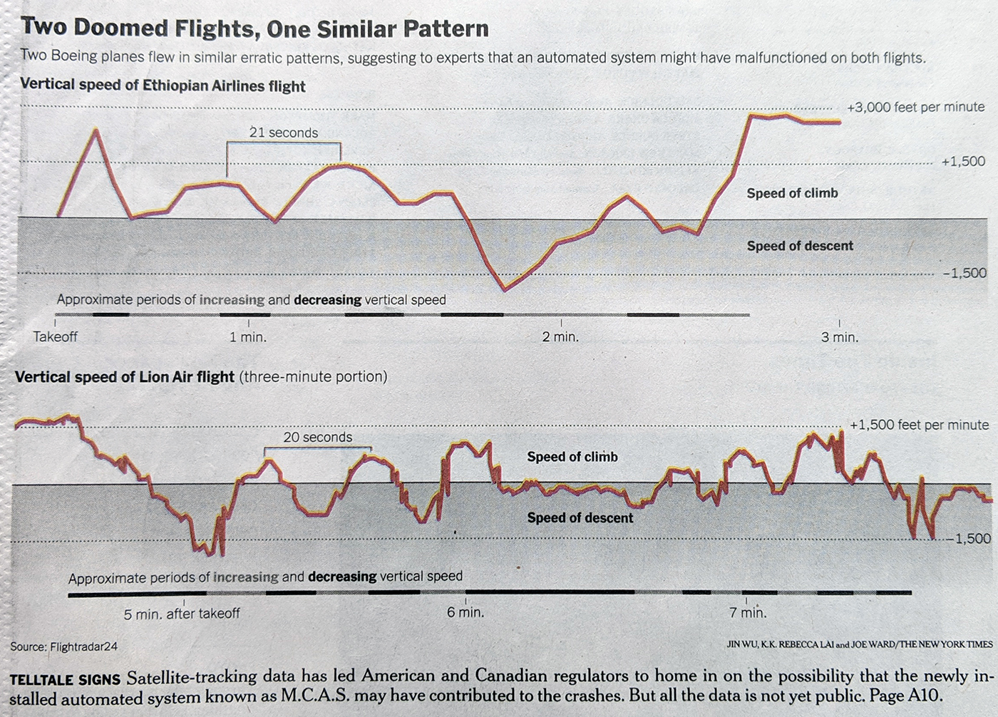
It uses the same scale on the y-axis and clearly shows how the aircraft gaining and losing vertical speeds. I am not sure what is gained by the shading below the 0 baseline. I do really enjoy the method of using a chart below the airspeeds to show the periods of increasing and decreasing vertical speed.
Credit for the piece Jin Wu, K.K. Rebecca Lai, and Joe Ward.
Leave a Reply
You must be logged in to post a comment.