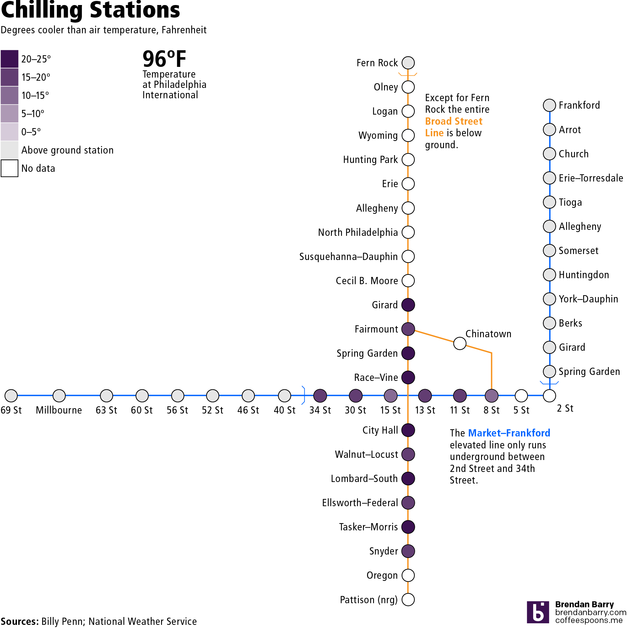
Yesterday we looked at Billy Penn’s graphics about the cooler stations and I mentioned a few ways the graphic could be improved. So last night I created a graphic where I explored the limited scope of the data, but also showing how low the temperatures were, relative to the air temperature outside, using weather data from the National Weather Service, admittedly from Philadelphia International Airport, not quite Centre City, which I would expect to be warmer due to the urban heat bubble effect.
I opted to exclude the Patco Line since the original dataset did not include it either. However a section of it does run through Centre City and could be relevant.
Credit for the piece goes to me, though the data is all from Billy Penn and the National Weather Service.
Leave a Reply
You must be logged in to post a comment.