Yesterday I read an article from the BBC about this weekend’s shooting at Brown University, one of the nation’s top universities. The graphic in question had nothing to do with killings or violence, but rather located Rhode Island for readers. And the graphic has been gnawing at me for the better part of a day.
First, its size. I typically read the news here on my laptop in the morning and evening and then around lunch I check the news on my mobile. (I find limiting my mobile screen use limits the propensity for doomscrolling.) This locator map occupied the entire screen in its column of text. I cannot say for certain this screenshot will be as large, but fingers crossed it is for point of emphasis.
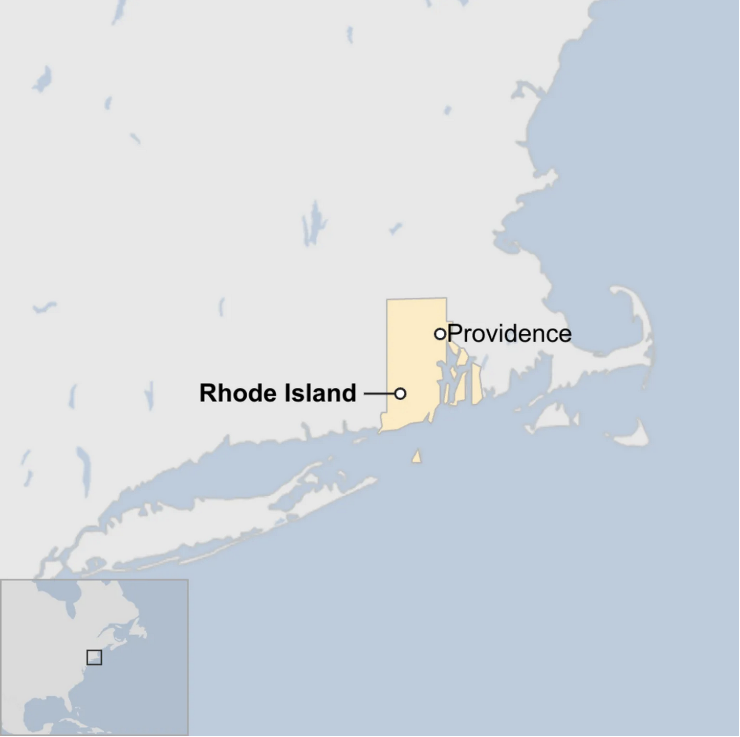
Context for my international readers, Rhode Island is the smallest state in the union. I visited Providence a few years ago for a long weekend and walked about half an hour east of the city for some good Portuguese food and was about another 15 minutes’ walk away from the border with Massachusetts. I like to joke I walked halfway across the state in an hour. (A quick search on Google Maps says I could walk across the state in 9.5 hours, so it isn’t a stretch…) Why did the BBC need such a large map for such a small state?
Secondly, locator maps work really well when they contain other points of reference. If we assume most people do not know where Providence and Rhode Island are, we can agree to the need for a locator map. But what points of reference does this map include? None.
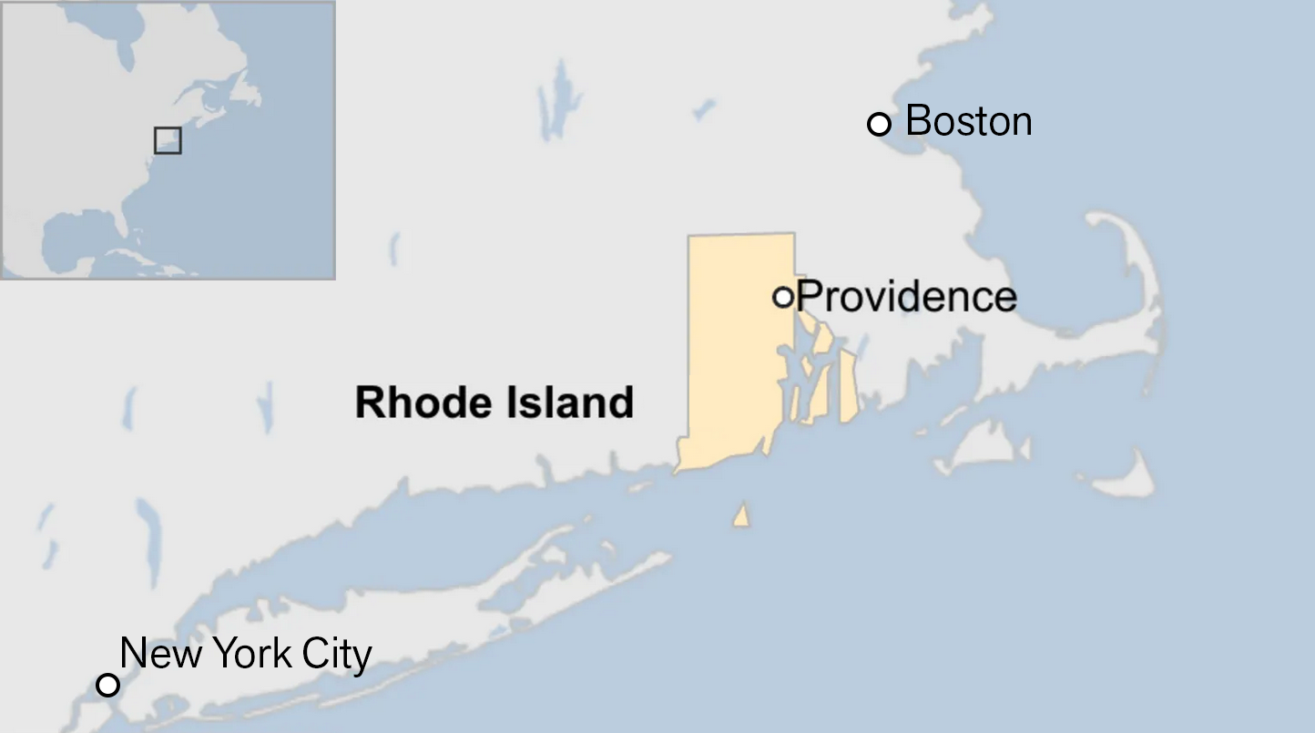
So here in a quick edit I reduce the size of the map and I add two points of reference and suddenly Providence’s place in the United States makes more sense.

No, I did not edit the shape of the square on the inset map.
My second quibble is the labelling for Rhode Island. The circle/dot points to a specific location. And that works well* for cities like Providence, Boston, and New York. But the dot for Rhode Island implies a specific location that is not true. Rhode Island is the entire shape of yellow. In circumstances like these I prefer an outline. Or even just an unlinked label works, because the graphic does not label other visible states: Massachusetts, Connecticut, New York, and New Jersey.
I like locator maps. I grew up a geography nerd—it was probably one of my favourite classes in school. Anything that happens in life happens in a time and a place and I am always curious to know where the place in a news story is. Granted, I know where Providence is, but if you mentioned a random town in upstate New York, I might instinctively open Google Maps and find where the town is located.
But I want locator maps to work well too. And I think this particular map from the BBC unfortunately fails to work. Especially because of how much space this graphic occupied in the article. In a smaller graphic, absolutely begin cutting labelling and context. But for a near-full screen image, these extra bits help readers tremendously.
Credit for the piece goes to the BBC graphics department.
* I am being overly simplistic here. Take a look at New York. The actual city of New York includes the grey island directly below the dot, Staten Island. The dot does not encapsulate all the area of the city. Even dots can be problematic at certain scales.