Last Wednesday, when I was more focused on the Artemis II launch, the Supreme Court held oral arguments about the administration’s attempt to end birthright citizenship and overturn the 14th Amendment to the United States’ constitution. Kind of a big deal.
NBC News ran a live blog covering the arguments and included an interactive map which detailed how the rest of the world addresses the issue.
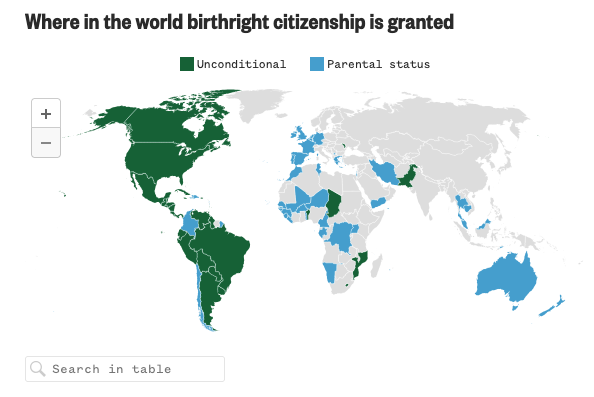
As a graphic, I wish it were a bit larger and not within a running live blog. In southern Africa you can see a teeny weeny blue dot—that is Lesotho—and getting my mouse over it could be tricky. Luckily, the designer also incorporated a text field so one can search for a country by name—though it does not help a user who does not know what or where Lesotho is.
Below the map the designer included a table summarising the different classifications, almost like subsets of the green vs. blue.
For what I imagine was a quickly designed interactive map, this does a decent job of showing the state of play. I wish we had more explicit labelling of the grey as unknown or something similar.
I wonder, too, if a geographic map is a good choice given how much grey is present. Would a box map or map less geographically accurate be a better choice? Hard to say here, but the large expanses of Siberia and western China make it worth considering.
All that is to say, during the hearings, Justice Gorsuch said something to the point that, and I’m paraphrasing, the international rarity of birthright citizenship makes for a good policy debate, but has no bearing on the constitutionality of the policy.
The case should be decided sometime later this summer. I bet there will be some graphics following up on this.
Credit for the piece goes to Jiachuan Wu.