Tag: choropleth
-
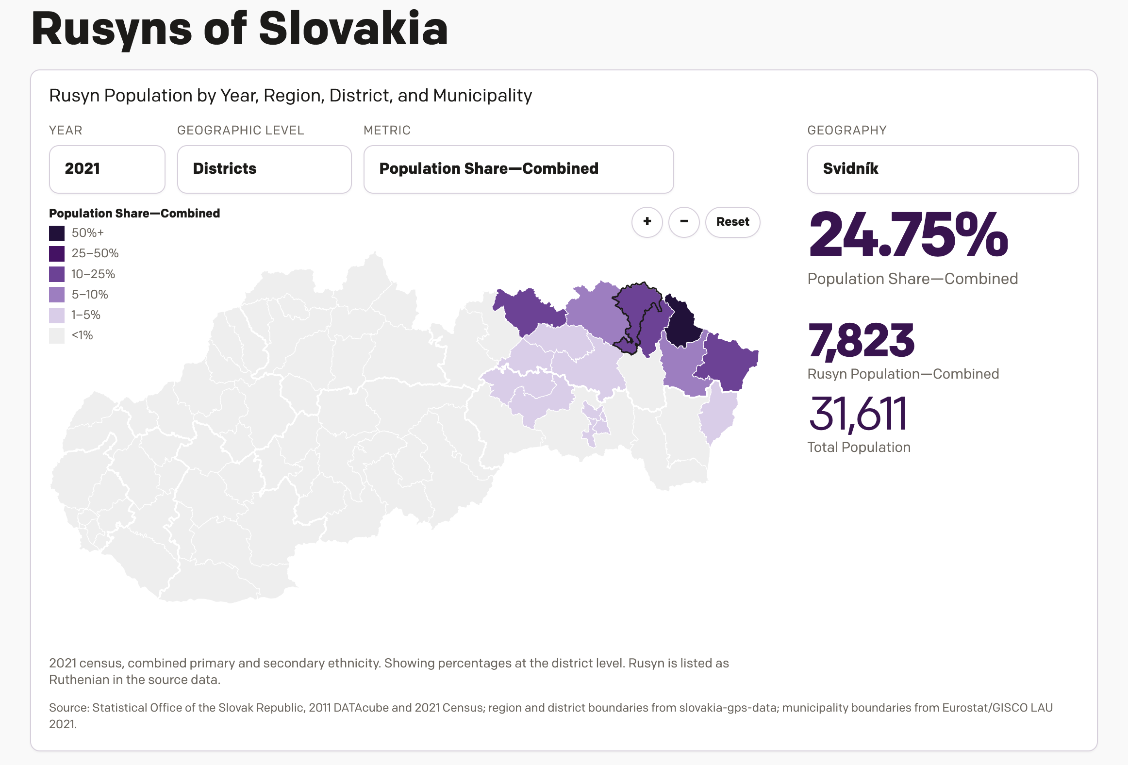
New(ish) Data for the Old Country
One of the most popular pieces of content on my website over the last several years has been a datagraphic I designed, which explores the Slovakian census data from 2011 on the Carpatho–Rusyns of Slovakia. I wrote about it for Coffeespoons back in 2012. The Carpatho–Rusyns, as they are known in the United States and…
-
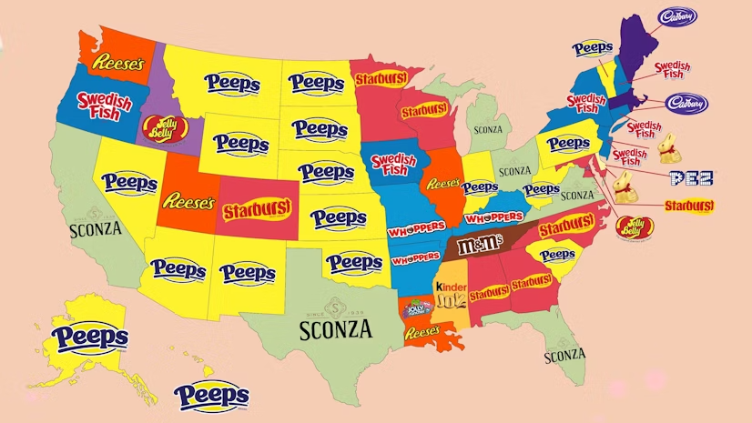
Peeps People in Pennsylvania
As many long-time readers know, my Carpatho–Rusyn origins means my family observes Orthodox Easter, which usually does not coincide with what I call Catholic Easter—because the other part of my background is Irish Catholic, so growing up there were two Easters. Now we just observe the one and so later today I am headed back…
-
Born in the U.S.A.
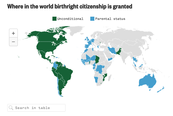
Last Wednesday, when I was more focused on the Artemis II launch, the Supreme Court held oral arguments about the administration’s attempt to end birthright citizenship and overturn the 14th Amendment to the United States’ constitution. Kind of a big deal. NBC News ran a live blog covering the arguments and included an interactive map…
-
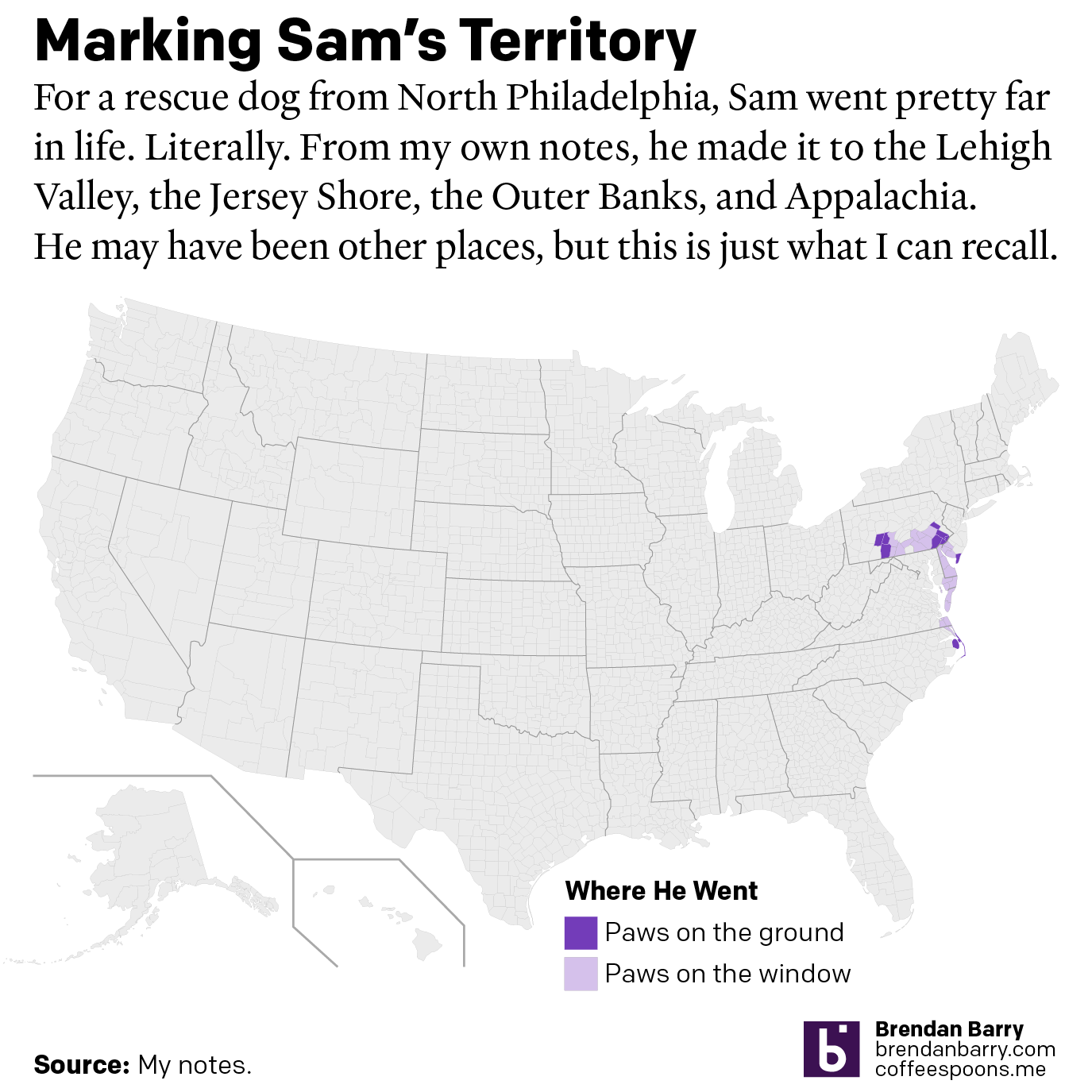
A Ruff Week
After last Friday’s post went live I headed home, because I received word that in the evening, we would be saying farewell to our family dog of 17 years, Sam. My sister adopted him after his first owners gave him up to a rescue shelter with injuries they could not afford to tend after he…
-
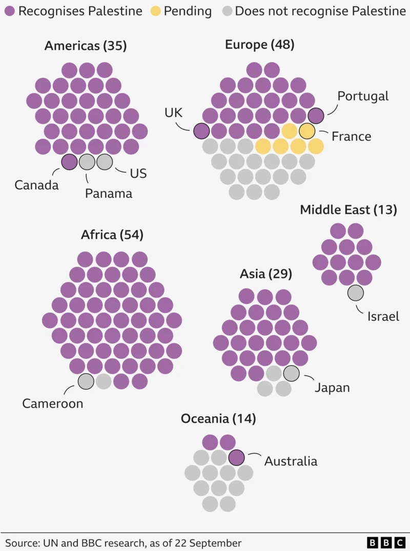
Palestine. The Newest Country in the World?
One of the most debated questions one could ask at pub trivia: How many countries are there in the world? To start, the question cannot be answered completely. What is a country? What is a state? What is a nation? Define recognition. Whose definition? When I worked at Euromonitor International I had to edit a…
-
Baby You Can Drive My Car
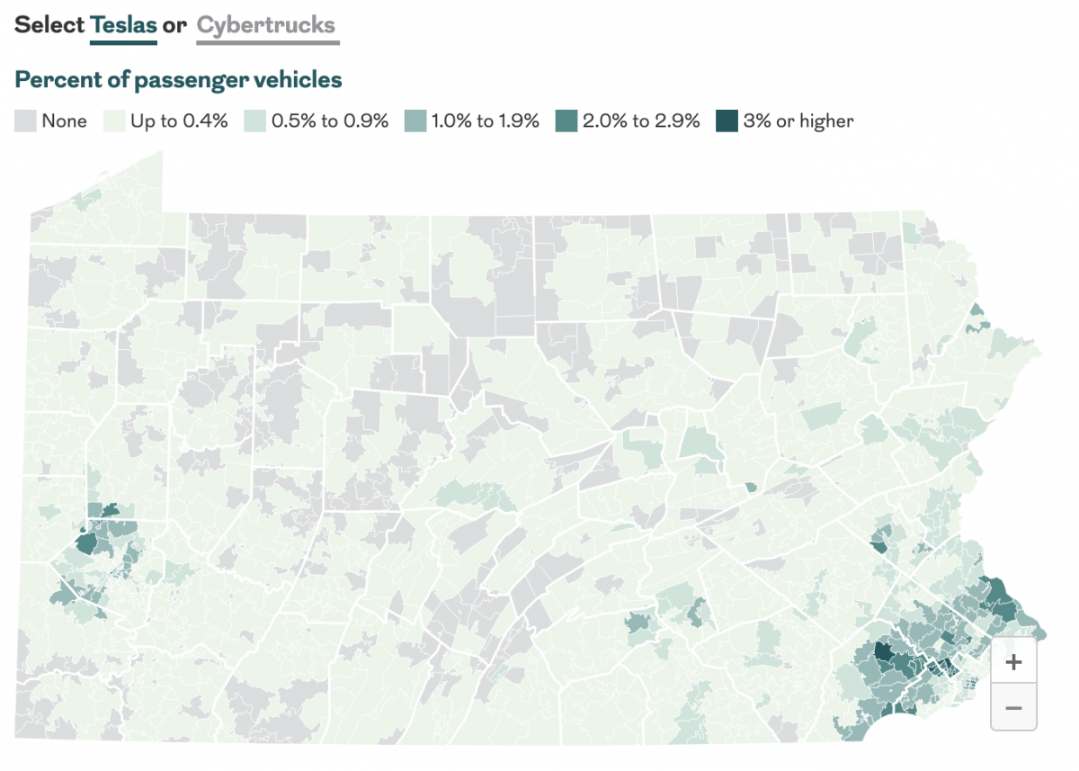
Last month the Philadelphia Inquirer published an article examining the geographic distribution of Teslas and Cybertrucks and whether or not your car is liberal or conservative. The interactive graphics focused more on a sortable table, which allowed you to find your vehicle type. The sortable list offers users option by brand and body type—not model.…
-
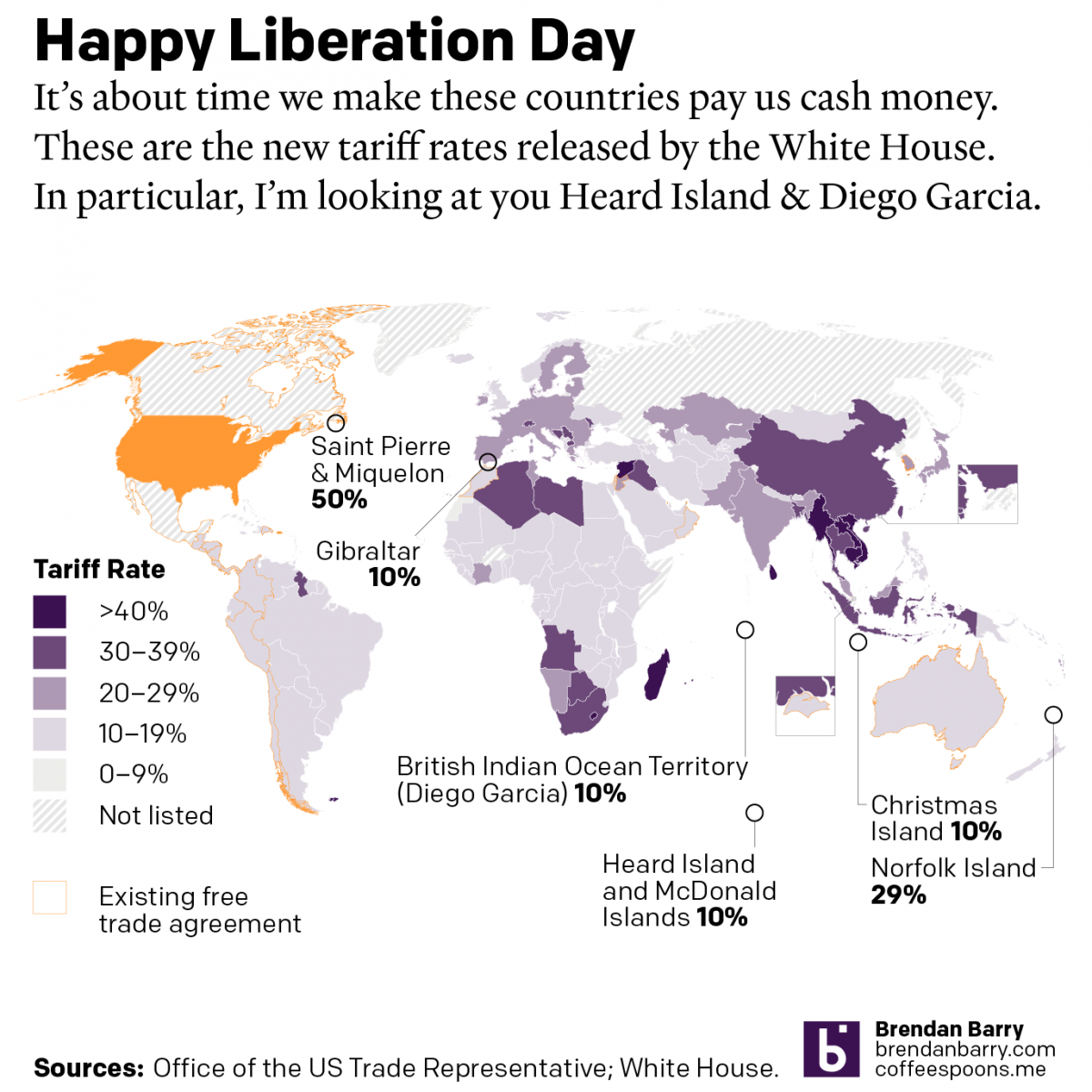
Happy Liberation Day
Yesterday I created a map detailing the new tariff rates released by President Trump on Wednesday. I was inspired by the curious inclusion of several small territories with almost no trade with the United States, and a few of whom are uninhabited. What follows is the graphic and the accompanying text I wrote as I…
-
248 Years Later, Philadelphia’s Still Hosting Debates
For those of you living under a rock, 2024 is a presidential election year in the United States and the campaign for the November election truly kicks off post-Labour Day. And post-Labour Day here we are. Tonight features a presidential debate between the two candidates, Vice President Kamala Harris and former president Donald Trump. Harris…
-
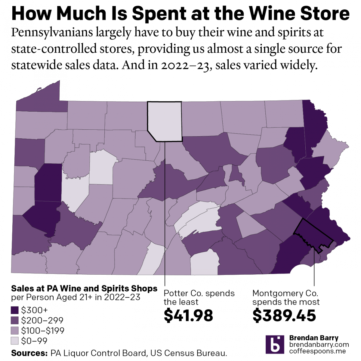
The Sun’s Over the Yardarm Somewhere
It’s been a little while since my last post, and more on that will follow at a later date, but this weekend I glanced through the Pennsylvania Liquor Control Board’s annual report. For those unfamiliar with the Commonwealth’s…peculiar…alcohol laws, residents must purchase (with some exceptions) their wine and spirits at government-owned and -operated shops. It’s…
-
Legendary Adjustments
The other day I was reading an article about the coming property tax rises in Philadelphia. After three years—has anything happened in those three years?—the city has reassessed properties and rates are scheduled to go up. In some neighbourhoods by significant amounts. I went down the related story link rabbit hole and wound up on…