Over the past week I did a bit more driving than usual. Every single day I watched the digital display at the local Wawa tick up by a penny or two. But I read the news and see reports of fuel shortages and restrictions, especially in Europe and Asia. This morning the BBC reported on the increase in fuel costs in the UK since the Third Persian Gulf War began back in February.
Spoiler: it’s not great.
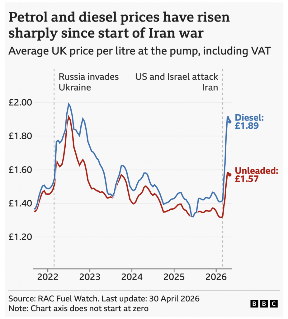
From a chart standpoint, this does a few things well. I like the annotations calling out not just the beginning of the Third Gulf War but the Russo–Ukrainian War. (Technically it started in 2014 with invasion and annexation of the Crimean Peninsula, but this new full-scale invasion phase began in February 2022.)
There is also a subtle white outline to the blue line creating visual separation from the red line as they often intersect. Is the label at the very end necessary? Probably not, but given how well the rest of the chart is designed the labelling is far from egregious.
Credit for the piece goes to the BBC graphics team.