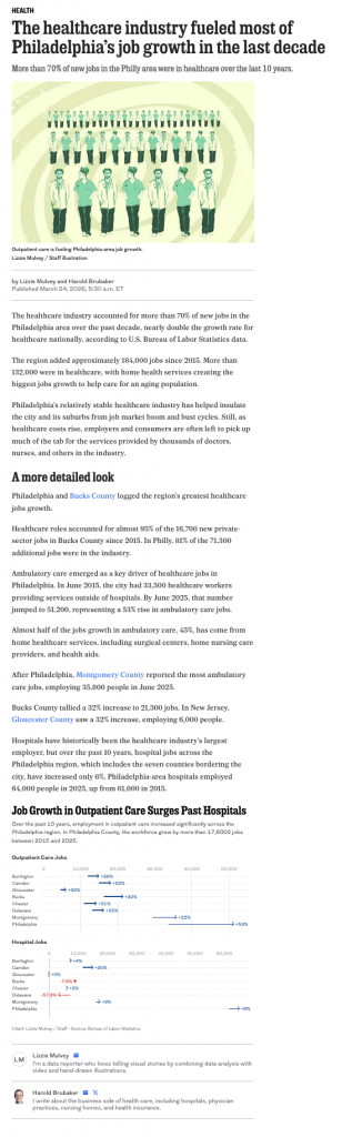
I was reading an article in my local rag, the Philadelphia Inquirer, when I came upon an article about the healthcare industry’s outsized role in the region’s job growth. The article led off with a staff illustration of medical-looking types on a graphic swirl background—nothing inherently wrong with that. The Inquirer would know best what sort of images best grab reader’s attention. From my experience, however, quality charts, but especially maps, work very well. And this being a regional data story, my gut said a map would work well.
When I got into the meat and potatoes of the article—sorry, doc, all red meat there—it was what I thought, an examination of Bureau of Labour Statistics (BLS) employment data and its change over the period. Each paragraph replete with factettes and data points. But it was not until I scrolled through and reached the very end of the article when I found a single graphic comprised of two charts.
First, this reads—pun fully intended—as a lost opportunity to leverage data visualisation to tell a data-driven story. I am definitely biased, but I am also definitely a visual learner and I would rather see the patterns than read the patterns. And as I often harp on, knowing the precise decimal point value is often unimportant. Rather, the relationships and directional information is often more valuable. Is A bigger than B, by a lot or a little? Which is growing faster? &c. ad nauseam.
Second, because it is a data-driven story, perhaps the author only had time to create one graphic for the article—constraints exist, much as we may wish they didn’t. But why does the article place it at the end? Perhaps because it details the split within the industry, i.e. hospitals vs. outpatient care? I probably would have shaped the article overall to place the graphic above the fold, so to speak. Or, I would have, as I led with, used the graphic as the article header. I just would not have placed it at the end where it is less likely to be read by a user with a shorter attention span than mine. Or with less time than one who ultimately wrote a blog about the issue.
But the graphic also struck me as a bit of a missed opportunity.
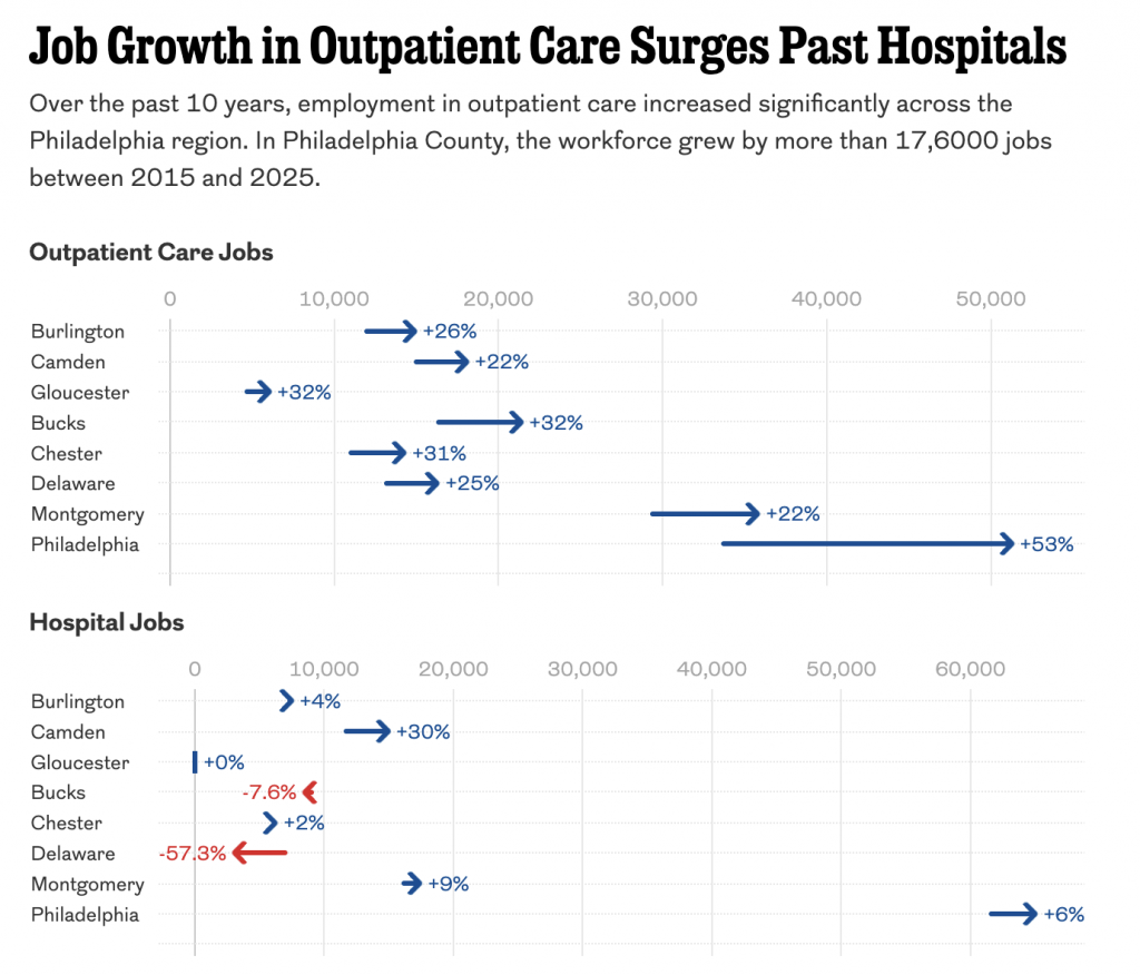
Personally, I don’t love the arrows. I find a smaller, less intrusive dot does the trick. And the labelling is…fine. But it creates visual noise. The far bigger issue is the small size of the hyphen.
Putting on my typographic nerd hat for a moment, the minus sign we all use on the keyboard is not the actual, real minus sign. It’s what we call a hyphen-minus. On US keyboards it sits between the 0 and the =. The problem is the hyphen-minus is more hyphen than minus, meant to join two letters and not act as a mathematical symbol. Visually it carries far less weight than its equal and opposite counterpart, the plus sign, and its cousin, the multiplication sign.
A brief typographic tangent, whilst I’m at it. The letter x is not the same as the ×, the multiplication sign. Here for Coffeespoons, presently typeset in Elena, a serif typeface, you can see the difference immediately with the inclusion of the serifs on the lowercase letter. It becomes just a touch less obvious in sans serif faces, but the giveaway is that the letter x sits on the baseline, or aligns with the bottoms of other letters except for those parts that stick down like the pointy bits in a p or q.
The issue is that because the hyphen-minus carries so much little visual weight compared to the plus sign it can almost disappear, especially at small sizes.
Now for most people, there is no need to go through the bother of using the minus sign (or the multiplication sign), because you will find neither on the keyboard. Nor is there an easy keyboard shortcut to replace the hyphen-minus (or the letter x) with their proper and correct symbols. Does an office email talking about negative growth numbers or some kind of force multiplier require a proper minus or multiplication sign for the point to be made clear? Probably not.
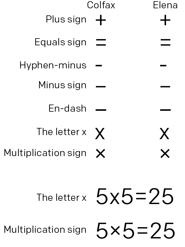
I would submit, however, that data visualisation is one place where the clear use of the correct symbols is important, because the characters are designed to function in the company of their mathematical peers. And just how you don’t want the plus sign to disappear—why else use it because without it the number is still implicitly positive—you don’t want the minus sign to disappear—why else use it because without it the arrow’s direction implicitly states the movement to be negative. The colours, red and blue here, are further reinforcement of the positive/negative movement. And if the argument is accessibility or increased clarity or legibility, than the minus sign here far outperforms the hyphen-minus. A chart is precisely where the precision of minus sign matters.
I would also bet that the clarity is incredibly useful in things like engineering, the medical and science fields, and anywhere else where the importance of a negative value is critical.
Now, above I included the en-dash above, because that is replaceable with Option+- on a Mac and on a PC with Alt+0150. For those looking for a bit more typographic rigour in their day-to-day (a proper use of the hyphen-minus), an en-dash is close enough to keep the visual weight of the plus sign, even in running copy such as this 2-2=0 vs. 2–2=0.
Back the graphic itself, though, because there were a few other points I wanted to critique here. Aside from the plus/minus sign, the labelling for percentage change lacks consistency. Bucks County’s hospital growth is −57.3% compared to Chester’s +2%. Note that only for the negative values did the designer include decimal points. I would either use them for all labels or for none of them. And here, because more than half of all values are double-digits, I would drop them.
Then we come to the graphic’s layout. As I said, I’m not terribly keen on the inclusion of the labels on the graphic. But they also do another thing—I think—and they force the bottom chart’s zero-baseline to start further to the right than the one directly above, presumably to fit that red text label. Because these are two subsets of the same healthcare dataset, I want the user to be able to not just compare within outpatients and hospitals, but also outpatients to hospitals. There are some trends worth showing there and the lack of a common baseline prevents a true comparison.
Also hurting a proper comparison is the charts use different maximums and so their scales are not compatible, again despite being in the same dataset. I would want both charts to end at the same point, probably around 70,000 or so.
You do all of that and you have a markedly improved datagraphic.
So I threw my screenshot into Photoshop and did what I could.
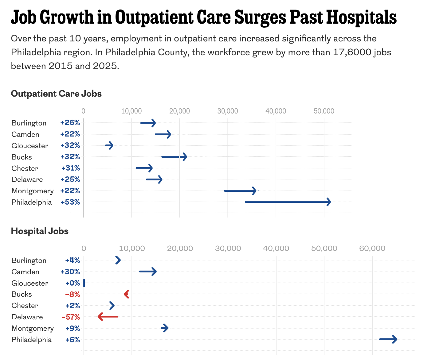
This version is a bit clearer with less noise in the graphic and the labelling, which I kept, but moved to a table-like format with the county labels. I did not recreate the chart, but instead stretched the top bit to make the 0 and 50,000 align with the bottom bit so you can truly compare across the dataset in the chart.
Overall, the graphic was fine, but a couple of considered changes could really improve similar graphics moving forward. I just wish that such a data-rich article could have even more charts and maps to visualise the story.
Credit for the piece goes to Lizzie Mulvey.