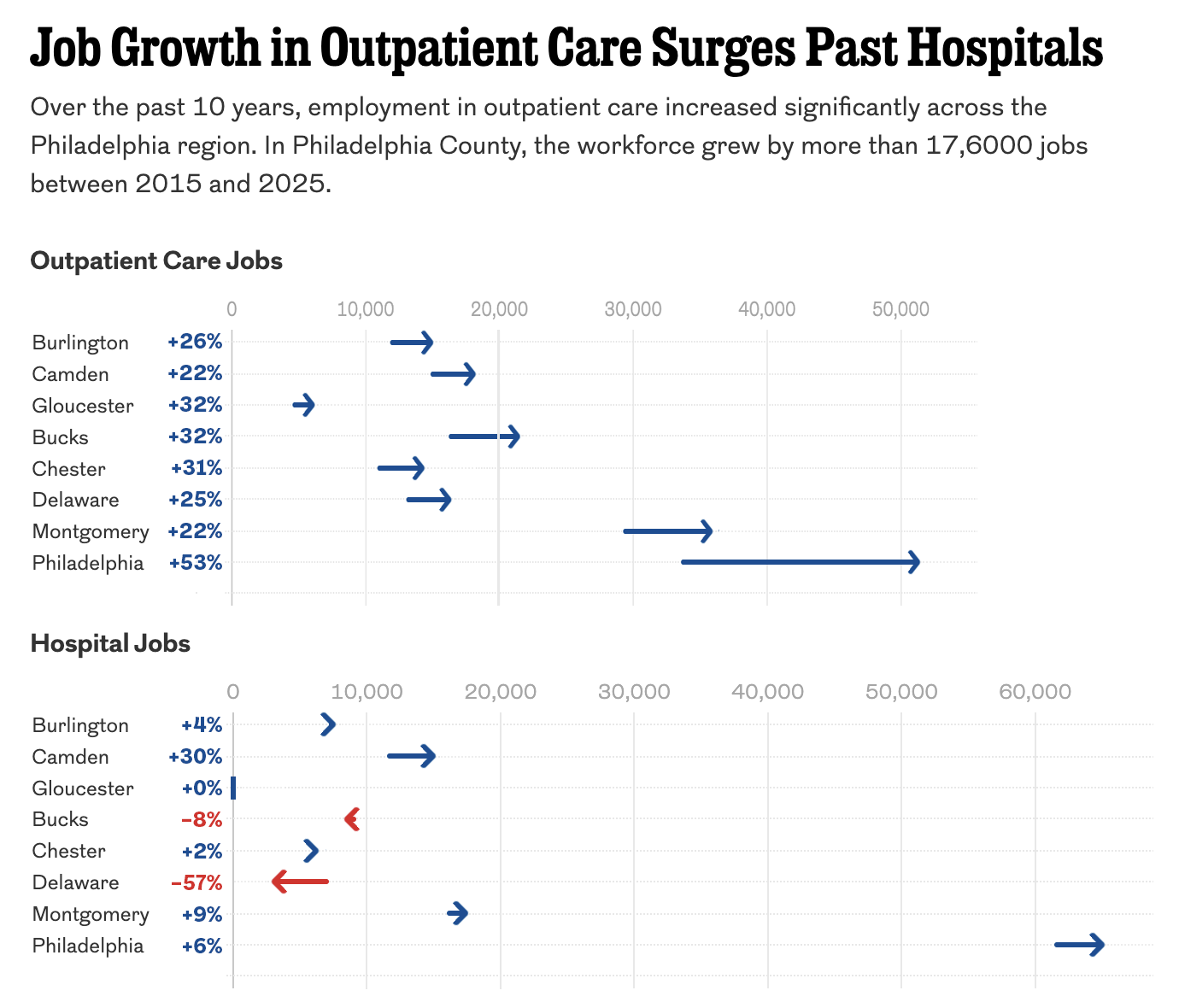
Just Keep Grinding it Out

There are certain journalism outlets that I read that consistently do a good job with information design or at least are known for it. Now I try to keep my media diet fairly large and ideologically broad, but in that there are also still some outlets that feature quality design than others. The New York Times, the Washington Post, and the Economist are usually probably top of my list, but you will also see the Wall Street Journal, Philadelphia Inquirer, Boston Globe, the Guardian, and the BBC. I also read more niche outlets for some of my interests, e.g. the Athletic for Red Sox and baseball. But these often don’t feature information design. Politico is one that I read for my political news fix. And when I was reading it whilst on holiday, I was surprised to find an article about the employment market with a really nice line chart.

The article examines the changing labour market where, for over a year now, bargaining power largely resided with employees. If employees wanted raises, benefits, perks, whatever, they could often leave their current employer if their requests weren’t met because another employer, desperate for staff, would likely meet their asks. However, as the economy cools, we would expect the labour market to tighten making few openings available. That begins to reduce the bargaining power of employees as now employers can say “take it or leave it”, knowing that the offers they make to staff aren’t likely to be met by other employers who don’t have open positions or aren’t otherwise hiring.

Four graphics punctuate the article, detailing just that changeover. The full article is worth a read, but I wanted to take a look at one graphic that I think best captures the design decisions made.

That looks like an inflection point to me.

My screenshot above doesn’t capture the interactivity, but we will return to that in a moment. We see three data series: job openings, quits, and layoffs and discharges. The designer represented each with a primary colour, making clear distinctions between the three, and since all three are represented by thousands of units, they can be plotted together. That allows one to make easy comparisons across the three series at particular moments in time, e.g. the Covid recession. My only real quibble is with that recession bar. I probably would have used a neutral colour like a light grey instead of red, because the red appears visually linked to layoffs and discharges when they really are not.

Normally when we see an interactive line chart, we have a small legend above, sometimes below, the graphic. Here, however, the labelling for the lines sit directly next to the line. This makes the display clearer for the reader who scans the data series and I’ve seen the approach often in print, but rarely for interactive work.

And when the reader mouses over the work, the highlight does a few nice things.

See what you want to see.

We can first see that the line with which the user is engaged becomes the focus: the remaining two lines recede into the background as they are greyed out. We also get a simple, but well designed text label above the cursor. Note how that behind the text there is a thin white stroke that creates visual separation between the letters and the data line. And that cursor is a small grey circle surrounding the data point, allowing you to see said data point.

Take it all together and you have a very clear and very effective interactive line chart. It’s a job well done.

When I see good work from unexpected places it’s important to call it out and highlight it because it means some design director somewhere cares enough to try and improve their publication’s quality of communication. And in an era when many outlets suffer from disinvestment and cost-cutting staff reductions that leave fewer designers, editors, and photographers on staff it is easy to imagine design quality decreasing.

So credit for this piece goes to Eleanor Mueller.