
This past weekend was a hot one in Philadelphia (and many other places across the eastern United States). As we enter July, the Philadelphia Inquirer published an article examining climate change’s impact on summer temperatures. Spoiler: it’s hotter.
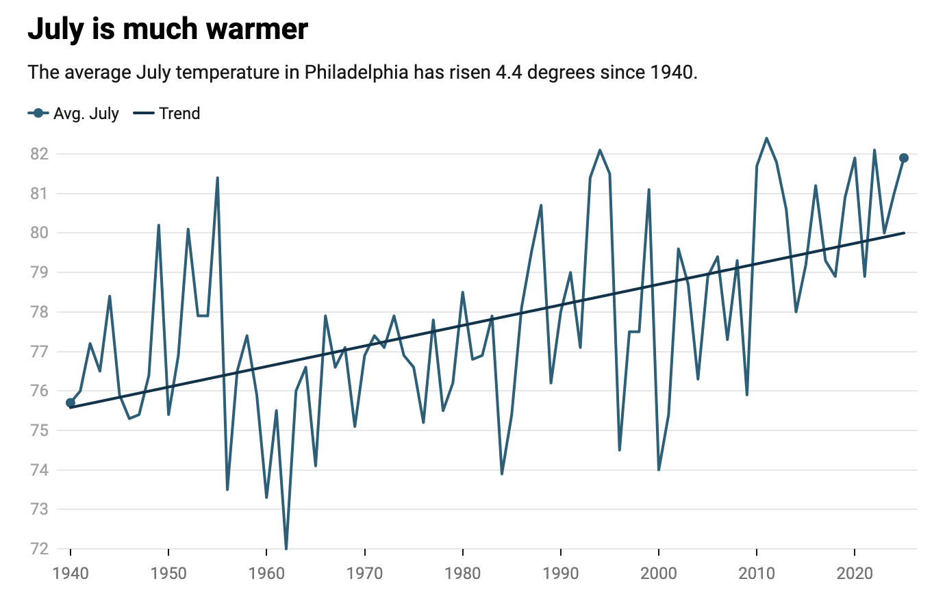
The article included two interactive line charts. The first one plotted the average high temperature of July for each year since 1940. Crucially, the graphic included a trend line showing how July’s temperature has trended. Spoiler: it’s hotter.
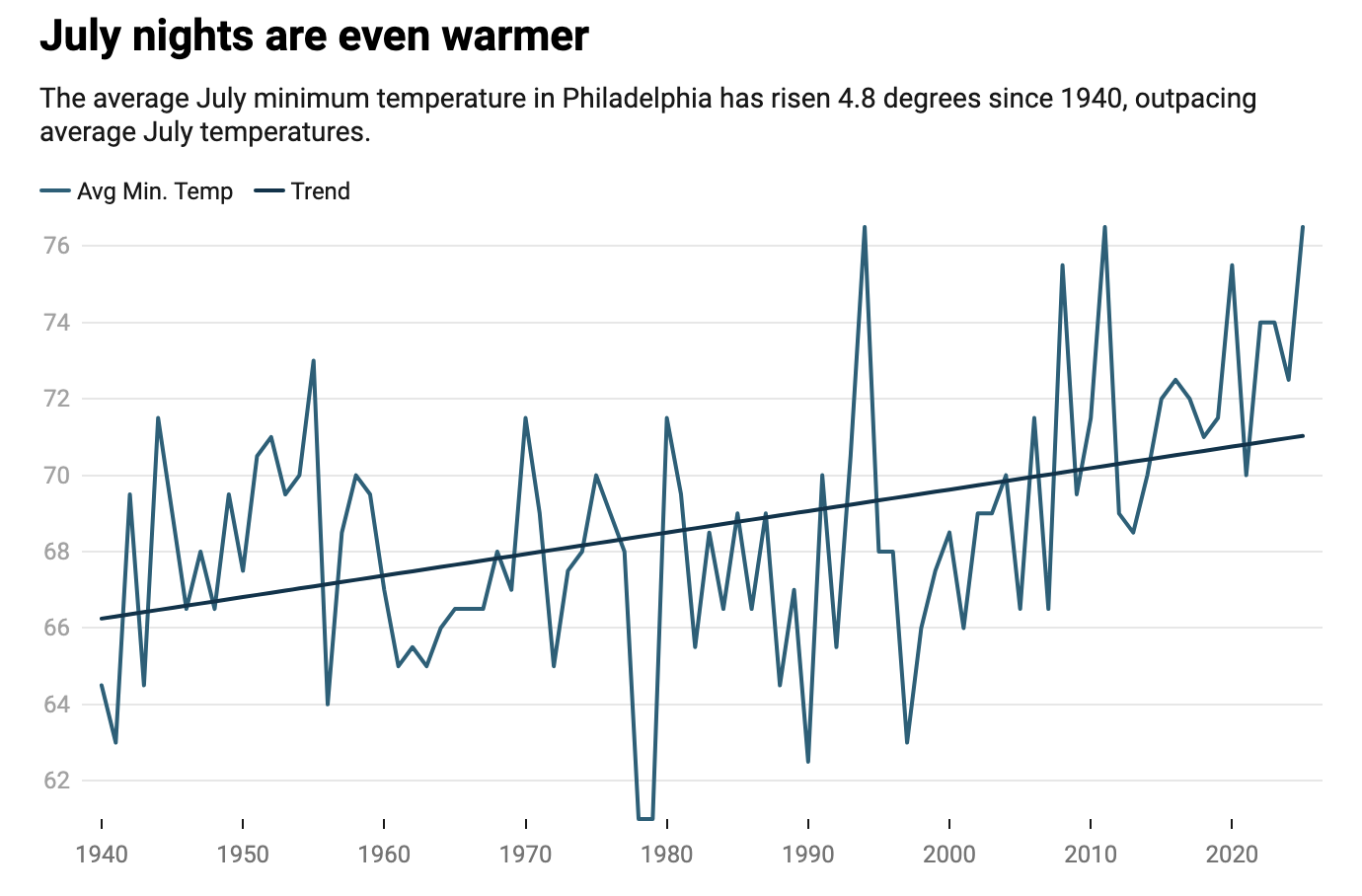
The second chart explored the nighttime lows of July and how low temperatures have changed since 1940. Spoiler: it’s hotter.
And having grown up in the suburbs and now living the better part of the last decade in the city, I can confirm it’s hotter.
But the article also reported that the increase in July low temperatures has actually been slightly greater than the high temperatures—4.8ºF vs. 4.4ºF. A quick look at the charts, however, shows a steeper slope for the highs than the lows, visually implying the opposite.
Instead of placing the data on two separate charts, I would have either used the same scales or combine the two into one single chart.
I decided to do the latter.
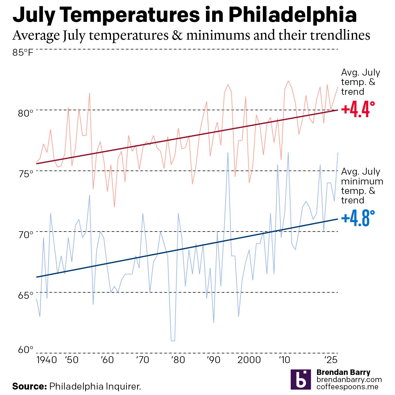
You can see the slopes here are far closer than they appear in the originals. Arguably, the trend in the last several years is even worse, as placing the two series together the minimum temperature is uncomfortably—literally—close to the average July temperatures.
The originals are not bad, to be clear. But, the article specifically called out the greater rate of increase for low temperatures and that warrants a bit more sensitivity to how the charts show that change.
Credit for the originals goes to Frank Kummer.
Credit for the alternate is mine.