Tag: climate change
-
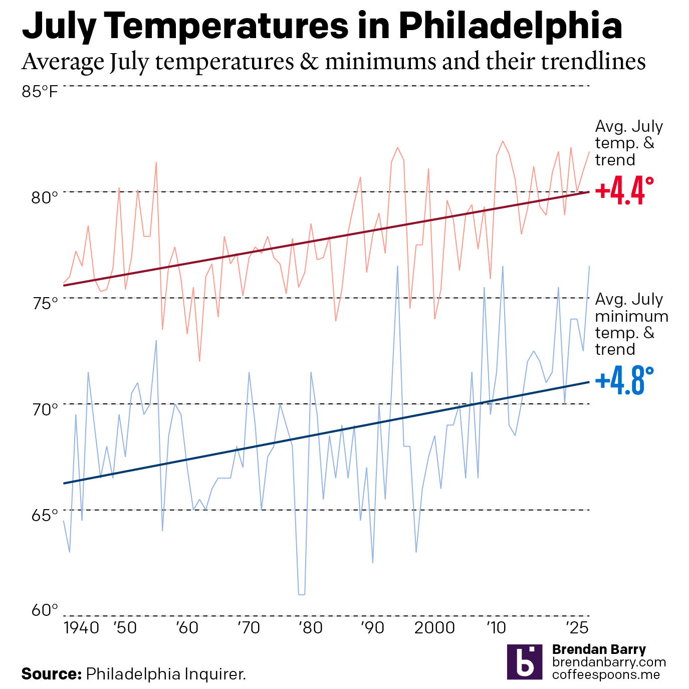
Just a Wee Bit Warm
This past weekend was a hot one in Philadelphia (and many other places across the eastern United States). As we enter July, the Philadelphia Inquirer published an article examining climate change’s impact on summer temperatures. Spoiler: it’s hotter. The article included two interactive line charts. The first one plotted the average high temperature of July…
-
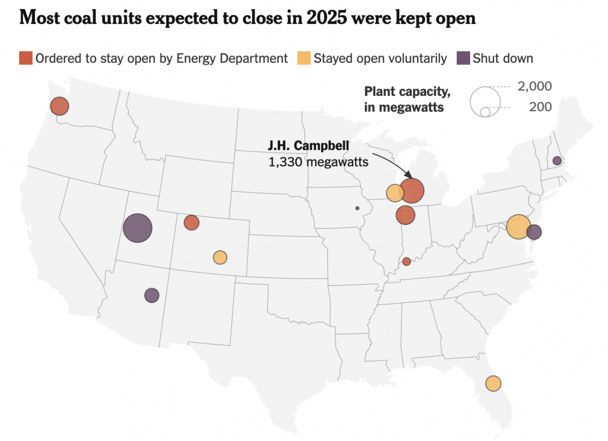
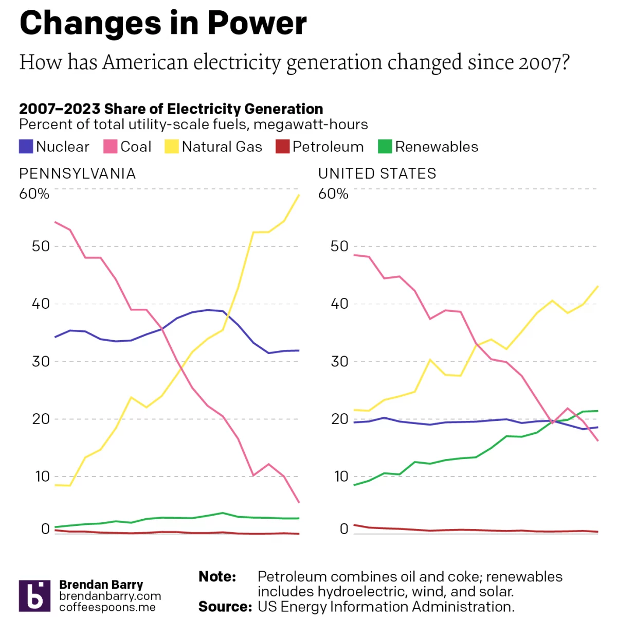
The Phoenix Rises from the Charcoal
To be clear, climate change is real. We know humanity drives the bulk of it via emissions of carbon and other greenhouse gasses, e.g. methane. Electricity generation plays a significant role in the total output, though not all means of generating power are equal. Wind, solar, hydro, and nuclear, for example, produce no carbon emissions.…
-
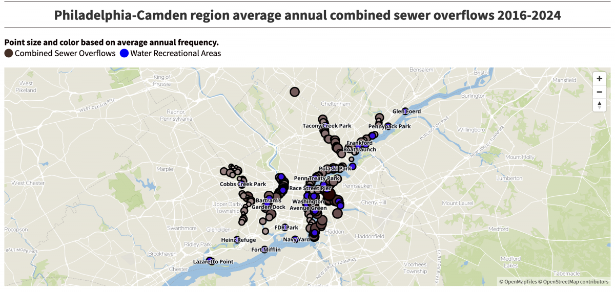
Boy, Does That Stink
(Editor’s note, i.e. my post-publish edit: The subject matter, not the work.) Last week the Philadelphia Inquirer published an article about the volume of sewage discharged into the region’s waterways over nearly a decade. It cited a report from Penn Environment, which claimed 12.7 billion tons of sewage enter the Delaware River’s watershed. I clicked…
-
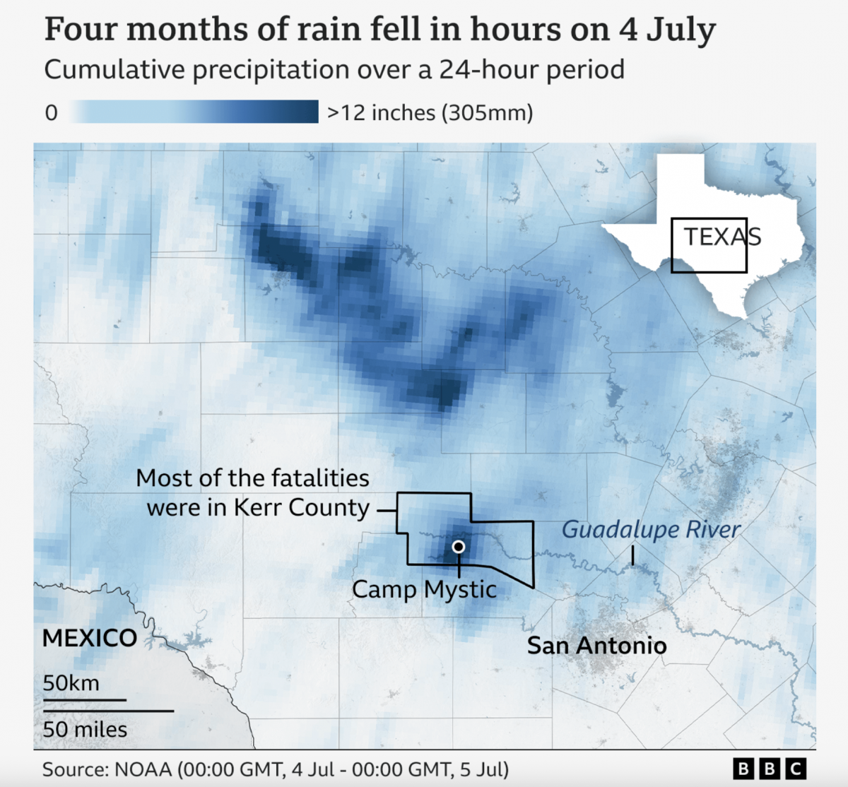
A Warming Climate Floods All Rivers
Last weekend, the United States’ 4th of July holiday weekend, the remnants of a tropical system inundated a central Texas river valley with months’ worth of rain in just a few short hours. The result? The tragic loss of over 100 lives (and authorities are still searching for missing people). Debate rages about why the…
-
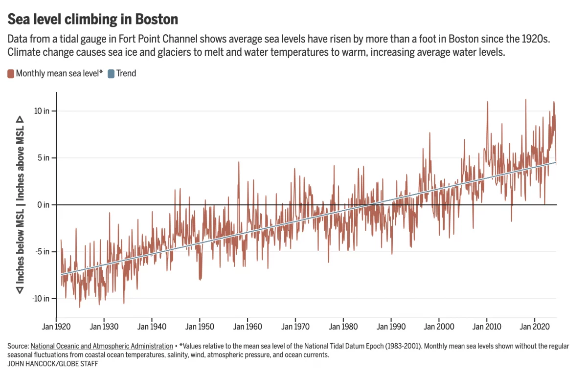
Fear the Floodwaters
This past weekend saw some flooding along the East Coast due to the Moon pulling on Earth’s water. In Boston that meant downtown flooding, including Long Wharf. The Boston Globe’s article about the flooding dwelt with more impact, causes, and long-term forecasts—none of which really warranted data visualisation or information graphics. Nonetheless, the article included…
-
Electric Throat Share
For the last few weeks I have been working on my portfolio site as I update things. (Note to self, do not wait another 15 years before embarking upon such an update.) At the University of the Arts (requiescat in pace), I took an information design class wherein I spent a semester learning about the…
-
Climate Conscientious and Cheaper Cars
Sometimes in the course of my work I stumble across graphics and work that I previously missed. In this case I was seeking a post about one of my favourite infographics, but it turned out I’ve never posted about it and so I will have to rectify that someday. However in my searching, I came…
-
The Great British Baking
Recently the United Kingdom baked in a significant heatwave. With climate change being a real thing, an extreme heat event in the summer is not terribly surprising. Also not surprisingly, the BBC posted an article about the impact of climate change. The article itself was not about the heatwave, but rather the increasing rate of…
-
Turn Down the Heat
First, as we all should know, climate change is real. Now that does not mean that the temperature will always be warmer, it just means more extreme. So in winter we could have more severe cold temperatures and in hurricane season more powerful storms. But it does mean that in the summer we could have…
-
There Goes the Shore
The National Oceanic and Atmospheric Administration (NOAA) released its 2022 report, Sea Level Rise Technical Report, that details projected changes to sea level over the next 30 years. Spoiler alert: it’s not good news for the coasts. In essence the sea level rise we’ve seen over the past 100 years, about a foot on average,…